26 March 2003
Together for the City We Love
![]() In February 1975, New York City reached the nadir of its financial crisis when underwriters withdrew from a $260 million bond issue, putting the the City on the verge of insolvency. To help generate income, the New York Commerce Commission hired ad agency Wells, Rich and Greene to develop a campaign that would promote New York City and state as a tourist destination. The slogan they came up with: I Love New York. The Commission hired designer Milton Glaser to develop a logo. When the ads came out in 1977, they featured New York celebrities including Frank Sinatra, Morgan Fairchild and Yul Brenner.
In February 1975, New York City reached the nadir of its financial crisis when underwriters withdrew from a $260 million bond issue, putting the the City on the verge of insolvency. To help generate income, the New York Commerce Commission hired ad agency Wells, Rich and Greene to develop a campaign that would promote New York City and state as a tourist destination. The slogan they came up with: I Love New York. The Commission hired designer Milton Glaser to develop a logo. When the ads came out in 1977, they featured New York celebrities including Frank Sinatra, Morgan Fairchild and Yul Brenner.
The campaign was an enormous success, running for 25 years, with no end in sight. (There’s certainly no shortage of fabulous I Love New York merchandise for sale around town.) The logo has become iconic and often imitated.
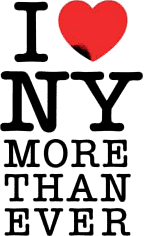
 In the aftermath of September 11, 2001, Glaser updated his design by adding a smudge to the lower corner of the heart and the words “More Than Ever.” The image must have struck a chord. It seemed to pop up in every shop window in town. Glaser, who’s taught design at the School of Visual Arts for 40 years, worked with the director of the school to print up posters. Students ran around handing out 5,000 posters, and New York’s papers reprinted the image for their readers to clip and post. Personally, I thought the image was corny, but a step up from all the flag waving. I did experience the incredible comradery of the people of New York City. Many, however, experienced incredible animosity and even violence.
At the bottom of the posters is text that specifically notes that the posters are not for sale. Glaser did make one exception, though, when he allowed WNYC, a public radio station, to sell posters to raise money to replace the broadcast tower and antenna that were destroyed when the towers collapsed. The gesture ultimately raised $190,000.
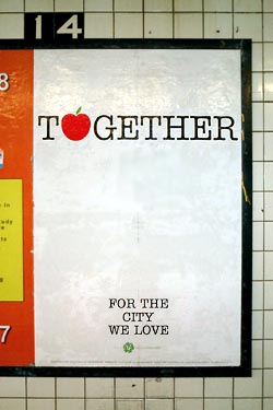
It’s a year and a half later and the city faces another financial crisis. Glaser has designed the third in a continuing series of messages: “Together for the City We Love.”
 Glaser told the Daily News:
“His new phrase was inspired by the city’s fiscal crisis and the recent threat of a transit strike. Glaser sent City Hall several designs with the slogan, which he says could serve as a ‘rallying cry’ to help New Yorkers bond during tough times.”
When I first saw the new logo in the subway, I was skeptical. As a New Yorker, I will not be bullied into happiness or togetherness. Certainly, when the State sells unity, I wonder who stands to gain. “Community” is often used the gloss over difference and dissent. “You’re either with us, or against us.”
The design, however, is open to interpretation. One could just as easily use it at a block party or mass action. And I’m sure subway riders will note their own impressions on the ad’s generous white space.
As it turns out, the city chose not to use the design. Instead, Glaser and SVA will be publishing it on their own again — the public act of private individual, an educational institution, and its students. SVA also arranged ad space in the subways. The students will distribute the printed posters this weekend.
“The people of NYC seem to be losing that sense of cohesion we felt a year and a half ago,” says Glaser. He hopes the campaign will encourage people to be nicer to each other and may try to use it as a fundraiser for the City to help pay for some of the services being cut. “It’s a drop in the bucket, but it would have symbolic meaning.”
Meanwhile, the city government has plans of its own. Mayor Bloomberg has set up a permanent office and campaign to sell New York to big business and investors and to woo major events. The effort relies less on advertising and more on deals with the private sector and behind-the-scenes lobbying.
It has already brought back Grammy’s and next year’s WNBA All-Star game to New York, but also the Republican National Convention in 2004.
I for one will be out there protesting, together for the city we love.

