19 March 2003
The Visual Rhetoric of War

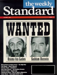
“The linking of the two evils. Unproven by the facts, reality in the image. The Wild West poster does the trick of validating the Bush approach and chosen iconography.”
The Better Rhetor builds on the work of Political Research Associates in this unpacking of the imagery used in a series of Weekly Standard covers.
See also Kate Brigham’s MFA thesis, Decoding Visual Language Elements in News Content, and its prototype Flash piece that allows you to alter design elements of post-September 11 news magazine spreads on the fly. See for yourself how non-verbal messages are expressed, the objectivity of the news is tilted, and the case for war is made by the choice of imagery, its cropping, composition, and color.
Thanks to drapetomaniac for the Better Rhetor link.

