24 January 2007
Negative Campaigning
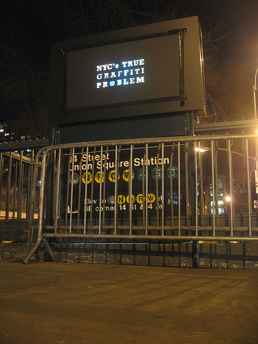
A great action in NYC, taping placards over those outdoor video billboards attached to subway entrances. The typography is composed of holes in the board, illuminated by the video ad beneath.
The project is Light Criticism, brought to you by the Anti-Advertising Agency and the Graffiti Research Lab.
In form, it reminds me of the work of Moose, writing his name on walls by cleaning them.
In context, it’s a lot like this guerilla wayfinding campaign, a grassroots, illegal action for civic improvement.
![]() 24 January 2007, 8:13 AM | LINK | Filed in
built, graffiti, guerilla wayfinding, posters, subway, typography
24 January 2007, 8:13 AM | LINK | Filed in
built, graffiti, guerilla wayfinding, posters, subway, typography
Read more items related by tag:


