

28 April 2008
Water Table
Articles on the New York Times website do not generally retain graphics and photos used in the print edition, particularly among older articles. So for a presentation on information design for advocacy, I went offline and dug up that graphic mentioned here. You know, the one that persuaded Bill Gates to shift his philanthropic strategy from cheap computers to public health? The graphic that “saved more lives in Africa and Asia than any other in history”?
Here’s the text of the 1997 article associated with the graphic, For Third World, Water Is Still a Deadly Drink.
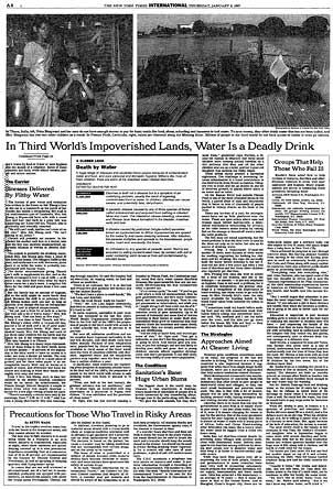
And a view of the graphic within the context of the page:
And finally, the graphic itself:
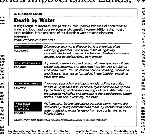
After such an awe-inspiring setup, it’s remarkable to me just how unremarkable the graphic actually is. Particularly compared to many of the examples I used in my little pamphlet on information design, there’s nothing really visually compelling or innovative about this one. But perhaps that’s part of its impact: just a clear, concise table calling out key data. The graphic gets out of the way of the information. And while the numbers themselves are stark, I think its power also comes from its context within the brutality described in the narrative — and that for the most part, clean water and sanitation are not problems we don’t know how to solve.
![]() 28 April 2008, 8:18 AM | LINK | Filed in
africa, information design, nytimes, water
28 April 2008, 8:18 AM | LINK | Filed in
africa, information design, nytimes, water
Read more items related by tag: