24 August 2009
Dale La Vuelta Al Mundo
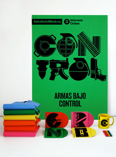
It’s rare to see a large, established non-profit take a bold risk with their branding. All the more reason I love the striking, typographic treatment of the graphics designed by Hey Studio for a campaign by Oxfam International Spain. (via)


