www
Banned in Translation
From Democracy Now!:
“The U.S. Treasury Department’s Office of Foreign Assets Control recently declared that American publishers cannot edit works authored in nations under trade embargoes which include Iran, Iraq, Sudan, Libya and Cuba.
Although publishing the articles is legal, editing is a ‘service’ and the treasury department says it is illegal to perform services for embargoed nations. It can be punishable by fines of up to a half-million dollars or jail terms as long as 10 years.
Robert Bovenschulte, president of the publications division of the American Chemical Society, which decided this week decided to challenge the government and risk criminal prosecution by editing articles submitted from the five embargoed nations.”
From the Treasury Department itself:
“As you know, the importation from any country and the exportation to any country of information and informational materials, whether commercial or otherwise, regardless of format or medium of transmission, are exempt from the Iranian Transactions Regulations, 31 C.F.R. Part 560 (the ITR). ITR, § 560.210(c)....
Nevertheless, certain activities described in your letter would fall outside of the information and informational materials exemption. The collaboration on and editing of manuscripts submitted by persons in Iran, including activities such as the reordering of paragraphs or sentences, correction of syntax, grammar, and replacement of inappropriate words by U.S. persons, prior to publication, may result in a substantively altered or enhanced product, and is therefore prohibited under ITR § 560.204 unless specifically licensed.”
Boy is this ever crying out for civil disobedience from all of us bloggers. I’m not sure if republishing or translating information off the Web is covered by this (since it’s accessible anyway), but posting translations of otherwise published or unpublished material probably would be.
Let the Office of Foreign Assets Control know about it at [email protected]. To complain to the Department of Justice about the issue email [email protected].
Via the Project Censored and Juan Cole
Mapping Feedback
 As far as centrally-coordinated online campaigns go, one technique I’ve particularly admired about MoveOn’s organizing is the way the coordinators gather feedback and circulate it back to the participants of a given action. Participants around the world can read about of what others are doing, and get a sense of the impact and scale of the action. Too many organizations simply fail to ask who is taking offline action. And many send out endless streams of urgent action alerts with little, if any, follow-up.
Usually MoveOn’s updates arrive as the text of an email, but this Flash driven map does the job visually and interactively. The map effectively presents both the macro and micro views of the many house parties organized across the U.S. on December 7, 2003 to view the documentary Uncovered: The Whole Truth about the Iraq War.
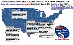 Despite the initial written instructions, the interface could be made a little more intuitive by giving shapes of the states some kind of rollover behavior.
Still, I find it more informative than MoveOn’s previous action map. This map of the February 26, 2003 phone-in rotates the display of only one tesimony per state. Instead of plotting data the map paints a more atmospheric picture of the plurality of voices and the outrage that rained upon the Capitol that day. The geographic shapes only provide a general spatial context to the ticking clock and growing tally of calls.
Between the two is a world map of candle light vigils organized on March 16, 2003. The map displays testimonies, photos, and the sites of vigils, but the user is unable to draw any actual numbers from it, only impressions. The zoom effect is gorgeous, but the testimonies quickly overwhelm, like hundreds of little pop-up windows you’re unable to move or close.
The maps were all designed and programmed by Stamen Design in San Francisco.
...
See also this Jully 2004 item about Stamen Design’s live, interactive conference call map.
Nonprofit Online Mapping in New York City
Steven Romalewski sends this growing list of nonprofit online mapping Web sites in New York City:
“We’ve noticed a kind of a critical mass of these mapping and data services recently.
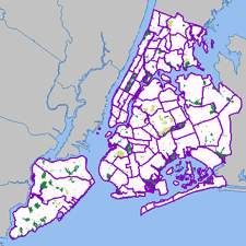 Most of these have been created by my project, NYPIRG’s Community Mapping Assistance Project (a team of six people, part of a nonprofit organization, that uses GIS to help other nonprofits achieve their missions). They’re all part and parcel of an effort to ‘democratize’ data and provide powerful new tools with a community-based focus. Each site uses GIS technologies that few other nonprofits have tapped into, but that government agencies and the private sector have used to great effect. The websites use government data in in new and innovative ways, often to provide services that most government agencies would never provide. And they give local neighborhoods and individuals a window on their world that would’ve been daunting, at best, and maybe impossible for the average citizen or block association to obtain. The sites have helped level the ‘playing field’ in New York to a great extent, so public agencies and large companies don’t have a monopoly on information.
Here are the links:
- http://www.MyCITI.org — the Community Information Technology Initiative (CITI) website that puts mapping tools in the hands of New York City’s local planning boards, in a way that they can avoid the need to spend limited resources and duplication if all 59 boards had to buy the software and invest in the data creation themselves;
- http://www.oasisnyc.net — a wealth of information about parks, wetlands, gardens, and other open spaces across New York, reaching across all levels of government and developed for all different aspects of the city’s ‘greening community’. This site was spearheaded and funded by the US Forest Service, and involves a steering committee of more than 40 nonprofits, government agencies, academics, and businesses;
- http://www.nonprofitmaps.org/netmaps/bedc/bedc.htm — the Brooklyn Economic Development Corp’s. ‘Destination Brooklyn’ service that offers detailed real estate and demographic information for every property and neighborhood in Brooklyn, geared toward small business owners and community development organizations;
- http://www.straphangers.org/cmap.php — the Straphangers Campaign’s ‘Get Where You’re Going’ site, providing precise location information about the subway stops closest to any street address in NYC (which the MTA’s maps can’t do, since they’re geographically distorted to fit on a printed page);
- http://www.MyGovernmentNYC.org — allows anyone with a New York City address to easily find and contact the public officials who represent them at all levels of government, and is used by thousands of people each month, regularly praising it for its simplicity and comprehensiveness;
- http://www.nonprofitmaps.org/netmaps/lac/lac.htm — how to locate family literacy programs based on a survey by the Literacy Assistance Center, mapped by category, borough, or ZIP Code. The site also shows nearby subway stops and public libraries;
- http://www.nonprofitmaps.org/nycnonprofits — the NYC Nonprofits Project Service Atlas. It extends a 3-year study of the nonprofit sector that was released in June 2002, by enabling you to locate any of more than 6,000 nonprofit groups in the city by ZIP Code, neighborhood, Community Board, or City Council district. Groups are listed in 17 major categories and lots of sub-categories. CMAP created the Atlas for the Nonprofits Project; and
- http://www.LowerManhattanMap.com — helping with the recovery and rebuilding efforts of lower Manhattan small businesses, tourist destinations, and cultural organizations. The site includes information maintained by 3 business improvement districts on almost 2,000 local businesses, retail stores, restaurants, community services, cultural sites, and tourist attractions.”
Popular Delusions and The Madness of Cows
Since we know exactly how mad cow disease is spread, it should be pretty easy to identify which meat to buy just by finding out how the cows are raised. Free range? Grass fed? Organic? It’s all labeled there on the package, right?
You might be surprised to find out just what falls into the gap between “Grass Fed” and “100% Grass Fed.”
 In steps the Consumers Union to provide the story behind the cypher:
“Consumers Union (CU), the independent nonprofit publisher of Consumer Reports magazine, is providing consumers with important information about which meat labels can and cannot help consumers wanting to reduce their the risk from mad cow disease.
Mad cow disease is known to pass from one animal to another through the use of animal by-products in animal feed. Certain labels indicate that animal by-products are not used in the feed that produced the meat. Therefore, meat carrying these labels is very low risk in terms of mad cow disease.
The information is posted at eco-labels.org which lists the the most helpful labels (“Organic” and “Biodynamic”) somewhat helpful labels (like “100% Grass Fed”), and labels that should not be relied upon to reduce the risk of exposure to mad cow disease (like “Free Range”).
In addition to meat labes, the site lists terms and labels from other food, household, and personal care products, and clearly states which terms do or do not have official definitions and organizations who verify compliance.
From eco-labels.org:
“CU launched www.eco-labels.org in the spring of 2001 to help educate consumers about these labels. Consumers Union believes that the best eco-labels are seals or logos indicating that an independent organization has verified that a product meets a set of meaningful and consistent standards for environmental protection and/or social justice....
The purpose of this site is to provide information to consumers regarding eco-labels, products that carry eco-labels, the organizations that produce eco-labels, and government and private standards for ‘green’ products. Our goal is to help consumers make more informed choices in the marketplace, and participate more effectively as citizens in important decisions that affect the environment.”
Road Kill
Courtesy of Ken Avidor:
 “Highway expansion in America is big business. The Highway Expansionists enjoys the support of both Democrats and Republicans and sometimes Greens. Millions of dollars are spent on propaganda to support the notion that the destruction of the People Zone for the Auto Zone is an inevitable and desirable part of “Progress.” If you add the billions of dollars the auto and oil industry spends on advertising and public relations, it is no wonder that opponents of highway expansion face a public wall of apathy and suspicion. It is not easy to break through that wall of conditioning. Words alone cannot correct the positve mental images people have of automobiles and highways from acquired from a lifetime of viewing TV commercials.
STRIDE (Southside Traffic Reduction Initiative to Determine our Environment) uses photos, art and comics on its website to counter the industry PR images. Comics and satire are also a fun way to convey complex ideas. They can also attract attention to more serious stuff. We are hoping to add music and animation to the STRIDE site in the near future.
These are some sites that have art and comics against highway expansion [in Minnesota]:
http://www.Stride-mn.org
http://www.roadkillbill.com
http://www.andysinger.com
http://www.carbusters.org/
Ill Communication
In the same sitting, I stumbled into two articles on the use of cellphones to coordinate street protest in real time. One in La Paz, the other in London, the former well organized, the latter ad-hoc. One from the country, the other from the city.
From Anarchogeek:
“The use of cell phones is interesting in how it relates to transforming the rural/urban power divide within the developing world. This isn’t something entirely new, rural community radio stations have played very large roll in communication and social transformation. In Bolivia, the revolution of 1952 lead by the miners unions, was coordinated by a network of rural community radio stations. With high illiteracy, little infrastructure, very poor communities these communities have relied on radio as the primary form of mass media.
In the last decade there has been an upsurge in the political power of indigenous movements in the Andes who have their power base in rural mostly disconnected communities. A lot of that upsurge is due to the many years of organizing by indigenous leaders, social movements, and NGO’s. That said, cell phones have acted as a major amplifier of their work. Increasing the ability for people to coordinate their actions and build robust social networks.
Unfortunately, I’ve not seen much written about the use of cell phones and other communications technology in the general strike and ‘Gas War’ in Bolivia last month. From my working with the rather small group of indymedia people in Bolivia I’ve heard some of how cell phones transformed the conflict. It helped people lay a more than week-long siege to La Paz. It also helped coordinate the marches of people from other parts of the country to the capital. When women went on hunger strike in churches the communications network made it a coordinated act, not simply the act of a few brave women in one location.
I think what happened in Bolivia is quite different than the much talked about ‘smart mobs’ as there were relatively few people will cell phones. The groups were not flexible, but rather quite well organized with cell phones used to coordinate between the leadership of existing organizations and networks. The use of cell phones facilitated the biggest indigenous siege of La Paz in almost 300 years.
Other important factors was Pios Doce and other community radio stations which played a vital mass media roll during the crisis. The Pios Doce transmitter in Oruro was bombed, by people who clearly didn’t expect the police to investigate anything. What the government didn’t figure out how to do was shut off the cell phones of known organizers, or towers which serve indigenous communities. My guess is the reason they didn’t shut them down was in part because cell phones were a vital communications tool for the police and army. Even the US Army in Iraq makes extensive use of consumer walkie talkies and unencrypted Instant Messenger. In India texting has been shut off at critical points to stem the spread of rumors and coordinated race riots during communalist uprisings in the last year. I expect as social movements turn to using cell phones and related technology as a tactical tool during protests and uprisings the governments will eventually learn how to turn off the ability to communicate at will.”
This last point is also noted in the BBC article about protestors chasing Bush in London:
“Some newspapers and websites were reporting mobile phone signals could be blocked for fear they could remote-control a bomb. But Scotland Yard has denied reports that police were considering shutting mobile phone masts during protests.”
In contrast to the Bolivia protest which shut down the capitol, the UK protests are intended to be a media hack and an adjunct to the big, organized, legally-sanctioned anti-war march on Thursday.
 “The Chasing Bush campaign is asking people to ‘disrupt the PR’ of the visit by spoiling stage-managed photos.
They are being encouraged to send location reports and images by mobile to be posted on the Chasing Bush site....
Technologies like text messaging and weblogs have been successfully used in the past to co-ordinate routes and meet-up points for mass protests.
But the gadgets are now being used more proactively to make protests more visible and disrupt any potential stage-managing of the President’s visit.
‘We are trying to spoil the PR, so we are not doing anything directly, but encouraging people to protest by turning their backs in press photos so they can’t be used.’
The campaign organisers have also asked people to go into protest ‘exclusion zones’ to send SMS updates and on-location reports about his appearances, and events at protests.”
See this previous post for more notes on electornic advocacy.
Captions, Television and its Double
The year 1960 marks a turning point in the history of technology and politics. The Kennedy-Nixon presidential debate was the first to be broadcast live on television. Kennedy’s telegenic composure and appeal is credited with tipping the vote in his favor. In 1960 ninety percent of U.S. households owned a television. For the first time, Americans in 1963 say that they get more of their news from television than newspapers. Television becomes an increasingly important source of information and enormous cultural force in the United States marking the assassination of President Kennedy, the rise of the Beatles, landing a man on the moon and returning him safely to Earth, I Love Lucy, Sesame Street, the Olympics, news of the war in Viet Nam, the Watergate hearings, the Watts riot, Star Trek, and the mini-series Roots. [source]
However, it would be at least another decade before millions of deaf and hard-of-hearing Americans could begin to participate.
From the National Captioning Institute:
 “The first innovators were not thinking about a captioning system for deaf and hard-of-hearing people. In 1970 the [U.S.] National Bureau of Standards began to investigate the possibility of using a portion of the network television signal to send precise time information on a nationwide basis. The Bureau believed that it could send digitally encoded information in a part of the television signal that is not used for picture information. The ABC-TV network agreed to cooperate. This project didn’t work, but ABC suggested that it might be possible to send captions instead.
This led to a preview of captioning at the First National Conference on Television for the Hearing Impaired in Nashville, Tennessee, in 1971. Two possible technologies for captioning television programs were demonstrated that would display the captions only on specially equipped sets for deaf and hard-of-hearing viewers.
A second demonstration of closed captioning was held at Gallaudet College on February 15, 1972. ABC and the National Bureau of Standards presented closed captions embedded within the normal broadcast of Mod Squad.
As a result of the enthusiasm these demonstrations created in the deaf and hard-of-hearing community, the National Association of Broadcasters studied the technical and economic factors involved in establishing a captioning service. The Association concluded that this captioning system was technically possible, but certain steps had to be taken before it could become a reality. The federal government then said it would fund the development and testing of this system. The engineering department of the Public Broadcasting System started to work on the project in 1973 under contract to the Bureau of Education for the Handicapped of the Department of Health, Education and Welfare (HEW).
While the closed-captioning service was being developed, there were some programs with ‘open’ captions airing on PBS. In 1971, The French Chef became the very first television program that was accessible to deaf and hard-of-hearing viewers. The ABC News was rebroadcast on PBS five hours after its broadcast on ABC-TV. From the time the captioned ABC News was first produced in 1973, it was the only timely newscast accessible to deaf and hard-of-hearing people until NCI’s real-time captioning service started in 1982....
Toward the end of the technical development project at PBS, it became clear that in order to get the cooperation of the commercial television networks, it would be necessary to establish a nonprofit, single-purpose organization to perform this captioning. And so in 1979, HEW announced the creation of the National Captioning Institute. The mission and importance of NCI was clear from the beginning. It was to promote and provide access to television programs for the deaf and hard-of-hearing community through the technology of closed captioning.
On March 16, 1980, NCI broadcast the first, closed-captioned television series. The captions were seen in households that had the first generation of closed caption decoder.
A silence had been broken. For the first time ever, deaf people across America could turn on their television sets — with a caption decoder — and finally understand what they had been missing on television.
The closed-captioned television service was an overnight sensation. Suddenly, thousands of people who had been living in a world of silence could enjoy television programs along with hearing people....
NCI ensured a bright future for closed-captioned television by partnering with ITT Corporation in 1989 to develop the first caption-decoding microchip, which could be built directly into new television sets at the manufacturing stage. This led to the introduction and subsequent passage of the Television Decoder Circuitry Act, which mandated that, by mid-1993, all new television sets 13 inches or larger manufactured for sale in the U.S. must contain caption-decoding technology. Now, millions of people have access to captions with the push of a button on their remote controls.”
From a more recent Captioning FAQ:
“On August 7, 1997, the FCC unanimously approved new regulations which will mandate captioning on virtually all television programming in the United States. Section 305 of the Telecommunication Act of 1996 is being implemented as a new section (Section 713) of the existing Communications Act. On September 17, 1998, the FCC modified their rules, in what can be considered a victory for caption viewers. The ruling took effect on January 1st, 1998, and it phases in requirements separately for ‘old’ and ‘new’ programming.”
Though numerous studies have shown that mixed-case text is easier to read than all uppercase, virtually all captioning in North America is done in uppercase only. The resolution of NCSA television and caption decoders generally results in ugly and illegible lowercase letters.
“[However,] mixed-case text is often used to indicate whispering, and is also often used for text that needs to be set apart, such as comments by an off-screen announcer (voice-over), or sound effects.
Caption decoders and televisions were not required by law to support lowercase letters at all until just a few years ago. There are, therefore, some televisions that will change mixed-case text to all uppercase.” [source]
Now, with the introduction of digital television, the design of the typeface for subtitling is no longer constrained by the technology of analog television.
This new digital environment provides for larger screens, higher screen resolutions, enhanced closed captions, and higher transmission data rates for closed-captioning.
 Enter Tiresias Screenfont, a typeface for television subtitling designed for maximum legibility. Development of the typeface included extensive user testing with viewers that had a wide range of visual abilities and viewing habits.
The Tiresias Screenfont was originally designed by a team led by Dr. John Gill, Chief Scientist for the Royal National Institute for the Blind.
“The typeface Tiresias Screenfont was originally designed for subtitling on UK digital television in 1998.... It has been specifically designed for screen display and has been adopted by the UK Digital Television Group as the resident font for interactive television. Screenfont is now being adopted for European digital television. Its use is also being considered in the USA.
Tiresias Screenfont has been designed to have characters that are easy to distinguish from each other. The design was carried out, with specific reference to persons with visual impairments, on the philosophy that good design for visually impaired persons is good design for everybody.”
Both font and philosophy have been taken from the television screen and applied to the public terminal, the built environment, and the printed page.
Other variations of Tiresias Screenfont have since been designed, each optimized for a specific purpose:
Tiresias PCfont is a typeface designed to display clearly on screen based systems, such the information displayed on TV monitors on public transport, at airports, railways or ferry terminals. Building societies and banks use screens to display information on cash dispensers. Many governments are now introducing screen-based public information systems in libraries and government offices. Tiresias PCfont makes these services and facilities more accessible.
Tiresias Infofont is designed to improve the legibility of information labels on public access terminals, ticket machines, telephone booths. The characters and letterforms have been designed to provide maximum legibility at a reading distance of around 30 to 100 cm. Infofont is not designed for large quantities of text.
Tiresias Signfont is for fixed (not internally illuminated) signage. The recommended usage is white or yellow characters on a dark background. Tiresias Signfont has a different level of boldness than Screenfont and PCfont, and has more open spacing than conventional type. Signfont is designed to provide maximum readability at longer distances.
Tiresias LPfont is designed for use in large print publications, and to be more legible than the standard typefaces that are currently in large print publications.
The Tiresias family of fonts are available for sale from Bitstream.
Update October 1, 2003: A couple of hard-of-hearing friends have brought up the petition campaigns that they, their friends, and parents participated in. The text above does understate the grassroots campaign.
(Clip) Art for Activists
From Riniart.org:
 “For 20 years, Rini Templeton made drawings of activists in the United States, Mexico and Central America while she joined them in their meetings, demonstrations, picket lines and other actions for social justice. She called her bold black-and-white images ‘xerox art’ because activists and organizers could copy them easily for use in their banners, signs, leaflets, newsletters, even T-shirts, whenever needed.
Her drawings also included workers, women and children, celebrations, scenes of town and country, many images from daily life. In all her work you can feel a unity with grassroots people across national and racial lines. She almost never signed a drawing, out of typical modesty. As a result, her style is widely recognized but her name is not.
Two years after she died in Mexico in 1986, Rini’s work was published in a bilingual book in the U.S. (Real Comet Press, Seattle) and Mexico (Centro de Documentación Gráfica Rini Templeton). Entitled The Art of Rini Templeton: Where There is Life and Struggle/El Arte de Rini Templeton: Donde hay vida y lucha, the U.S. editorial coordinator was Elizabeth (Betita) Martinez. The Mexican team included 5 editors from the Punto Crítico magazine collective together with a production coordinator. All had worked with Rini extensively.
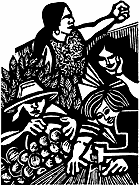 With the book out of print, it was decided to continue making her work available through this web-site. Rini’s sister, Lynne Brickley, made that possible with generous support.
You will find 600 drawings here, organized by theme, with brief texts in English explaining the story behind each set of drawings. There is also a short biography about Rini. Photos of her sculptures, done before she switched to graphic work, are not included here nor are the many reminiscences of Rini written by friends and co-workers for the book.
In the spirit of Rini Templeton’s life and work, activists serving causes that Rini would have supported are invited to use drawings freely in their leaflets, newsletters, banners and picket signs or for similar non-commercial purposes. Those wishing to use drawings in the production of an item for sale, such as a book, should write to the Rini Templeton Memorial Fund, c/o Elizabeth Martinez, 3545 24th Street, San Francisco, CA 94110. A reasonable fee will be asked, to help maintain this web-site.”
Viva Rini.
SocialDesignZine
SocialDesignZine is an Italian Web log on design and the public interest. The project was started last Spring by the AIAP, the Italian Association for the Design of Visual Communication.
A translation of a statement of purpose by Mario Piazza, AIAP President:
“The need for reflection and listening that is part of the job for those who work in communication design is today of vital importance. And it is for this reason that the AIAP has started this site and program as a new step in its operating policy, which in recent years has attentively investigated the professionalism, and above all, the discipline of this field. These two levels are inseparable if one truly believes in the maturation of this profession.
Our idea is simple: we want to build a series of on-line constellations around the association’s institutional site, which will continue to be the gravitational center of the network. A series of sites which approach pertinent professional topics in a thorough way. Themes which we have already confronted in part, but which can no longer be included our site and the ‘ordinary’ activity of the association. But not only this — these themes need to be looked at in a new light and with all the potential that new technologies offer us.
In our most recent meeting in Riccione we made a first stab at this new approach. Participation in the AIAP Community was very high because it was a sort of meeting place. A place for listening, where ideas flowed and communication was direct and friendly. It was a time for growth for a ‘community’ of designers.
It is along these lines that this new site was born. We have dedicated a fundamental part to the future and to something we have worked on a lot in these past years: the theme of the ethical horizon of the profession. Above all this working site, open to your contributions, will try to understand what the social dimension of communication design is. And so we start by asking a few questions:
Is social design a sustainable project? Is is an ethical project? Is it ecological? Participatory? Political? Or is it something completely different? Our wish is to build together a well thought-out answer. We would like to construct a sort of manifesto, a ‘bill of social design.’
Along these lines we will construct materials, documentation, reflections — a rich and complete database for research, instruction, continuing education. Also for this purpose we are requesting submissions and active participation in order to document projects and experiences which aid in reflection, which communicate the elevated meaning of designing.
But the heart of the project, and the part which we have already put into motion is the construction of testimony and presentations on daily themes, concrete instances, based on news, a life lived, personal research or information to be shared. In other words a place where, with a sense of responsibility and motivated participation on the part of the user, we can dialogue, exchange ideas, listen and grow together, developing a more critical and intense eye which, through these exchanges, will allow us to become responsible designers. Skilled, in quality and intelligence, in confronting professional themes with the knowledge of our own limits and those of the world around us. It is hope in a project, it is our new challenge.”
They’ve just posted an Italian translation of my review of the book Citizen Designer: Perspectives on Design Responsibility.
It’s also intertesting to see more professional associations exploring the issue of ethical practice. I wonder how far it will go.
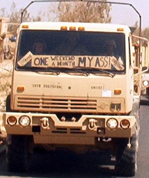
One Weekend a Month My Ass!
A U.S. reservist in Iraq emails a photo to a friend back home. Friend posts it on his blog. The image is widely circulated by email, and ultimately finds mention in The New York Times a month later.
The war drags on. Tours of duty are extended. U.S. soldiers continue to kill and be killed. Dissent among the military and military families smoulders.
And the scholarship funding? Job skills? Veteran’s benefits? One weekend a month?
See these articles about the myths and messages in military graphics and advertising sold by recruiters to high school and college students across the United States of America.


