

Found 4305 matches from 1,400 records in about 0.1613 seconds for phone or e or geodeta.
On the pace of change from an interview with investigative journalist Inga Springe:
"It might take maybe five years for something to happen, like I've been reporting about corrupt custom service guy for five year, and nothing changed. He was only promoted, because governing politicians were supporting him. But then, political situation changed, and there were all the evidence for the new government actually to use against this corrupt guy. And then, there was criminal investigation, and he was convicted. Sometimes it takes a lot of time, but still these 'aha!' moments, this is the one which really drives me. And when you publish, and you can see some impact. It always depends how much time it will take. But that's the next thing, which also is very, like, satisfying."
So much work is planting seeds. It can take years, even decades for radical ideas to one day seem inevitable, for lost causes to become common sense, impossible cases become moot.
Being a historical account of women in printing, publishing, and typographical compositing in these United States of America and Western Europe.
The text below is assembled from Unseen Hands, Women Printers, Binders & Book Designers (Princeton University Library, 2003), Women in Printing & Publishing in California, 1850-1940 (California Historical Society, 1998), and Epochal History of the International Typographical Union (I.T.U., 1925.) Other sources are indicated where used.
“Women have been involved in printing and the making of books ever since these crafts were first developed. Even before the advent of movable type, there was a strong tradition of women producing manuscripts in western European religious houses. In the Convent of San Jacopo di Ripoli in Florence, we find the first documented evidence, in 1476, of women working as printers. Girls and women were often trained by their fathers or husbands to assist in printing businesses, and there are many instances from the fifteenth to the eighteenth centuries of women taking over and managing these enterprises upon the early demise of their male relatives.... Many, certainly, only managed the business, while others were more directly involved. Estellina, wife of the printer Abraham Conant, proudly stated in a Hebrew book, Behinat `olam (Mantua, ca. 1477) that ‘she, together with one man, did the typesetting.’ [source]
In the 19th century, a limited number of occupations were open to women — teaching, needlework, domestic service, etc. Male-only unions ruled the printing business. Women, where employed at all, were relegated to certain low-paying jobs considered best suited for the weaker sex, such as dressing (polishing imperfections) from metal type, folding printed sheets, and sewing bindings. Yet there were exceptions — a few women were also employed in typesetting. Women who were widows or daughters of printers often learned typesetting out of necessity.
James Franklin, brother of Benjamin Franklin, taught something of the art to his two daughters prior to his death in 1835, and when he died he left his printing plan at Newport, R.I. to his widow and family. They operated it successfully for many years.
A woman’s typographical union was formed in France with a journal entitled La Compositrice, and the first major woman’s journal edited by a woman, Godey’s Lady’s Book, was published in Philadelphia from 1830-1858, edited by Sarah Josepha Buell Hale. [source]
...
Women were employed in the Day Book office in New York in 1853, while a strike was in progress against that office. This inspired a determined campaign against women printers. Union leaders inveighed against employment of women and urged the National Typographical Union to do something about it. The National wisely disclaimed any desire to interfere in treatment of the issue by local unions. Horace Greely, celebrated editor of the New York Tribune and a former president of Typographical Union No. 6 of New York, took up his redoubtable pen....
‘Your fears that women will supplant you, or seriously reduce your wages, Messrs. Compositors, are neither wise nor manly. The girls who marry and have families to look after will stop setting type — never doubt that — unless they are so luckless as to get drunken, loafing, good-for-nothing husbands, who will do nothing to keep the pot boiling, and then they must work, and you ought not to be mean enough to stop them, or drive them back to making shirts or binding shoes at three or four shillings a day.
If you find yourselves troubled with too strong a competition from female workers just prove yourselves worthy to be their husbands; marry them, provide good homes and earn the means of living comfortably, and we’ll warrant them never to annoy you thereafter by insisting on spending their days at the printing office setting type. But waxing theologic and pious, you tell us of the sphere of action God designed women to occupy —of her ‘purity’ and of the ‘immorality and vice’ she must inevitably sink into, should she be admitted into the composing room to set type beside you. We feel the force of these suggestions — we admit the badness of the company into which unregulated typesetting would sometimes thro her — but did it ever occur to you that this is her lookout rather than yours? It is perfectly fair of you to apprise her beforehand of the moral atmosphere to which promiscuous typesetting would expose her, but when you virtually say she shan’t set type because if she did your society and conversation would corrupt her you carry the joke a little too far.’
By 1864, due in large part to the depletion of the male work force during the Civil War, additional workers were needed in trades which were previously thought of as ‘male’ trades — one of these being typesetting. The number of newspapers and the demand for printed materials was on the increase, and women began to step into jobs in both the printing and publishing fields.
The National Typographical Union permitted women to form unions and to join existing unions in 1869, the same year it was renamed the International Typographical Union. Augusta Lewis Troup, journalist and typesetter for Susan B. Anthony’s newspaper The Revolution, was elected corresponding secretary of the International Typographical Union in 1870. She became the first woman to hold any national union office. [source]
...
 After hearing of the role of women in the 15th century printing industry, Emily Faithful decided to set up her own firm in Edinburgh in 1857 employing women only. In 1859 she founded the Victoria Press in London and employed men to do the heavy work. This met with a lot of hostility with the print unions which said that it encouraged immorality. In 1862 she earned the title of Printer and Publisher in Ordinary to the Queen, moved to an office in Farringdon Street and then to Praed Street, Paddington, where she remained until 1881. She was also a writer and poet and was involved in some of the publications produced by her firm such as the feminist English Woman’s Journal and the Victoria Magazine. [source] While her journal was established as a general literary magazine it provided a strong feminist emphasis on suffrage, married women’s property, education, employment and all of the other feminist/women’s concerns of the day. [source]
During the late 19th century, women writers often moved into positions as editors of newspapers or small journals. At this same time, the Woman’s Suffrage Movement was gaining momentum and the women-edited journals were the obvious choices in which to further their cause. Spiritualism was also a popular movement at the turn of the century among women — largely because it did not discriminate by gender or ethnic background — and the women publishers felt a kinship because of this non-discriminatory nature. Journals such as The Carrier Dove, The Spiritualist, and The Golden Dawn were all journals edited by women and devoted to not only Spiritualism but in some cases, also to the Suffrage Movement.
Other women publishers and editors followed a more literary angle, publishing journals which featured articles on a wider variety of topics. In 1863, Lisle Lester took charge of the Pacific Monthly, a woman’s literary magazine previously known as the Hesperian. It had a rocky career as was the career of Ms. Lester — who was widely known for her strong opinions on many topics and her tussles with the male typographical unions. Another woman, Emily Pitts Stevens, gained prominence when she transformed the Sunday Evening Mercury — which was known as ‘a Journal of Romance and Literature’ — into the premier voice for woman’s suffrage in the West. She hired women to set type for her newspaper and in 1869 changed its name to The Pioneer — as ‘a name that more nearly covers our thought and tells the nature of our object and ambition.’ She became a major force in the founding of the California Woman Suffrage Association on January 28, 1870.
...
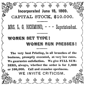
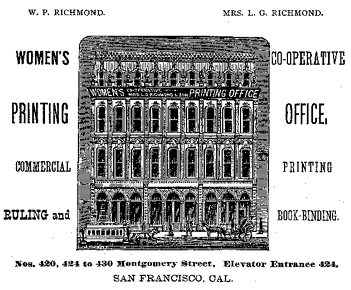 In San Francisco, which was becoming a center for printing and publishing in the West, women-run printing offices appeared in the 1870s and 1880s. The Women’s Union Job Printing Co., the Woman’s Publishing Company, Amanda B. Slocum and Jennie Patrick were a few either woman-run and/or -staffed printing offices of this period. The most prominent and prolific was The Women’s Co-Operative Printing Union, established in 1868 on Clay Street by Mrs. Agnes Peterson, followed in 1873 by Mrs. Lizzie G. Richmond. Early 1870 billheads produced by the WCPU proudly proclaimed, ‘Women set type! Women run presses!’ So confident was Lizzie Richmond that her billheads and advertisements often stated, ’We invite criticism.’ These printing offices produced a variety of printed materials for the public — books, commercial catalogs, corporate annual reports, legal briefs, [as well as] invitations, broadside advertisements, and handbills.
The many journals, newspapers, books, and even billheads that were printed during the late 19th and early 20th centuries used mainly one method of illustration — that of the wood engraving.... Leila S. Curtis and Eleanor P. Gibbons were two women who started up and ran successful engraving businesses in San Francisco. Both were trained in engraving and design. Their designs were found on billheads, business cards, and stationery, as well as in book illustrations, commercial catalogs, and innumerable other small printed items. Magazines published during this period often used the technique of the woodcut — rather than a wood engraving — to illustrate their pages. The technique used in producing a woodcut allowed for larger more fluid compositions. Lucia Mathews cut the designs for Philopolis (1906-1919) — a magazine published by Arthur, her husband, and herself during the early part of the 20th century. Florence Lundborg, an artist influenced by both Art Nouveau and the Arts and Crafts movement of the early part of this century, produced woodcut images for The Lark, the San Francisco literary magazine published by Bruce Porter and Gelett Burgess from 1895-1897. [source]
...
The turn of the century saw an increased interest in the aesthetic aspects of printing — now that women were an accepted part of the work force — and many fine presses sprang up throughout the state [of California]. A fine or ‘private press’ is generally understood to be a small printing house which issues for public sale limited editions of books which have been carefully made on the premises.
By the 1920s a tradition of fine printing was well under way in San Francisco, with Taylor and Taylor, John Henry Nash and the Grabhorns already fairly well established. These printing houses encouraged printing by women.... Other women with their own presses were Rosalind Keep of the Eucalyptus Press, Helen Gentry, and Jane Grabhorn at Colt Press, which was founded along with William Matson Roth and Jane Swinerton. In southern California, private presses were often a husband and wife team. The Saunders Studio Press of Claremont was founded in 1927 by Lynne and Ruth Thompson Saunders. The Plantin Press in Los Angeles was established in 1931 by Saul and Lillian Marks, Saul being in charge of design and layout and Lillian responsible for composition. Women such as Virginia Woolf and Elizabeth Yeats also founded private presses that produced handsome limited editions of the work of contemporary authors and artists. [source]
Women were notably successful at bookbinding, both ‘on the line’ — producing factory bindings — and in the creation of splendid examples of hand binding, particularly during the Arts and Crafts Revival of the late nineteenth and early twentieth centuries.
With the dawn of the 20th century and the emergence of women’s rights, women in printing and publishing entered more seamlessly into the work force. Finally, with the advent of fine press printing, the women printers in the 1920s and 1930s emerge as figures who achieved their goals to work at a skilled occupation that offered them not only an honest living but also a chance to use their creative instincts and skills.”
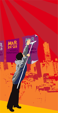
From March 26-28, I attended the Designs on Democracy conference on the UC Berekely Campus. I’ve been meaning to write up my impressions but have found it difficult to put words to those three incredible, densely-packed days of presentations, meetings, networking, and solidarity. Where to begin?
From the Bay Area Indymedia center:
“Designs on Democracy was a three day conference on design, advertising, public relations and marketing for social change.... The conference was organized by a crew of eight activists. Forty volunteers did the work that made it happen for the 350 who attended. Designs on Democracy, said Favianna Rodriguez, one of the organizers: ‘is not just for designers, it’s for people who are in the business of doing marketing and selling the image of the Left, to take it to a broader audience and make it more appealing.’”
 They’ve already posted two pages of notes and several audio files of the conference sessions in Ogg Vorbis format. More audio, video, and documentation is on the way.
The organizers from Tumi’s Design, the Ruckus Society, the Design Action collective, and Change the Game did an amazing job, clocking in months of preparation. The speakers, attendees, and volunteer tech crew were also incredibly flexible and generous.
The sumptuous, donated food also merits special mention, particularly from the Sankofa Kitchen Project, a black, vegan cooking collective in Oakland. The project is part of the East Side Arts Alliance and works with youth to build community gardens, teaches them how to grow and cook their own food, and promotes traditional cuisine, community spirit, and good nutrition — in part a response to the cheap, corporate, fast food crap showered on poor, urban neighborhoods.
Participants arrived from a range of organizations and backgrounds. Some were designers, organizers, techies, printers, media workers. Some from unions, others working on prisons, environmental justice, or genetically modified foods. Some worked in advertising, others on access, training, media justice, or getting out the vote. Some were just designers looking for a way to do more.
Some were veterans, active since the 1960’s, others just fresh out of school. Some owned their own businesses, some worked in collectives or in non-profits, and still others were freelance.
And, where other events of its kind might have fractured into quarrelling ideological factions, here there was common cause: Bush must go.
Many of the conference sessions focused on messaging, narrative, and framing to communicate effectively, move “the middle,” and build a stronger movement for social justice. The list of sessions and speakers makes for interesting reading.
I gravitated towards the more practical sessions, on fund raising and organizational structures. I won’t go into detail about individual sessions — will post more of my notes here soon — but here are a few other impressions and tidbits:
- Several speakers addressed the importance of focus groups and research, and within that the notion of using different messages for different cultural groups. An easy way to recruit for focus groups is to advertise on craigslist. (Offering pizza helps.)
- Favianna and the staff of Tumi’s see themselves within a tradition of radical graphic work in the Americas and on the West Coast: Siquieros, Rivera and the muralists of the Mexican revolution, artists and writers in Chile who created culture of resistance, the independent publishing of the Black Panther Party, the Chicano movement of the 70’s and their work with the United Farmworkers. Like the Young Lords, the Native American Movement, and the BPP, Tumi’s program is to serve the people. “Without the movement, without the grass roots, graphics work is not revolutionary.”
- Only one member of Congress has a child serving in the war.
- In the U.S., you can buy voter registration lists. It’s not cheap, but it is public information. You can cross reference the data with your membership list or demographic information to more effectively market to voters.
- If you’re an unaffiliated designer with a project idea and you want to raise funds, consider finding a non-profit organization willing to act as a fiscal sponsor. You can arrange for tax-deductible donations or foundation support through them, in exchange for a small percentage of the proceeds.
One topic of discussion that was missing from the conference was information design and mapping. This is not just marketing, but using design for analysis and making data accessible. See, for instance, the 2000 Palm Beach County ballot design.
In addition to meeting many new people, I had the chance to meet several people I’d previously known only online including Jason Justice, founder of the Graphic Alliance, an electronic network of progressive designers, and Alex Steffen of the community Web log worldchanging.com. It was also great to reconnect with a couple of folks I’d met at the Ruckus Tech Tools Action Camp in 2002.
Overall, the air crackled with excitement and energy. It was nice to recharge, to find out everyone was doing, and to find among them a progressive community of designers. Many, including myself, didn’t want this to end with the conference itself.
So what’s next? Another one in a couple of years? Perhaps local or regional conferences? An international federation of progressive designers? For now, a database of resources is in the works and will eventually be posted on the site. Watch this space for more.
Good-looking printed documents can complement protests, lobbying, and media work.
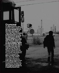
This Saturday, Anne Rolfes and Iris Carter Brown from the Louisiana Bucket Brigade spoke about their campaign against Shell to stop polluting their neighborhood.
They talked about a few of the ways reports and Web sites made a difference to people campaigning on the ground.
 Sophisticated graphics convey the impression of an organized, sophisticated movement. One that can overcome its opponents.
- Reports give people pride in their issue, people who have been blown off by governments and powerful corporate opponents. It validates what you think when you see it in print. It makes you ready to take on the man.
- Reports document oral history that may not continue to be passed down. The elders of the community grew up with and around a big old oak tree. Now it’s fenced off, a part of Shell’s industrial property.
- Reports create oral history. Ruth Jones’s son was killed by gas explosion in early 1970s. After the funeral, Shell gave her a check for $500. Ruth agreed to let this be published. The story affirmed the sense of injustice in the community, and the anniversary of his death became an occasion marked by the community annually .
- Reports put the peoples’ side of the story into the mainstream media. Printed reports reach journalists who do not go into the field. The reports tell the details that might not otherwise be told. The documents are also posted on the Web and citations enter electronic press archives. The LABB report began to be cited journals and studies from afar.
- Reports help catalyze the campaign, framing the issues strategically at each phase of the campaign.
- Reports educate different audiences, including elected officials. It makes people in power take the issues seriously. It also encourages people involved in other campaigns, including overseas via the Web site.
- Reports creates room for artistry. Powerful photos and visuals tell the story, and move the emotions.
- Reports create a forum for people in the community. People being poisoned can tell their own stories, put their words into print.
See some of the Louisiana Bucket Brigade’s reports here. They were designed by the Design Action collective and printed by Ink Works Press.
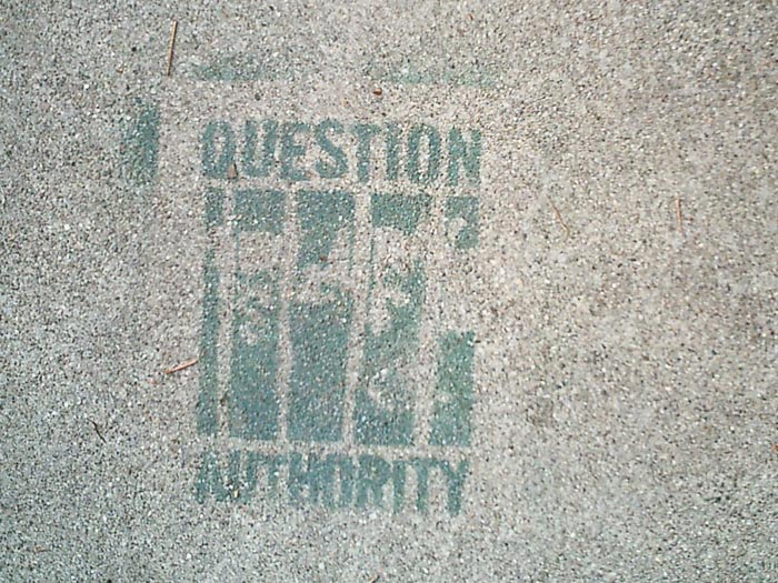
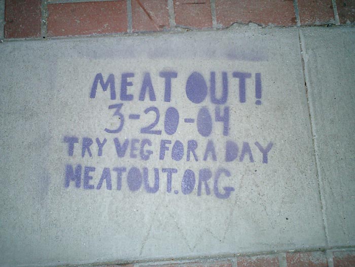
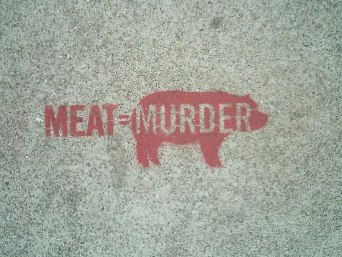
Some political stencil graffiti I spotted this weekend on the sidewalks of San Francisco and Oakland. Click an image below for a larger version.
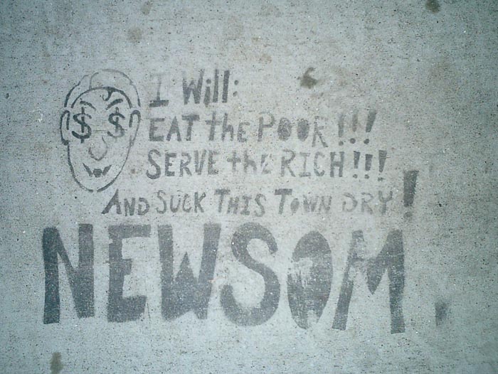
That’s Mayor Gavin Newsom to you.

Most buildings built before June 1979 are rent controlled. However, housing prices are so high that some landlords are willing to destroy their buildings to build new ones that can rent at the city’s incredible market price.

“PROTECT THE BAY / DON’T DUMP”
There’s lots more at http://www.stencilarchive.org/.
 After ribbing David about open sourcing his content management system, I decided to put up myself. So here’s my first Free Software project: pagify is a perl script that takes the output of Microsoft Word’s “Save as Web Page...” and
- cleans out the cruft and proprietary XML gunk,
- splits the file into HTML pages wherever a Heading 1 style appears, and
- converts endnotes into footnotes on the appropriate pages.
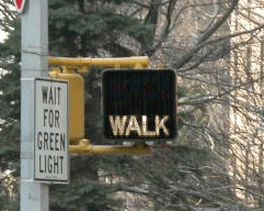
Everyone knows that New Yorkers pay attention to crosswalk signals... right?
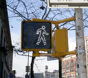
So if you live in New York City, you may or may not have noticed that all the old crosswalk signals are gone. Instead of the spelling out WALK and DON’T WALK in type, the new signals use pictograms of a big red hand and walking person in a dotted outline of bright LED’s.
The new signal displays fit into the old, existing signal housing. And, by switching from incandescent bulbs to light-emitting diodes, the City notes, the new signals will both last longer and use less energy.
This piece in the New Yorker provides some hard numbers:
“The city is changing all eighty-five-thousand signs, at a cost of $28.2 million. The job started in 2000, in Queens; by February [2004] the [job] should be complete....
The idea is that the new ones, which rely on dozens of light-emitting diodes, or LEDs, will last six times longer than the old ones, which relied on two bulbs, and will save two million dollars a year in maintenance and electricity costs....
The brighter signs should be more visible to persons with partial sight. But, the author notes, the signals do have detractors:
“Among them many children, who sense that there is something patronizing about the hieroglyphs....
‘First of all, they’re really bright,’ Jacob said. ‘They hurt my eyes, even from, like, a block away. They make my eyes water. And, also, the first thing my sister could read was Walk/Don’t Walk.’ The three of them came to a corner: across the street, an upraised hand. They took a look, then crossed anyway. ‘The old one is just more original,’ Jacob went on. ‘Almost every other place has the Man and the Hand. Whenever I go anywhere else, it’s the Man and the Hand. Italy, France—they always have that. It’s un-unique. So I don’t really like it. Actually, most of my friends don’t like it.’”
The NYC page also claims that switching to “internationally recognized symbols” will make the signs “easily recognized by non-English speaking pedestrians.” I applaud the recognition and accomodation of non-English speakers in such a massive, city-wide initiative, but while the symbols may be “internationally recognized” in Western Europe, an open palm has different meanings in different cultures. For instance:
- In Japan an open palm in front of one’s face means “I don’t know,” “I don’t understand,” or “I am undeserving,” [source]
- In Greece, “extending the arm and hand (palm open) as if pushing something away from you is an age-old form of insult. In wars, Greeks would humiliate their prisoners by rubbing mud or fecal matter into their faces.” [source]
- And in Nigeria, pushing the palm of the hand forward with fingers spread is a vulgar gesture. [source]
 With closs-cropped hair and boot-cut pants, the figure in white resembles other symbols used around here to indicate “male.”
The NYC page doesn’t mention it, but new crosswalk symbols are nationally mandated in the Manual of Uniform Control Devices published by the U.S. Department of Transportation. The Manual sets forth detailed design standards for traffic signage around the United States.
Recently, in San Francisco I discovered another variation I’d never seen before. In addition to the white man and red hand, the signals there feature a red countdown indicating the number of seconds remaining to cross the street. It turns out the countdown option was added to the Manual in 2000, and is slowly gaining popularity across the country. I was struck by the simple brilliance of it. The additional information is much more useful than the simple flashing hand or DON’T WALK. The latter always seemed to start flashing when one was halfway across the road. This calls to mind the scene from Rain Main when the austistic character stops walking in the middle of the road.
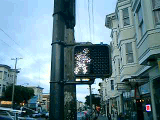
But that, apparently, is exactly when it is supposed to start flashing. The period of the countdown, flashing hand, and flashing DON’T WALK is known as the “pedestrian clearance interval”, the time for pedestrians to finish crossing, not to start crossing.
Local studies around the U.S. are finding that the countdown signals come at a price. While the countdown reduces the number of pedestrians who start running when the flashing DON’T WALK signal appears, the countdown seems to be interpreted to mean that it is OK to cross the street if there are enough seconds on the clock. Pedestrians are more likely to start crossing the street during the countdown than during the flashing DON’T WALK. This is contrary to the intent of the designers, and of the law.
Significant data has not yet been gathered on the countdown signal’s effect on the overall number of pedestrian fatalities.
A low-cost, powerful tool for environmental monitoring by communities poisoned by industrial facilities built near their homes.
“The EPA-approved ‘bucket’ is a simple, community friendly tool that fenceline neighbors use to take air samples. Taking air samples is a powerful experience for community members who are used to being ignored, overlooked, and disrespected by corporations and government. Dorothy Jenkins, President of Concerned Citizens of New Sarpy, used to call the refinery to complain about the odors. A low ranking operator would tell her not to worry, that the black plume of smoke that billowed for hours near her home was not harmful. Now Mrs. Jenkins has a bucket. When refinery managers and government regulators tell her that there is nothing to worry about, she answers, ‘Why, then, was there a benzene reading of 14 in my air sample, a reading that violates the state standards?’ The bucket gives community members power to hold institutions accountable to provide a safe and healthy environment.”

From the History of the Louisiana Bucket Brigade:
“The bucket brigades were started in 1995 by attorney Edward Masry (of Erin Brockovich fame) when both were made ill by fumes from a petroleum refinery he was suing on behalf of citizens of Contra Costa County, California. When he called the local, state and federal environmental authorities, they told him that their monitors detected no problem. This so angered Masry, whose clients were being exposed to these toxic releases daily, that he hired an environmental engineer to design a low cost device, the ‘bucket’, which the community could use to monitor their exposure for themselves. This set in motion a movement which would give communities living near refineries, chemical plants or other toxic air emitting sources, a chance to take on indifferent regulators and corporations who were telling them that there is no problem with the air they are breathing while they are choking and dying.
The ‘bucket’ is a low cost $75 version of the $2000 Suma canister used by government and industry and is simple to use. Suspect air is drawn into a Tedlar bag inside the bucket. The bag is then sealed and sent to a laboratory for analysis. The lab analysis is the most expensive part of the operation. For about $500 per sample, the contents of the bag are run through a GCMS (Gas Chromatograph Mass Spectrometer), which compares the ‘fingerprints’ of the sample with the fingerprints of about 100 toxic gases in the computer library. The bag is non-reusable and cost about $15. In practice, much of this cost has been borne by charitable and government grants.
Working closely with Masry, Denny Larson proceeded to promote the use of these buckets in other communities exposed to refinery and other toxic air emissions. Larson hired a student intern to re-engineer the buckets in order to produce a community manual to educate fenceline neighbors that they could build and operate their own air monitoring systems. When completed, the manual helped spread the buckets throughout the refinery belt of Contra Costa County to 7 communities.
The biggest hurdle was getting the authorities, who belittled the idea of citizen bucket brigades, to accept the results. Larson met with EPA Region 9 officials, including the administrator, Felicia Marcus, in 1996 and asked the agency to approve and fund bucket air sampling. To its credit, EPA Region 9 invested in a quality assurance evaluation of the bucket results and ended up accepting them. With the EPA acceptance, Denny was able to work with grass roots groups around the country to launch local bucket brigades.”
Update: Read more about the bucket in this Christian Science Monitor article from April 1, 2004.
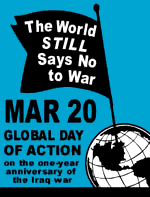 Those little blue stickers are popping on the streets of New York again. This Saturday, on the one-year anniversary of the invasion of Iraq, millions will take to the streets to call for peace. Protests are scheduled in over 50 countries, with over 200 events planned around the United States.
United for Peace and Justice has made variations on their “flag” flyer template available for download with space to add details about your local event or create your own translation, and with rotated globes for events in Africa, Asia, or Europe.
By now there are plenty of downloadable flyers on the Web, but few designed for translation and personalization, while retaining a generally persistent brand. I’ve not seen another organization producing anti-war posters this user-oriented.
Except the Bush-Cheney presidential campaign.
From Wired:
“The Bush-Cheney presidential campaign disabled features of a tool on its website Thursday that pranksters were using to mock the Republican presidential ticket.
The tool originally let users generate a full-size campaign poster in PDF format, customized with a short slogan of their choice. But Bush critics began using the site to place their own snarky political messages above a Bush-Cheney ’04 logo and a disclaimer stating that the poster was paid for by Bush-Cheney ’04, Inc.”
See a handful of sample posters in this nostalgic Fash piece.
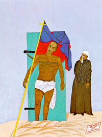 From Noam Chomsky, Year 501: The Tragedy of Haiti, 1993:
“The leader of the revolt [against the U.S. invasion], Charlemagne Péralte, was killed by Marines who sneaked into his camp at night in disguise. In an attempt at psywar that prefigured some of Colonel Edward Lansdale’s later exploits in the Philippines, the Marines circulated photos of his body in the hope of demoralizing the guerrillas. The tactic backfired, however; the photo resembled Christ on the cross, and became a nationalist symbol. Péralte took his place in the nationalist Pantheon alongside of Toussaint.”
The photograph was immortalized in 1948 by Philome Obin in his painting, Crucifixion de Charlemagne Péralte pour la Liberté.
page 1 2 3 4 5 6 7 8 9 10 11 12 13 14 15 16 17 18 19 20 21 22 23 24 25 26 27 28 29 30 31 32 33 34 35 36 37 38 39 40 41 42 43 44 45 46 47 48 49 50 51 52 53 54 55 56 57 58 59 60 61 62 63 64 65 66 67 68 69 70 71 72 73 74 75 76 77 78 79 80 81 82 83 84 85 86 87 88 89 90 91 92 93 94 95 96 97 98 99 100 101 102 103 104 105 106 107 108 109 110 111 112 113 114 115 116 117 118 119 120 121 122 123 124 125 126 127 128 129 130 131 132 133 134 135 136 137 138 139 140 141 142 143 144 145 146 147 148 149 150 151 152 153 154 155 156 157 158 159 160 161 162 163 164 165 166 167 168 169 170 171 172 173 174 175 176 177 178 179 180 181 182 183 184 185 186 187 188 189 190 191 192 193 194 195 196 197 198 199 200 201 202 203 204 205 206 207 208 209 210 211 212 213 214 215 216 217 218 219 220 221 222 223 224 225 226 227 228 229 230 231 232 233 234 235 236 237 238 239 240 241 242 243 244 245 246 247 248 249 250 251 252 253 254 255 256 257 258 259 260 261 262 263 264 265 266 267 268 269 270 271 272 273 274 275 276 277 278 279 280 281 282 283 284 285 286 287 288 289 290 291 292 293 294 295 296 297 298 299 300 301 302 303 304 305 306 307 308 309 310 311 312 313 314 315 316 317 318 319 320 321 322 323 324 325 326 327 328 329 330 331 332 333 334 335 336 337 338 339 340 341 342 343 344 345 346 347 348 349 350 351 352 353 354 355 356 357 358 359 360 361 362 363 364 365 366 367 368 369 370 371 372 373 374 375 376 377 378 379 380 381 382 383 384 385 386 387 388 389 390 391 392 393 394 395 396 397 398 399 400 401 402 403 404 405 406 407 408 409 410 411 412 413 414 415 416 417 418 419 420 421 422 423 424 425 426 427 428 429 430 431
[ Back ]
[ Next ]