Found 5343 matches from 1,400 records in about 0.2038 seconds for text or to or speech or TTS.
A low-cost, powerful tool for environmental monitoring by communities poisoned by industrial facilities built near their homes.
“The EPA-approved ‘bucket’ is a simple, community friendly tool that fenceline neighbors use to take air samples. Taking air samples is a powerful experience for community members who are used to being ignored, overlooked, and disrespected by corporations and government. Dorothy Jenkins, President of Concerned Citizens of New Sarpy, used to call the refinery to complain about the odors. A low ranking operator would tell her not to worry, that the black plume of smoke that billowed for hours near her home was not harmful. Now Mrs. Jenkins has a bucket. When refinery managers and government regulators tell her that there is nothing to worry about, she answers, ‘Why, then, was there a benzene reading of 14 in my air sample, a reading that violates the state standards?’ The bucket gives community members power to hold institutions accountable to provide a safe and healthy environment.”

From the History of the Louisiana Bucket Brigade:
“The bucket brigades were started in 1995 by attorney Edward Masry (of Erin Brockovich fame) when both were made ill by fumes from a petroleum refinery he was suing on behalf of citizens of Contra Costa County, California. When he called the local, state and federal environmental authorities, they told him that their monitors detected no problem. This so angered Masry, whose clients were being exposed to these toxic releases daily, that he hired an environmental engineer to design a low cost device, the ‘bucket’, which the community could use to monitor their exposure for themselves. This set in motion a movement which would give communities living near refineries, chemical plants or other toxic air emitting sources, a chance to take on indifferent regulators and corporations who were telling them that there is no problem with the air they are breathing while they are choking and dying.
The ‘bucket’ is a low cost $75 version of the $2000 Suma canister used by government and industry and is simple to use. Suspect air is drawn into a Tedlar bag inside the bucket. The bag is then sealed and sent to a laboratory for analysis. The lab analysis is the most expensive part of the operation. For about $500 per sample, the contents of the bag are run through a GCMS (Gas Chromatograph Mass Spectrometer), which compares the ‘fingerprints’ of the sample with the fingerprints of about 100 toxic gases in the computer library. The bag is non-reusable and cost about $15. In practice, much of this cost has been borne by charitable and government grants.
Working closely with Masry, Denny Larson proceeded to promote the use of these buckets in other communities exposed to refinery and other toxic air emissions. Larson hired a student intern to re-engineer the buckets in order to produce a community manual to educate fenceline neighbors that they could build and operate their own air monitoring systems. When completed, the manual helped spread the buckets throughout the refinery belt of Contra Costa County to 7 communities.
The biggest hurdle was getting the authorities, who belittled the idea of citizen bucket brigades, to accept the results. Larson met with EPA Region 9 officials, including the administrator, Felicia Marcus, in 1996 and asked the agency to approve and fund bucket air sampling. To its credit, EPA Region 9 invested in a quality assurance evaluation of the bucket results and ended up accepting them. With the EPA acceptance, Denny was able to work with grass roots groups around the country to launch local bucket brigades.”
Update: Read more about the bucket in this Christian Science Monitor article from April 1, 2004.
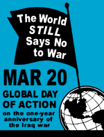 Those little blue stickers are popping on the streets of New York again. This Saturday, on the one-year anniversary of the invasion of Iraq, millions will take to the streets to call for peace. Protests are scheduled in over 50 countries, with over 200 events planned around the United States.
United for Peace and Justice has made variations on their “flag” flyer template available for download with space to add details about your local event or create your own translation, and with rotated globes for events in Africa, Asia, or Europe.
By now there are plenty of downloadable flyers on the Web, but few designed for translation and personalization, while retaining a generally persistent brand. I’ve not seen another organization producing anti-war posters this user-oriented.
Except the Bush-Cheney presidential campaign.
From Wired:
“The Bush-Cheney presidential campaign disabled features of a tool on its website Thursday that pranksters were using to mock the Republican presidential ticket.
The tool originally let users generate a full-size campaign poster in PDF format, customized with a short slogan of their choice. But Bush critics began using the site to place their own snarky political messages above a Bush-Cheney ’04 logo and a disclaimer stating that the poster was paid for by Bush-Cheney ’04, Inc.”
See a handful of sample posters in this nostalgic Fash piece.
 From Noam Chomsky, Year 501: The Tragedy of Haiti, 1993:
“The leader of the revolt [against the U.S. invasion], Charlemagne Péralte, was killed by Marines who sneaked into his camp at night in disguise. In an attempt at psywar that prefigured some of Colonel Edward Lansdale’s later exploits in the Philippines, the Marines circulated photos of his body in the hope of demoralizing the guerrillas. The tactic backfired, however; the photo resembled Christ on the cross, and became a nationalist symbol. Péralte took his place in the nationalist Pantheon alongside of Toussaint.”
The photograph was immortalized in 1948 by Philome Obin in his painting, Crucifixion de Charlemagne Péralte pour la Liberté.
Steven Romalewski sends this growing list of nonprofit online mapping Web sites in New York City:
“We’ve noticed a kind of a critical mass of these mapping and data services recently.
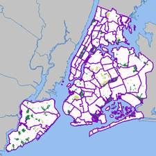 Most of these have been created by my project, NYPIRG’s Community Mapping Assistance Project (a team of six people, part of a nonprofit organization, that uses GIS to help other nonprofits achieve their missions). They’re all part and parcel of an effort to ‘democratize’ data and provide powerful new tools with a community-based focus. Each site uses GIS technologies that few other nonprofits have tapped into, but that government agencies and the private sector have used to great effect. The websites use government data in in new and innovative ways, often to provide services that most government agencies would never provide. And they give local neighborhoods and individuals a window on their world that would’ve been daunting, at best, and maybe impossible for the average citizen or block association to obtain. The sites have helped level the ‘playing field’ in New York to a great extent, so public agencies and large companies don’t have a monopoly on information.
Here are the links:
- http://www.MyCITI.org — the Community Information Technology Initiative (CITI) website that puts mapping tools in the hands of New York City’s local planning boards, in a way that they can avoid the need to spend limited resources and duplication if all 59 boards had to buy the software and invest in the data creation themselves;
- http://www.oasisnyc.net — a wealth of information about parks, wetlands, gardens, and other open spaces across New York, reaching across all levels of government and developed for all different aspects of the city’s ‘greening community’. This site was spearheaded and funded by the US Forest Service, and involves a steering committee of more than 40 nonprofits, government agencies, academics, and businesses;
- http://www.nonprofitmaps.org/netmaps/bedc/bedc.htm — the Brooklyn Economic Development Corp’s. ‘Destination Brooklyn’ service that offers detailed real estate and demographic information for every property and neighborhood in Brooklyn, geared toward small business owners and community development organizations;
- http://www.straphangers.org/cmap.php — the Straphangers Campaign’s ‘Get Where You’re Going’ site, providing precise location information about the subway stops closest to any street address in NYC (which the MTA’s maps can’t do, since they’re geographically distorted to fit on a printed page);
- http://www.MyGovernmentNYC.org — allows anyone with a New York City address to easily find and contact the public officials who represent them at all levels of government, and is used by thousands of people each month, regularly praising it for its simplicity and comprehensiveness;
- http://www.nonprofitmaps.org/netmaps/lac/lac.htm — how to locate family literacy programs based on a survey by the Literacy Assistance Center, mapped by category, borough, or ZIP Code. The site also shows nearby subway stops and public libraries;
- http://www.nonprofitmaps.org/nycnonprofits — the NYC Nonprofits Project Service Atlas. It extends a 3-year study of the nonprofit sector that was released in June 2002, by enabling you to locate any of more than 6,000 nonprofit groups in the city by ZIP Code, neighborhood, Community Board, or City Council district. Groups are listed in 17 major categories and lots of sub-categories. CMAP created the Atlas for the Nonprofits Project; and
- http://www.LowerManhattanMap.com — helping with the recovery and rebuilding efforts of lower Manhattan small businesses, tourist destinations, and cultural organizations. The site includes information maintained by 3 business improvement districts on almost 2,000 local businesses, retail stores, restaurants, community services, cultural sites, and tourist attractions.”
From Democracy Now!:
“The U.S. Treasury Department’s Office of Foreign Assets Control recently declared that American publishers cannot edit works authored in nations under trade embargoes which include Iran, Iraq, Sudan, Libya and Cuba.
Although publishing the articles is legal, editing is a ‘service’ and the treasury department says it is illegal to perform services for embargoed nations. It can be punishable by fines of up to a half-million dollars or jail terms as long as 10 years.
Robert Bovenschulte, president of the publications division of the American Chemical Society, which decided this week decided to challenge the government and risk criminal prosecution by editing articles submitted from the five embargoed nations.”
From the Treasury Department itself:
“As you know, the importation from any country and the exportation to any country of information and informational materials, whether commercial or otherwise, regardless of format or medium of transmission, are exempt from the Iranian Transactions Regulations, 31 C.F.R. Part 560 (the ITR). ITR, § 560.210(c)....
Nevertheless, certain activities described in your letter would fall outside of the information and informational materials exemption. The collaboration on and editing of manuscripts submitted by persons in Iran, including activities such as the reordering of paragraphs or sentences, correction of syntax, grammar, and replacement of inappropriate words by U.S. persons, prior to publication, may result in a substantively altered or enhanced product, and is therefore prohibited under ITR § 560.204 unless specifically licensed.”
Boy is this ever crying out for civil disobedience from all of us bloggers. I’m not sure if republishing or translating information off the Web is covered by this (since it’s accessible anyway), but posting translations of otherwise published or unpublished material probably would be.
Let the Office of Foreign Assets Control know about it at ofac_feedback@do.treas.gov. To complain to the Department of Justice about the issue email AskDOJ@usdoj.gov.
Via the Project Censored and Juan Cole
 As far as centrally-coordinated online campaigns go, one technique I’ve particularly admired about MoveOn’s organizing is the way the coordinators gather feedback and circulate it back to the participants of a given action. Participants around the world can read about of what others are doing, and get a sense of the impact and scale of the action. Too many organizations simply fail to ask who is taking offline action. And many send out endless streams of urgent action alerts with little, if any, follow-up.
Usually MoveOn’s updates arrive as the text of an email, but this Flash driven map does the job visually and interactively. The map effectively presents both the macro and micro views of the many house parties organized across the U.S. on December 7, 2003 to view the documentary Uncovered: The Whole Truth about the Iraq War.
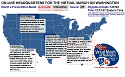 Despite the initial written instructions, the interface could be made a little more intuitive by giving shapes of the states some kind of rollover behavior.
Still, I find it more informative than MoveOn’s previous action map. This map of the February 26, 2003 phone-in rotates the display of only one tesimony per state. Instead of plotting data the map paints a more atmospheric picture of the plurality of voices and the outrage that rained upon the Capitol that day. The geographic shapes only provide a general spatial context to the ticking clock and growing tally of calls.
Between the two is a world map of candle light vigils organized on March 16, 2003. The map displays testimonies, photos, and the sites of vigils, but the user is unable to draw any actual numbers from it, only impressions. The zoom effect is gorgeous, but the testimonies quickly overwhelm, like hundreds of little pop-up windows you’re unable to move or close.
The maps were all designed and programmed by Stamen Design in San Francisco.
...
See also this Jully 2004 item about Stamen Design’s live, interactive conference call map.
In case you missed it, yesterday Mayor Bloomberg and the Sanitation Commissioner announced that the City will resume recycling glass and return to weekly recycling collections on April 1.
Glass and plastic recycling was suspended in July 2002 as a “cost-cutting measure.” It turned out that mixing recyclable materials with the regular waste stream did not actually save much money. And, when they found out that others were willing to pay for the City’s recyclables, the City resumed the collections. Bi-weekly plastic recycling resumed July 2003.
See this previous blog post from July 2003.
Huzzah!
On February 6th, 2004, Al Leidner, former head of New York City’s Department of Information Technology and Telecommunications GIS Program, spoke to members of GISMO about the future of geographic information systems in New York City.
A version of this program was originally presented to the Municipal Data Processing Council. I’ve combined my own notes below with those taken by James Labate.
The GIS Utility: Key Integration of IT
- GIS marries information technology with the science of geography.
- The value of information has become the center point of the industry: the quality, amount, and how integrated it is.
- The technology is there, but the data is lacking. The more combinable data is, the more valuable it becomes. To that effect, the “stove piping” of information is a massive problem.
- From Data to Wisdom: Increasing the value of data should be the goal of the GIS Community.
- The “Where Field” - Geography as an ancient science vs. IT as a new industry. GIS people need to bring geography to IT people.
- We’re still in the early stages of understanding the integration of data. But all data is spatially enabled and therefore can be combined. For example, an automated mapping application can plot a database of 500,000 tree locations off of building and other feature locations.
- Five basic fields on NYCmap, the City government-maintained basemap, are: postal address, latitude and longitude, street segment, parcel, and building. These are all related and identified with a unique ID.
How Do We Create Value?
- With a “critical mass” of data support to NYCmap.
- The Department of Health used a “critical mass” of West Nile identifiers (e.g. infected birds) to created a predictive model of West Nile Disease. (A series of maps were shown depicting the spread of the virus.) Using the maps, they could quickly spray selected areas. Human cases are preempted. Predict death and stop it. GIS can save lives.
- In 9/11, the NYC Office of Emergency Management lost its office and data when the towers collapsed. Responders to the disaster needed combinations of data. GISMO volunteers and others provided data to responders from an ad-hoc office at Pier 92. Speed and ability to deal with complex interactions were key features.
- City’s 311 non-emergency hotline uses a GIS engine which geocodes all data that is taken in. With this, can look for patterns and trends in neighborhoods. (Do trash dumping complaints predict a rise in crime?) The City recently mapped cell phone outages using survey info from 311 and the DoITT Web site.
- My Neighborhood Statistics at nyc.gov, and CMAP’s myCiti expand the knowledge of GIS among non-GIS professionals.
- 40 City, 35 State Agencies create knowledge from GIS data. (See notes on Al’s GIS Coordination Program).
New Developments
- Massive sewer and water system mapping project underway.
- Dept. of City Planning releases geosupport desktop application.
- COGIS - developing better property tax lot outlines.
- Homeland security driving Federal, Local GIS integration.
- FDNY, EMS, NYPD integrating exchange of data for emergency response, sharing with State, FBI.
- Modeling building and subway systems for emergency response. 468 stations in MTA. PATH and Amtrak next.
- Aerial photos, from Pictometry, show all sides of every building in NYC. Free to City agencies.
Opposing the Future - Roadblocks to Progress
- Underfunded IT and GIS.
- Little understanding of the transformative process of IT.
- Contempt for Planning - Outmoded stereotyping.
Cultural Evolution
- What are the combinations of data across service and agency barriers that produce results?
- What are the analytic and predictive tools that can do it?
- Combine all capital projects - see where there are synergies, opportunities to overcome problems.
Benefits
- Revenue: better use of geography will create a higher level of billing accuracy, increasing City revenues.
Public Safety
- Develop an integrated 911. Fire Dept. and Police should be working off the best geocoding system possible to improve response time, plot fastest routes to sites.
- CompSTAT - Police Dept. Application - GIS saving lives. Info and analysis brought together with new way of organizing. (See this BBC article on mapping crime.)
- Hazardous materials and combustibles: combination of previously uncombined data to give firefighters more information before entering a building.
Predictions
- Every City agency will have GIS. Wireless connections to data applications from sites.
- 500% staffing increase in City GIS Personnel.
- Federal Govt. will need and seek out state and local data as it is more accurate and of a higher quality.
- Spatially enabled information will be the foundation of a 35% increase in productivity and 2% increase in revenues.
- All City strategic data will be available and the increase of shared valuable information will increase social cohesion and collaboration.
- Construction time will be reduced 10% and construction costs reduced 5%.
- Predictive models will reduce violent crime by another 50%.
Al noted that more and more City data is available online, though many in audience noted felt that the City does not share enough of its data. NYCMap is not available to the public for “security reasons,” but is licensed to a couple of Universities and corporations under strict terms.
See also “City Governments Map Trends” from Wired, February 1, 2004, and this 2002 interview with Al about GIS and the emergency response on September 11, 2001.
With reference to this discussion, I’ve posted this condensed translation of the lecture notes presented by graphic designer Neville Brody and historian Stuart Ewen at the AIGA conference in San Antonio, September 1989. It appeared in the January/February 1990 issue of Print.
Design Insurgency
In its enthusiastic youth, design was invested with vision. Awestruck by futurism, swept by currents of modernity, design, it was claimed, could communicate new ideas about society, light the way to new and democratic ways of seeing.
Designers took part in great public debates over the fate of civilization. Design, they believed, could transform reality; it could help to deliver humanity from the social inequities of the past and give rise to a utopian future. Without such commitments — we were warned — design would merely lay a gloss across the face of barbarism.
These hopes have gone unrealized; the gloss is everywhere. Design is shackled by historical amnesia. The sense of social vision that once inspired it is but a dim memory. Obedient to the orders of corporate clients, designers are cogs in the wheels of commerce. They serve as pastry chefs in glorified soup kitchens, doling out mass-produced visual gruel.
 Design has little recollection that it once saw its role as one of creative communication; of exploding false outlooks and turning the world upside down. Instead, design is employed to discourage ideas, to bury thought. Design has become just a profession, an instruments of commercial guile, of calculated deceptions.
Empires were first based on a trade in raw goods; populations were dominated by the sword.
Empires were then built on manufactured goods; populations were disciplined by the clock.
Today’s empire is an Empire of Images; populations are led by their line of sight.
Design and Typography are the ways by which invisible goods are made visible.
In the rush for gold, design groups serve as armies of occupation in the battle for our minds; shock troops for the triumph of the superficial.
The impulse to mask the terms of social experience — or to offer images as a surrogate for experience — is reiterated again and again across the consumer culture.
Consumer society is mentally and culturally programmed to accept image manipulation. The packaging of abbreviated ideas jeopardizes actual thinking... critical thinking... common sense. Human subjectivity is cultivated as a resource for economic exploitation.
Life issues — social, material, environmental, spiritual — disappear from consideration amid a blur of disembodied representations. Within the dazzle of the spectacle, the real problems, needs and hopes of millions are made invisible.
In their lives, in the vernacular regions of popular expressions, people struggle to break through the din... to be seen... to be heard.
The trajectory of design follows the logic of an economy constructed of thin air. The manufacture of goods has given way to the manufacture of information. A “symbolic economy” — inflated by finance, credit and a global trade in abstract value — diminishes the notion of production for use. As one more negotiable currency, design decorates the acceleration toward catastrophe, transforming it into a persuasive conception of beauty before our eyes.
Design is propelled by the priorities of commercial gain. Wherever one turns, the capture of the eye is the preferred strategy of merchandising. All information is distorted by the means by which it is made appealing. “Good design” is defined as that which sells. Packaging overwhelms content. Our vistas are cluttered with images, yet — more and more — there is the unsettling realization that nothing is there.
In the uninterrupted flutter of changing appearances that characterizes the consumer culture, almost every form of representation bears a tenuous connection to matter, assuming — with increasing rapidity — the character of expendable currency.
One hundred thirty years ago, Oliver Wendell Holmes prophesied a culture of bodiless images about to take hold. “Every conceivable object of Nature and Art,” he wrote, “will soon scale off its surface for us. Men,” he predicted, “will hunt all curious beautiful grand objects, as they hunt cattle in South America, for their skills, and leave the carcasses [behind] as of little worth.”
This describes the practices of today’s style industries. Design is now the hunter. Fuelled by an economy predicated on planned obsolescence, design — like all commercial media — consumes every vision in its path. To create the impression of progress, of change, and of an “ever-evolving new,” predators of style prowl the terrains of human expression and creativity, desperately seeking surfaces to appropriate and sell.
The terrain of vernacular expression becomes contested ground; commercial colonizers and local populations struggle over the locus of meaning.
Design hijacks and recycles culture. Style is ripped from any source, and turns up in a place where it is least expected. Colliding world views are translated into design, images to be purchased. All faces are seen; few are given voice.
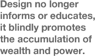 Design no longer envisions, it advertises. Design no longer informs or educates, it blindly promotes the accumulation of wealth and power; it aestheticizers corporate greed and commercially motivated waste. Design is something to be used up. Its primary significance is that it will lose significance.
Whatever the “skin,” or its origin, its meaning is compromised — or lost — when it enters the realm of the style market. Within an ever-shifting tableau of design, all images send the same message: consume, use up, replace.
How a distributed message is communicated determines how it will be received, and how a message is received determines its form and structure.
Conforming to the logic of disposability, the most fundamental truth underlying an image is that it will soon cease to exist. While changes is design depict a charade of progress, the cultural garbage grows deeper and deeper. The perpetual waste of goods, the destruction of the earth’s environment, become acceptable norms. A trust in the promise of “the good life” requires an ever growing leap of faith.
Design is a hungry animal that constantly needs feeding, but it is using up its sources of reference. Culture is not a bottomless pit that can be endlessly ransacked. Design is in fact now eating itself through the last resort of self-reference.
Content can be dangerous. It can undermine the design message, the message that:
- packaging is all important;
- the image of the content is the content;
- there are no “goods anymore... only advertisements.”
We are no longer expected to read; only to recognize... respond... buy. Interpretation is stifled. Ideas are muted. Meaning gives way to presentation. Presentation creates a need; promises a fulfillment; closes the deal. Those that evoke the desire promise us the means of satisfaction. Packaging is the tool of a seduction.
Packaging seduces through a process of codification. Information and culture are delivered pre-codified, pre-digested, pre-packaged, ready-to-wear. Little is left to the imagination. Imagination is dangerous. It can imagine things not for sale. All power to the imagination!
At the heart of design lies an ethic of deliberate swindling. Images without bottom offer us fantasies of freedom: the freedom to be lifted out of the dreariness of necessity; the freedom to be who and what we wish; the dream of wholeness. According to the endless chain of visual ideas, satisfaction can be purchased across a retail counter... or from a catalog. Shopping replaces citizenship in the practice of democracy, and buying becomes the only remaining means of expression.
In the Empire of Image, typography, too, vies on the battleground of perception, seeking to shape and limit the vistas of possibility.
In the beginning there was the Word. In the end there was Typography. Words contain the power to persuade. Commercial uses of typography have hyper extended this eloquence. At the summit of this power stands the corporate logo: the ultimate exercise of typographical authority.
It is not the words we use, but how we display them. The initial message of written communication is its type style. The choice of typeface, weight, size and position dictates the emotional response to any piece of information or disinformation. Typography commands our attention. It lays claim to Truth. It propels the word past the barrier of reason... massaging, tantalizing, or alarming the psyche.
If you approach design purely as a solution to a problem, all you can ever hope to communicate is the problem itself.
In the world of advertising and design, a toxic society is daily rendered desirable. Tear it up!
The need for art and imagination to break free from the market has never been greater. It is a matter of survival. What is critically needed is a fresh approach to visual communication — a design insurgency — freed from the fetters of the “bottom line.”
Somehow, we must find a route towards the idea that design can be a meaningful response to people’s needs; more than an answer derived from a marketing question, more than a recycled skin.
Designers must assess the consequences of their work. The practice of design must be motivated by ongoing social concern. Designers must move beyond their drawing tables, step outside their Macs, reconnect their concerns to contours of popular experience and aspiration and establish a means for dialog.
Design today is approached as if selecting from a supermarket shelf. This reduces any element used to the meaningless, and leads to a state of pure ornament and gesture. Decoration is not a substitute for a good idea, and most design today works in the belief that the more you add, the better it is.
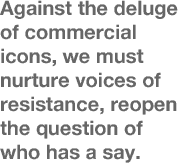 Against the deluge of commercial icons, we must nurture voices of resistance, reopen the question of who has a say.
We are still using a typographic language that was created for a different society with different thoughts and ideals which it needed to communicate in a different way to ourselves.
We must find new languages; and rethink the world according to the needs of individual human communities. The dominance of surface over substance must be overcome. There needs to be a reconciliation of image and meaning.... A design insurgency.
Typography and design can be removed from the confidence games of consumer engineers, and become part of an organic process: affirming free thought, free expression, new social relations.
This can not be left to the wiles of “experts” or “specialists.” As long as design is defined as a profession — an insulated commercial priesthood — the public will be seen as little more than fodder for the market.
The requirements of community, the preservation of human and material resources, the liberating powers of education — not indoctrination — should stand at the center of the design process, guide its development.
True education must encourage social criticism, vision, creative self-expression, questioning, dangerous ideas... even subversion, where necessary.
If — like reading, writing, arithmetic — social and environmental awareness, visual literacy and critical design were elevated and encouraged in schools from an early age, more and more children would begin to master the means of visual communication.
Such education can then be carried on into the arenas and practices of everyday life.
On that day, people will move beyond consuming images. In the ensuing visual dialog, more voices will be heard, alternative possibilities will be acknowledged. The realm of public expression will step beyond the boundaries of commercial inducement, representing, and responding to, social, environmental and spiritual needs.
A democracy of expression will begin to nullify the power of packaged illusions.
Many of these themes appear a decade later in the 2000 re-issue of the First Things First Manifesto, an update to the 1964 declaration. The emphasis on individual, creative resistance reminds me of Adbusters, which began publishing the same year this speech was delivered. A compendium of Brody’s graphic design, The Graphic Language of Neville Brody was published a year earlier in 1988, as was Stuart Ewen’s work of cultural criticism All Consuming Images.
It’s interesting to compare the ideas expressed here with the work currently displayed on one author’s Web site. Plenty of exhuberent and expressive work, but I can’t find much social criticism or design in the public interest.
Drapetomaniac sends a link to this video clip of an interview with Casey Blake. Professor Blake is
“currently working on three book-length projects: Public Art and the Civic Imagination in Contemporary America... an edited volume titled The Arts of Democracy: Art, Civic Culture, and The State... and a collection of essays on the culture and politics of the 1970s.”
I’ve transcribed the clip below.
“In the early and mid-1960’s, the Federal Government initiated two significant programs for funding public art in the United States, and these programs in effect became the leaders in the public art field in this country during the 60’s and 70’s and in some ways beyond.
The first of these was the Art and Architecture Program of the General Services Administration which sponsors public art installations inside and outside federal office buildings and courthouses. And, the second is the Art in Public Places Program of the National Endowment for the Arts which was founded in 1965.
Both of these programs were very much the creation of liberals in the Kennedy administration and after that in the Johnson administration, and also within the Rockefeller wing of the Republican party. And, I think that the architects of these programs were all men who were steeped in European culture. They were knowledgeable about the history of European art and European Modernism in particular, and they wanted to see the United States — now a military and economic power — come of age as a kind of artistic power in the world and produce artwork that could bear comparison to the great works of high European Modernism.
 These were also anti-Communists and they believed that federally sponsored public art programs, and arts programs generally, could play a role in furthering the mission of the United States in its global campaign against the Soviet bloc, in large part by holding up the artistic achievements of the United States as an example of what a civilization devoted to individual freedom was capable of producing, and then, finally, a program that attempted to remake American cities along modernist lines.
I think that when you look at the federal programs that sponsored public art installations in the United States beginning in the mid-1960’s, and then developing further in the late 60’s and early 70’s, you see that these programs were all inspired by a set of assumptions and by a notion of cultural authority that came under attack almost immediately after these programs were put into place. In particular, the notion that artistic decisions and decisions about the uses and design of public spaces should be best left to experts, in particular experts in the visual arts, came under attack almost immediately first from the political left, in many cases from the political right, but I think more broadly from a kind of popular revolt at the local level. I think that on the whole, those people who were angry about public art in this period, in the 70’s and 80’s were asking a vitally important question, namely, ‘What was “public” about them? Who was the public that was going to decide what public art was going to appear in public spaces?’
I think that beyond the question of ‘who decides what art should appear in public spaces?’ and ‘what makes it public?’, the protests of the 1970’s had to do with questions about the fate of the American city in this period. In the 1960’s public art was very explicitly linked to a program of urban renewal that promised a kind of modernist revitalization and redesign of American cities. By the mid-1970’s with the fiscal crisis of American cities setting in in earnest, I think it became very difficult to believe that public art on its own could somehow remake urban culture. More to the point that you see beginning in the 70’s and certainly continuing through the 80’s, a kind of backlash against the idea of urban renewal that had been promulgated after World War II that relied so heavily on the bulldozing of traditional neighborhoods and their replacement by modernist forms of planning and architecture. So in many ways, by the mid-to-late 1970’s public art installations no longer seem like these vehicles of urban revitalization, but rather seem like the most visible symbols of a liberal urban project that had gone terribly wrong.”
page 1 2 3 4 5 6 7 8 9 10 11 12 13 14 15 16 17 18 19 20 21 22 23 24 25 26 27 28 29 30 31 32 33 34 35 36 37 38 39 40 41 42 43 44 45 46 47 48 49 50 51 52 53 54 55 56 57 58 59 60 61 62 63 64 65 66 67 68 69 70 71 72 73 74 75 76 77 78 79 80 81 82 83 84 85 86 87 88 89 90 91 92 93 94 95 96 97 98 99 100 101 102 103 104 105 106 107 108 109 110 111 112 113 114 115 116 117 118 119 120 121 122 123 124 125 126 127 128 129 130 131 132 133 134 135 136 137 138 139 140 141 142 143 144 145 146 147 148 149 150 151 152 153 154 155 156 157 158 159 160 161 162 163 164 165 166 167 168 169 170 171 172 173 174 175 176 177 178 179 180 181 182 183 184 185 186 187 188 189 190 191 192 193 194 195 196 197 198 199 200 201 202 203 204 205 206 207 208 209 210 211 212 213 214 215 216 217 218 219 220 221 222 223 224 225 226 227 228 229 230 231 232 233 234 235 236 237 238 239 240 241 242 243 244 245 246 247 248 249 250 251 252 253 254 255 256 257 258 259 260 261 262 263 264 265 266 267 268 269 270 271 272 273 274 275 276 277 278 279 280 281 282 283 284 285 286 287 288 289 290 291 292 293 294 295 296 297 298 299 300 301 302 303 304 305 306 307 308 309 310 311 312 313 314 315 316 317 318 319 320 321 322 323 324 325 326 327 328 329 330 331 332 333 334 335 336 337 338 339 340 341 342 343 344 345 346 347 348 349 350 351 352 353 354 355 356 357 358 359 360 361 362 363 364 365 366 367 368 369 370 371 372 373 374 375 376 377 378 379 380 381 382 383 384 385 386 387 388 389 390 391 392 393 394 395 396 397 398 399 400 401 402 403 404 405 406 407 408 409 410 411 412 413 414 415 416 417 418 419 420 421 422 423 424 425 426 427 428 429 430 431 432 433 434 435 436 437 438 439 440 441 442 443 444 445 446 447 448 449 450 451 452 453 454 455 456 457 458 459 460 461 462 463 464 465 466 467 468 469 470 471 472 473 474 475 476 477 478 479 480 481 482 483 484 485 486 487 488 489 490 491 492 493 494 495 496 497 498 499 500 501 502 503 504 505 506 507 508 509 510 511 512 513 514 515 516 517 518 519 520 521 522 523 524 525 526 527 528 529 530 531 532 533 534 535
[ Back ]
[ Next ]

