Found 4306 matches from 1,400 records in about 1.7215 seconds for phone or e or geodeta.
The June issue of Metropolis magazine has a short review of this blog in its Screen Space column:
Social Design Notes
Activist and graphic designer John Emerson’s Web log follows the role of design in social activism, collecting little-known news items from around the world. Recently Emerson has devoted much of his coverage to the war in Iraq. He critiques the way newspapers and magazines use graphics to enforce pro-war rhetoric and celebrates protestors who alter existing ads and signs to get their message out.
I’m flattered that Metropolis reviewed my blog, but the review is somewhat skewed by its timing. If you stopped by during the invasion of Iraq that was probably much of what I was blogging.
Crawl through the archives, though. There’s some good stuff there. I do write a lot about the role of design in social justice movements, but I also blog other examples of design in the public interest including (but not limited to) environmentally friendly materials, civic wayfinding, public friendly consumer labeling, sustainable energy sources and design for energy efficiency, universal design and accessibility, mapping, design and public transit, e-government, and design by working people for working people. In addition to news items, I do post some commentary, criticism, original research, and longer features (when I get the time.) I do hope to do more of the latter and less of the link propagation.
I’m not sure what “little-known” means. I do not post items because they are obscure, though I sometimes do not post things that are all over everyone else’s blogs. “Little-known” to who?
In my item on anti-war protests in the City, I was not just celebrating protestors altering ads, but commenting on how protestors were using the City itself not just as a site of protest but as a medium. Not just altering ads, but posting stickers and signs of their own, marching by the thousands, rearranging street furniture, blocking traffic with their bodies, changing the face of the City and using the City itself to disrupt business as usual. I’m actually increasingly skeptical of Adbusters style activism, of altering logos and ads unless it’s within the context of a broader grassroots social movement.
Anyway, all this is to say that in year two of this blog (which starts today) I will try to post more in-depth, to organize my archives better, and to further clarify this whole “design in the public interest” thing.
Thanks for stopping by.
The Washington Post reports on the demise of the payphone:
“In Washington, as in other parts of the country, pay phones are disappearing from the landscape. The number of them across the country has dwindled from a high of 2.7 million in the mid-1990s to about 1.9 million now, supplanted by the more personal wireless phones that fit in a pocket. The small companies that maintain them are pulling out of the business. Even at the higher price of 50 cents a call, many phones run at a deficit — it costs more to clean, maintain and service them — so people like [technician Andres] Castro are yanking them from their sockets, cutting the lines, and pulling them from shopping centers, gasoline stations, restaurants and street corners where they used to turn a booming profit.”
The Globe and Mail reports that instead of dismantling its pay phones, Bell Canada has started adding WiFi capabilities:
“Aimed at business customers, the service is free until late March and available at several sites in Montreal, Kingston, Ont., and Toronto. The project will also include service at Air Canada airport lounges in Calgary, Montreal, Toronto and elsewhere. The pilot project is intended to measure how customers use the service and how much to charge for it, although some observers wonder if service providers will be able to make much money from so-called wireless fidelity or wi-fi hot spots. For Bell’s hot-spot trial, it’s mostly setting up wi-fi nodes where it has payphones, effectively ‘reinventing’ the payphone business.”
In the United States, massive amounts of cash are being thrown at building a nationwide wireless infrastructure. Adding WiFi to payphones is picks up on an exisitng infrastructure. From Bell Canada’s press release:
“The plan calls for payphones in high traffic areas to be fitted with Wi-Fi technology; typical locations include airports, train stations, hotels, convention centers and corporate campuses.”
Adding WiFi to payphones would be a good way of brining WiFi to underserved neighborhoods — the same neighborhoods that rely on pay phones rather than cell phones.
From the Post again:
“It is much easier — and cheaper — to dial from a cell phone for customers who can afford one. However, pay phones are still profitable in the lowest-income areas of a city, said Terry Rainey, president of the American Public Communications Council Inc., an industry group representing independent pay phone operators around the country.
‘There are a great number of people in this country without a phone,’ Rainey said — 4 and 5 percent, which is more than the 1 or 2 percent of the U.S. population that lacks television sets.
‘Some lower-income areas rely on [pay phones] for regular communications, as well as, in some cases, emergency calls,’ said Mason Harris, president of Robin Technologies and of the Atlantic Payphone Association.”
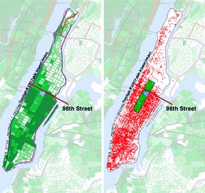
Compare this map of median household income from the 1990 U.S. Census with this 2002 map of WiFi hotspots in Manhattan. From the Public Internet Project:
Click here for a larger version.
Update: On May 10, 2003, the New Jersey Star-Ledger reported that Verizon plans to put WiFi transmitters in pay phones across New York City. No mention of how much it will cost to use.
Also of note is this May 5 article from the International Herald Tribune which describes plans by the city of Paris to build a WiFi network along the subway system. Two or three antennas could be places outside each of Paris’s 372 Metro stations.
“Ideas that Matter is an initiative by [paper company] Sappi that provides funding to support creative design for social good. Your talent and skills could benefit the many institutions working for change: non-profit organisations that are involved in scientific, environmental, educational, cultural or relief programmes.
Sappi is ready to award financial grants of up to €50,000 to pay your out-of-pocket expenses and the full implementation of a print campaign. This includes the cost of the photography, illustration, films, paper, printing, mailing, etc...
Select the non-profit organisation that would benefit from your ideas and ask them to agree to your ideas and application for a grant. Then prepare your creative print campaign proposal and submit it to Sappi. Remember your campaign must exploit the effectiveness of ideas on paper, maximising the potential of posters, direct mail, brochures or print advertising - or something new. Of course, you can submit more than one application if you have more than one idea.”
Check some of the previous winners. The org seems inclined (though not necessarily limited) to funding projects that promote charities that promote children’s rights and humanitarian health and development projects. Get your application here. Entries must be postmarked by May 31, 2003.
When picking a paper stock, you might also consider some of their fine woodfree products.
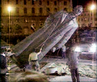
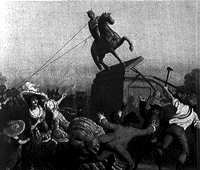 King George III |
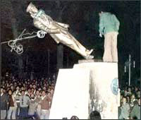 The Shah of Iran |
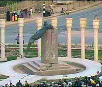
Unable to anticipate a clear surrender by the Iraqi government, on April 4 the Bush administration announced it’s vision of a “rolling victory,” “a strategy to declare victory in Iraq even if Saddam Hussein or key lieutenants remain at large and fighting continues in parts of the country.” Days later, the media run images of a statue of Hussein being toppled by U.S. marines and jubilant Iraqi’s.
...
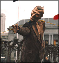
A week later, protestors in San Francisco stage their own toppling of their own. A popular protest mimicking the Marines mimicking a popular protest, the protestors pull down a makeshift statue of President Bush in the style of Saddam Hussein’s.
...
And a week after that, protestors in South Korea topple a cardboard cutout of a statue of Kim Il-Sung.
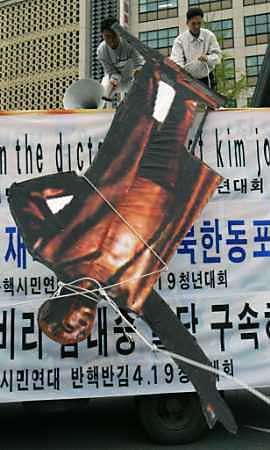
...
Update: On July 3, 2004 the Los Angeles Times confirmed that it was Army psy-ops that toppled the statue of Saddam Hussein, not the Iraqi civilians shown on television.
Over a year ago I attended a lecture on design at the Cooper Union. The speaker projected a series of slides illustrating his minimalist design philosophy. One of the images was of the B-2 bomber. I was shocked and disturbed that a design philosophy would fail to take into account social, political, and economic contexts. Particularly of an object which, when used as intended, delivers massive death and destruction.
It prompted me to dig deeper into design and the public interest. And to start this Web log.
On evening of April 16, I arranged a panel discussion at Cooper titled “Design in the Public Interest / Design Against the War.” I invited three panelists to speak about their work as designers involved in the anti-war movement.
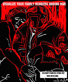 First up was Lee Gough, a printmaker, anti-war activist, and graphic artist based in Brooklyn, NY. She showed a series of prints from a portfolio-in-progress on the Iraq invasion and the war at home, called “The War Went Well.” Some of the images have been used in posters on the Web site Who Dies for Bush Lies“ and for Military Families Speak Out, an organization of people who are opposed to war in Iraq and who have relatives or loved ones in the military.
One image “Fight the War at Home” was inspired by a subway ride home from lower manhattan on September 11. Even as the towers had just been destroyed, there were still, as there had been for many years, homeless persons on the subway appealing to cityfolk to remember them, and to give. The image is a graphic reminder that some have been under domestic attack in our country for a long time, and that funds for the war on poverty pale in comparison to our “defense” budget. Another image, “Visualize Your Family Members Waging War” depicts a despondent soldier with a crutch being embraced by a woman. Lee’s expressive linocut style brings a gravity to the subject matter.
Lee commented on the challenges of choosing one’s message, for instance, noting the different context of “Bring the Troops Home” for troops that have been drafted vs. those who enlisted voluntarily.
One member of the audience raised the question of why U.S. flags and “being American” were the province of the pro-war movement, when large numbers of U.S. citizens were opposed to the war. I noted that I’d seen many anti-war demonstrators holding up flags and patriotism at rallies. On the Web, Who Dies for Bush Lies? effectively tackles effect of the war on U.S. soldiers and U.S. civilians, in addition to Iraqi soldiers and civilians. The danger was raised, though, of the rhetorical trap: the argument over who is “more American” can go back and forth forever, and quickly turning attention away from the crisis at hand.
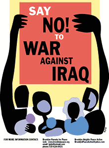 Nancy Doniger has worked as an illustrator for almost 20 years, producing art work for newspapers, magazines, books, posters and T-shirts for both for-profit clients and not-for-profit groups. She is currently a member of Brooklyn Parents for Peace, for whom she created the “Say No to War Against Iraq” poster.
She also helped organize a community/family oriented workshop that gave kids and parents an opportunity to make anti-war art for protest marches. Adults and kids made signs and worked with a puppeteer to create a large paper mache dove, and lots of little doves held aloft on cardboard tubes.
Nancy showed some earlier examples of her work, including a forceful image against the FTAA, a stark two-color poster for a conference on the conflict in Israel and Palestine, and a bright, celebratory “Welcome Back to Brooklyn” poster.
She also showed a couple of iterations of the “Say No to War” poster. One implied the damage of war with flames, but the final version ultimately centered on the mass mobilization. She noted that, in contrast to other illustrations, her work on this piece progressed from representation to geometric abstraction to make the poster more inclusive, using large blocks of color instead of specific depictions of race and gender. She is currently working on a “Hate Free Zone” poster.
Nancy noted the effect of the “Say No to War” poster on her block. The block appeared to be a very pro-war, where “the flags are quick to come out.” But over time, the “Say No to War” poster began to appear in windows and doorways. I certainly noticed it up and down the block where my step-sister lives.
Nancy is also involved in upcoming anti-war event “WEARNICA.” Sponsored by Brooklyn Parents for Peace, on May 3, 2003 a group of artists will present original anti-war art executed on the backs of white cotton dress shirts. The shirts will be worn in public spaces around New York and the world. The event was conceived by Works on Shirts Project whose inspiration for the event came after Colin Powell insisted upon covering the tapestry of Picasso’s Guernica during his warmongering speech to the General Assembly of the United Nations on February 5, 2003.
L.A. Kauffman is a staff organizer for United for Peace and Justice and designer of materials to promote the February 15 and March 22 marches in New York City. Her sticker and poster designs United for Peace and Justice can been seen on the streets across the New York City.
Leslie arrived at design through her work as editor of a progressive journal. She was inspired by the bold, clear graphics of Gran Fury and ACT-UP, and the use of those graphics on the street and at demonstrations, stage managing the events to push its imagery into the mainstream media. She claims she can not draw, so uses clip art in her graphics. The image of the blue pennant flag and black group have become a ubiquitous the city streets.
The idea behind a worldwide day of anti-war marches came out of the European Social Forum held in Florence this past November. At the Forum, the date February 15 was chosen as a date for anti-war demonstrations “in every capital.” What transpired was unexpected and unprecedented.
United for Peace and Justice had only just formed in the November of 2002, but it wasn’t January the group started working on the February 15 march. 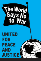 “The World Says No” was the headline of the February 15 flyer design, accompanied by a list of cities taking part in the event. As news of the event travelled across the Internet, marches were planned in more and more cities. Leslie held up various versions of her February 15 design with more and more cities added. Ultimately, marches were held in 793 cities around the world on February 15. Of particular note is virtual absence of communication or coordination between the participating cities.
Leslie spoke of the focused purpose of the posters produced for the event: not to educated, but to mobilize. The flyers lack all superfluous text or argument, just the headline, time and place. The posters and stickers were not trying to change people’s minds, instead to reach out to people who were already against the war but had not yet taken action.
In addition to sticker and flyers, palm cards cut from 1/4 page xerox copies on blue paper were popular and successful. They are both cheaper and more effective — easier to stuff in your pocket, less burdensome on the counter tops of sympathetic shopkeepers.
For the February 15 march, 200,000 stickers were distributed in 5 weeks. For the March 22 march, 200,000 stickers were distributed in 3 weeks. Astonishing numbers, posted around town by a continual flow of volunteers through the office. It’s also a useful bench mark: this is how many it takes to spread the message. A month later, I’m still finding remnants of UPfJ stickers on walls and phone booths. Leslie noted the effect of thousands of little acts of civil disobedience for the spirit of protestors, slowly bolstering a spirit of resistance around in the City and specifically, against the police department ban on marching past the U.N. on February 15.
In total, 1.1 Million pieces of literature distributed. Almost all of the printed materials were bilingual: English on one side, Spanish on the other. However, materials were also produced in Korean, Spanish, French, Creole, and Chinese. Quite a few donations for all these production expenses came online via paypal.
The question was raised about the environmental impact of producing all those printed materials. Her response: it’s also better for the environment if the war is prevented.
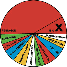 Other examples of design projects were raised by members of the audience: a “Do Not Bomb Iraq” sticker to replace the “Do Not Lean On Doors” sticker in NYC subway cars; colorful logos, charts and imagery designed by Stefan Sagmeister for “Move Our Money,” a campaign to reallocate 15% of the U.S. military budget for education; and flyers handed out to tourists at ground zero with a graphic representation of the number of teachers aides that will be cut from City’s budget. The image leaves it to the viewer to make to the connection to the military expense of a war in Iraq.
Many spoke of the importance of New Yorkers being seen as against the war. September 11 was an attack on New York, and the war is being waged in our name. Others spoke of the urgency of independent media, and the challenge of reaching out beyond “preaching to the converted.”
Overall, I was struck by how spontaneous the designers’ actions were. In almost every case, the designers simply stepped forward and got involved: signs made for a rally were eagerly snapped up; hundreds of thousands of stickers eagerly taken and distributed; and, “Say No to War” posters popped up on an otherwise apparently pro-war street. It seems that one doesn’t necessarily have to change everyone’s minds. There are more “converted” than you think. They just don’t have the graphic materials to display yet.
About 50 people came to the event, a decent turnout despite the announcement from the Pentagon the previous day that “the major fighting” in Iraq was over... and the fact that I’d scheduled the event on the first night of Passover. (Such a Jew am I.) The arc of the event could have used a better closing at the end, as well as a better transition between panelists. I also noted the lack of diversity in the audience. I think next time, I should hold it at different time and place. I’m also quite pleased with the invite design. Peel off the event description and you’re left with an anti-war sticker. Many thanks to Photobition for helping hammer this out in time.
One purpose of the event was to connect artists, designers, and activists. I’m disappointed more Cooper students didn’t show, but after the event quite a few people milled around having these intense little conversations until I kicked everyone out to close the room and return the lights. And quite a few people asked me what was next. Perhaps the start of a new Committee to Unsell the War?
Prison Families Community Forum Launches Campaign to Fight Inmate Telecom Injustices In New York State
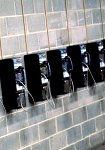 The Prison Families Community Forum needs visual art work! Prison Families Community Forum is a growing network of families directly affected by incarceration in New York State. We are part of a Brooklyn-based non-profit community development organization and are mobilizing families of NYS prisoners to fight the exploitative and dehumanizing practices of New York State, the Department of Corrections and MCI. To keep in contact with loved ones inside, families are forced to absorb charges up to 68% more than anyone else in NYS pays for a collect phone call, a kickback to the state.
We are looking for intense, compelling and even graphic visuals that speak to the hardships faced by families and communities of the incarcerated. Your work will be used for public education, direct action campaign materials, and other forms of print and electronic media, and will help our families more effectively communicate our calls for justice.
Please call for specific details on images which would be most useful. Any visuals representing the injustices of prison are welcome. Artwork may be submitted as JPEGs, prints, or slides and may be sent via email as an attached file and/or via snail mail to the address below.
Please submit art to:
Kym Clark
Criminal Justice Organizer
Developing Justice
c/o Fifth Avenue Committee
141 Fifth Avenue
Brooklyn, NY 11217
718/857 -2990 x41
kclark -at- fifthave -dot- org
“On Monday, March 31, the Los Angeles Times published a front-page photograph that had been altered in violation of Times policy.
The primary subject of the photo was a British soldier directing Iraqi civilians to take cover from Iraqi fire on the outskirts of Basra. After publication, it was noticed that several civilians in the background appear twice. The photographer, Brian Walski, reached by telephone in southern Iraq, acknowledged that he had used his computer to combine elements of two photographs, taken moments apart, in order to improve the composition.”
Bloggers are all abuzz about this. You can see the photo and its sources here. The improved composition shows the soldier slightly enlarged, both feet planted, and made to look as if his gun is pointing at the Iraqi.
I hope that such high-profile corrections will inspire skepticism, but worry that they lend the appearance of objectivity and diligence to the rest of the coverage. And thoroughness at the expense of the stories that are not being told.
“Times policy forbids altering the content of news photographs. Because of the violation, Walski, a Times photographer since 1998, has been dismissed from the staff.”
Sucks for Mr. Walski to lose his job, but I’m sure an experienced war photographer with an eye for composition won’t have too much trouble finding a market for his images. Perhaps he could try the Brits?
Otherwise, I look forward reading the Times’s call for Colin Powell to be fired for his misrepresentations. And Bush for his many lies.
See also Underxposed, on photographs and lies in the media.
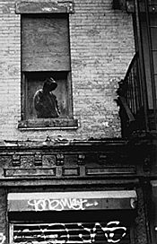 “Last summer I postered the Lower East Side where I live with a series of faceless sweatshirt-hooded grim reaper figures. Lately heroin trafficing down here has reached epidemic proportions. Several of my close friends and colleagues have died from overdoses or HIV infections from dirty needles. Late at night, in an operation resembling a guerilla raid, I installed the Hoody posters on the perimeters of the drug copping zones. Besides the ominous ‘pause’ given passersby, I intended the Hoody posters as warning signs, promoting awareness about a deepening problem in my own neighborhood.”
Dan Witz, “Sending a message through Hummingbirds and Hoodies,” Public Art Review Spring/Summer 1995
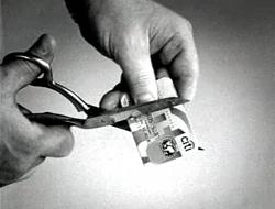
Undermining labor, devastating the envrionment, preying on inner cities, profiting from prisons, and backing biotech companies like Monsanto, Citibank is the target of a new TV spot and campaign by the Rainforest Action Network.
In the commercial, Ali MacGraw, Ed Asner, Darryl Hannah and Susan Sarandon read the names of some of the of thousands of people who have cut up their Citi cards to protest the financial giant’s practice of using its customers’ dollars to fund the world’s most environmentally destructive projects.
“Much has already been made of the thumbs-up gesture that British and American soldiers have received from ‘welcoming’ Iraqis. Unlike in many western cultures, in the Middle East the thumbs-up can be an insult, roughly translating as ‘up yours’. But the US Army’s Defense Language Institute says that after the first Gulf War, the gesture was adopted by some Iraqis, along with the ok sign, as a ‘symbol of co-operation and freedom’.” (BBC)
page 1 2 3 4 5 6 7 8 9 10 11 12 13 14 15 16 17 18 19 20 21 22 23 24 25 26 27 28 29 30 31 32 33 34 35 36 37 38 39 40 41 42 43 44 45 46 47 48 49 50 51 52 53 54 55 56 57 58 59 60 61 62 63 64 65 66 67 68 69 70 71 72 73 74 75 76 77 78 79 80 81 82 83 84 85 86 87 88 89 90 91 92 93 94 95 96 97 98 99 100 101 102 103 104 105 106 107 108 109 110 111 112 113 114 115 116 117 118 119 120 121 122 123 124 125 126 127 128 129 130 131 132 133 134 135 136 137 138 139 140 141 142 143 144 145 146 147 148 149 150 151 152 153 154 155 156 157 158 159 160 161 162 163 164 165 166 167 168 169 170 171 172 173 174 175 176 177 178 179 180 181 182 183 184 185 186 187 188 189 190 191 192 193 194 195 196 197 198 199 200 201 202 203 204 205 206 207 208 209 210 211 212 213 214 215 216 217 218 219 220 221 222 223 224 225 226 227 228 229 230 231 232 233 234 235 236 237 238 239 240 241 242 243 244 245 246 247 248 249 250 251 252 253 254 255 256 257 258 259 260 261 262 263 264 265 266 267 268 269 270 271 272 273 274 275 276 277 278 279 280 281 282 283 284 285 286 287 288 289 290 291 292 293 294 295 296 297 298 299 300 301 302 303 304 305 306 307 308 309 310 311 312 313 314 315 316 317 318 319 320 321 322 323 324 325 326 327 328 329 330 331 332 333 334 335 336 337 338 339 340 341 342 343 344 345 346 347 348 349 350 351 352 353 354 355 356 357 358 359 360 361 362 363 364 365 366 367 368 369 370 371 372 373 374 375 376 377 378 379 380 381 382 383 384 385 386 387 388 389 390 391 392 393 394 395 396 397 398 399 400 401 402 403 404 405 406 407 408 409 410 411 412 413 414 415 416 417 418 419 420 421 422 423 424 425 426 427 428 429 430 431
[ Back ]
[ Next ]


