

Found 4305 matches from 1,400 records in about 0.1146 seconds for phone or e or geodeta.

One year ago, a few days after September 11, someone had stapled a sign to a lamp post on 7th street in the East Village. I was taking basic Arabic at the time and could just make it out: I Love New York. The next day it was gone. It was half torn when I saw it. No doubt someone finished the job. There was a lot of misdirected anger in the streets then. There still is.
Click on the graphic above for a larger version you can print out and post on a lamp post near you.
“Incorporated in 1973, Self-Help Graphics & Art has been the leading visual arts center serving the predominantly Chicano community of Los Angeles. Self Help Graphics’ mission is to (1) To foster and encourage the empowerment of local Chicano artists, (2) To present Chicano art to all audiences through its programs and services, and (3) To promote the rich cultural heritage and contribution of Chicano art and artists to the contemporary American experience.
Key artistic programming endeavors include Self-Help’s Printmaking Atelier, which offers resources for artists to create and produce unique serigraphs; the Exhibition Print Program, which brings print-work exhibitions to local, regional, national and international audiences, and the Professional Artists Workshop Program, which provides artists with the opportunity to develop professional experience while experimenting with a variety of techniques and mediums. Self-Help’s services are free of charge. Without these efforts, many local artists would not have the exposure and resources to be self-supporting.”
Work from the Printmaking Atelier is in museum collections around the world. Self Help Graphics has also exhibited more Chicano Art in Mexico than any other U.S. center.
“An offspring of the May ‘68 student revolt, Grapus design collective was founded in 1970 by Pierre Bernard, Gerard Paris-Clavel and Francois Miehe. They were joined in 1974-5 by Jean-Paul Bachollet and Alex Jordan; with Miehe’s departure in 1978, the main core was set.
All members of the French Communist Party (PCF), they concentrated their early efforts on the new society visions of the Left, producing cultural and political posters for experimental theatre groups, progressive town councils, the PCF itself, the CGT (Communist trade union), educational causes and social institutions. At the same time, they rejected the commercial advertising sphere....
For 20 years they provided inspiration to graphic design students all over the world, with their idealistic principles (of brining culture to politics, and politics to culture), and their highly distinctive form of image-making: an accessible and unpredictable mixture of child-like scrawl, bright colors, sensual forms and high-spirited visual pranks.
Throughout their history, Grapus remained Communists and idealists and continued to operated collectively: all work left the studio signed ‘Grapus’ even when their studio numbers had grown to around 20, operating in three separate collectives. They finally disbanded in January 1991, splitting into three independent design groups.”
From Liz McQuiston, Graphic Agitation: Social and Political Graphics since the Sixties, Phaidon, p. 56.
This article on the AIGA NY Web site emphasizes role of “the artistic” at the expense of “the political” in the breakup of the organization. Instead, I read it as the group wrestling with their relationship to the State and the establishment. Grapus member Pierre Bernard, on his design for the Louvre:
“‘I didn’t want to support the cliché that the Louvre was a place of order, reverence, and boredom,’ says fifty-six-year-old Bernard, ‘At the same time, I wanted to claim the wealth of the museum as the property of the French people, not the property of a cultural elite.’
Although he is a former member of the Communist party, this is not strident leftist rhetoric. Bernard’s approach to graphic design is more artistically than politically driven....
The Louvre assignment was a turning point in Bernard’s career. His fellow designers at Grapus believed the collective should turn down the job. ‘We used to argue all the time about who we should work for,’ he says. ‘Unlike other members of the group who only wanted to design for political causes, I believed that graphic communication could be an instrument of social change when applied to cultural institutions and so, in 1991, I went my way and formed the ACG, short for Atelier de Creation Graphique.’”
The piece further attributes the the downfall of the collective to the adoption of social design by the mainstream:
“The 1980’s were a time of cultural euphoria in socialist France. Jack Lang, minister of culture, supported a wide range of avant-garde art projects, and graphic expression was one of them. Every socialist city, town and village had to have its logo. All the government agencies felt compelled to acquire a graphic identity. And the Georges Pompidou Center had just mounted an exhibition called Images d’utilite publique (Images for Public Use) that defined, for the first time, the role of graphic design in modern democracies. Most important for French Designers, a coherent graphic design theory was beginning to emerge. But instead of helping Grapus mainstream its revolutionary message, this sudden surge of public interest in graphic design challenged their very raison d’etre. No longer in the opposition, the members of the collective felt that they were betraying their subversive mission. Like the [Situationist International], who disappeared as a group in the confusion of the student uprising they had fostered, Grapus dissolved when it’s confrontational ideology was successfully co-opted by the cultural establishment....
Today, the members of the Grapus collective are practicing their craft, each on their own terms. None have sold out. Paris Clavel designs award-winning, leftist posters under the Ne pas plier monkier (a pun on the "Do Not Fold" warning on mailing envelopes containing graphic material, the name suggests an inflexible state of mind), Miche teaches at the Ecole de Arts Décoratifs. Alex Jordan, who had joined Grapus in 1976, formed Nous travaillons ensemble (We Work Together), another design collective known for it’s social involvement. Fokke Draaijer and Dirk Debage, two Dutch graphic designers who stayed on with Pierre Bernard to form ACG, also eventually left to create their own studios.”
See also Hundreds of Grapus Posters Online!
“This shared web-gallery of radical arts exists to document, develop and promote the artform of the post-corporate millennium - subvertising.
Subvertising is the Art of Cultural resistance. It is the ‘writing on the wall’, the sticker on the lamppost, the corrected rewording of Billboards, the spoof T-shirt; but it is also the mass act of defiance of a street party. The key process involves redefining or even reclaiming our environment from the corporate beast. Subvertising is allot like good modern art - they both involve finding idiots with too much power and wealth, and taxing them.”
A mixed collection of images from corporate logos to propaganda posters on issues from Animal Rights to War & Peace. Most of the images are “CopyLeft” or “Anti-Copyrighted.”
“CopyLeft means copyright except for non-profit making initiatives/organizations where the it is used to positively portray what it set out to do. If you are not sure what it originally set out to do you must ask its creator. This means that you can use the (graphics, article etc.) If you are not making money out or it and do not have the intention of doing go. If you are you must get permission from the creator to use it. This is a slightly reduced form of anti-copywrite.”
The concept resembles the more developed idea of Copyleft put forward by the Free Software Foundation. On the other hand:
“Anti-Copyright means use freely for whatever you want, and comes from the perspective that copyright should not exist at all or that there is no need to copyright the information/image as you wish it to be distributed freely and reused.”
Got any images to contribute?
From “Beauty Tips and Politics” by Lauren Sandler in the The Nation:
“‘The error that we tend to make is that we think that women’s magazines are what editors want and what their readers want—and thus are are social inidicators—when in fact they are what advertisers want,’ says Gloria Steinhem. ‘They’re just advertising indicators.’ Steinham says this is why she pulled all ads from Ms.”
Actually, says Steinem, Ms. started turning a profit, or at least breaking even, when it stopped taking advertising. And, not just refusing advertising, the magazine ran a monthly feature called “No Comment” that drew attention to offensive advertising campaigns and practices.
Still, writes Sandler:
“The ad pages that accompany domestic and international rights abuse stories are getting top dollar in Marie Claire, largely because readers polled say these are among the pages they read most.”
Of course, polls can be misleading indicators in their own right.
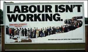
From The Guardian:
“The Conservative party’s 1978 poster of a snaking line of people queuing for the unemployment office under the slogan ‘Labour isn’t working’ has been voted the poster advertisement of the century [by the trade magazine Campaign].
Created by the Saatchi brothers, the poster is cited as instrumental in the downfall of James Callaghan’s Labour administration in the 1979 election and the rise of Margaret Thatcher, partly because he rose to the jibe and complained [about the poster in Parliament]. It also marked a sea-change in political advertising as, aiming at traditional Labour supporters who feared for their jobs, it was the first to adopt the aggressive marketing tactics which characterise modern elections.
The BBC has a story on the background of the Labour poster and how the photo was faked.
“News that people in the advert were ‘actors’ and not genuinely unemployed had leaked and Healed said the Conservatives were dishonest, reaching a new low by ‘selling politics like soap-powder’.
But Labour politicians were not hawk-eyed enough to spot that the basic ‘deceit’ was compounded by using the same few people over and over. Walsh had ensured that the volunteers’ faces were out of focus and could not be recognised.
Since then the tactic of putting up a deliberately controversial poster on a few bill-boards - and then reaping millions of pounds of free publicity as TV and newspapers report the fuss has become a standard and cost-effective tactic for advertisers.
When the election was delayed until the spring of 1979 the Saatchis brought out a second version of the poster with the legend ‘Labour still isn’t working’.
After the election Lord Thorneycroft, Tory party treasurer at the time, claimed that the poster had ‘won the election for the Conservatives’.”
Found via coudal partners.
“The posters produced by the ATELIER POPULAIRE are weapons in the service of the struggle and are an inseparable part of it. Their rightful place is in the centers of conflict, that is to say, in the streets and on the walls of the Factories. To use them for decorative purposes, to display them in bourgeois places of culture or to consider them as objects of aesthetic interest is to impair both their function and their effect. This is why the ATELIER POPULAIRE has always refused to put them on sale. Even to keep them as historical evidence of a certain stage in the struggle is a betrayal, for the struggle itself is of such primary importance that the position of an ‘outside’ observer is a fiction which inevitably plays into the hands of the Ruling Class. That is why these works should not be taken as the final outcome of an experience, but as an inducement for finding, though contact with the masses, new levels of action, both on the cultural and the political plane.”
Statement by the Atelier Populaire, Paris, 1968.
“Cuba has a long tradition of producing unique and powerful posters. After the revolution in 1959, posters took on a vital social role in promoting the wide range of issues facing a small country struggling for self-determination and identity. Three agencies emerged as the primary producers of an enormous output of visual material - OSPAAAL, the Organization in Solidarity with the People of Asia, Africa, and Latin America; ICAIC, the Cuban film industry, and Editora Politica, which was the publishing department of the Cuban Communist Party.”
From the Cuba Poster Project, a collaboration between the National Library of Cuba and the Bancroft Library at the University of California, Berkeley to catalogue, preserve, digitize, and exhibit printed material from Cuba. This essay on the history of Cuban poster art touches on OSPAAAL and its distribution of posters as a means of international solidarity:
“Among its many activities has been the publication of Tricontinental magazine since 1967. At its peak its circulation was 30,000 copies, produced in 4 different languages and mailed to 87 countries. Included in most issues were folded-up solidarity posters, thus establishing the most effective international poster distribution system in the world.”
Images:
- A huge collection of OSPAAAL posters organized by region.
- Posters for sale, organized by artist
- Another collection of OSPAAAL posters for sale
- A small collection from the International Institute of Social History in Amsterdam, with short bios of some of the artists.
- Posters of Cuban Cinema
“As a part of Massachusetts Bike Week, May 2001, three Somerville artists got together and created the SUV ticket, recruited an army of cyclists, pedestrians and greens to ticket ALL SUVs!
The movement continued this year with our National Ticketing Effort, targeting 50 cities in 50 States on May11 -19, 2002. Now ticketing actions are being planned and carried out by local folks near you!”
See the ticket here (26K PDF). The campaign has generated a bit of local media coverage, made a few enemies, and even affected a purchasing decision or two. See some responses here. Of course, one good ticket deserves another.
Thanks to Jamie Leo for the tip.
“These photographs, which are from a series entitled ‘No Space at All’, were taken in Kyoto during the bubble and post-bubble eras of the last decade. They document spaces in the city that are defined by concrete, asphalt, cars, metal or chain-link fencing and the absence of what once occupied them — usually an old house or traditional Kyoto machiya. These spaces, which more often than not are used as parking lots to accommodate the growing number of cars, are replacing the warmth of traditional Kyoto blocks with a kind of emptiness. Such spaces are rapidly increasing and can be seen in every part of the city. They are now becoming a characteristic feature of Kyoto’s urban landscape.”
page 1 2 3 4 5 6 7 8 9 10 11 12 13 14 15 16 17 18 19 20 21 22 23 24 25 26 27 28 29 30 31 32 33 34 35 36 37 38 39 40 41 42 43 44 45 46 47 48 49 50 51 52 53 54 55 56 57 58 59 60 61 62 63 64 65 66 67 68 69 70 71 72 73 74 75 76 77 78 79 80 81 82 83 84 85 86 87 88 89 90 91 92 93 94 95 96 97 98 99 100 101 102 103 104 105 106 107 108 109 110 111 112 113 114 115 116 117 118 119 120 121 122 123 124 125 126 127 128 129 130 131 132 133 134 135 136 137 138 139 140 141 142 143 144 145 146 147 148 149 150 151 152 153 154 155 156 157 158 159 160 161 162 163 164 165 166 167 168 169 170 171 172 173 174 175 176 177 178 179 180 181 182 183 184 185 186 187 188 189 190 191 192 193 194 195 196 197 198 199 200 201 202 203 204 205 206 207 208 209 210 211 212 213 214 215 216 217 218 219 220 221 222 223 224 225 226 227 228 229 230 231 232 233 234 235 236 237 238 239 240 241 242 243 244 245 246 247 248 249 250 251 252 253 254 255 256 257 258 259 260 261 262 263 264 265 266 267 268 269 270 271 272 273 274 275 276 277 278 279 280 281 282 283 284 285 286 287 288 289 290 291 292 293 294 295 296 297 298 299 300 301 302 303 304 305 306 307 308 309 310 311 312 313 314 315 316 317 318 319 320 321 322 323 324 325 326 327 328 329 330 331 332 333 334 335 336 337 338 339 340 341 342 343 344 345 346 347 348 349 350 351 352 353 354 355 356 357 358 359 360 361 362 363 364 365 366 367 368 369 370 371 372 373 374 375 376 377 378 379 380 381 382 383 384 385 386 387 388 389 390 391 392 393 394 395 396 397 398 399 400 401 402 403 404 405 406 407 408 409 410 411 412 413 414 415 416 417 418 419 420 421 422 423 424 425 426 427 428 429 430 431
[ Back ]
[ Next ]