Found 4305 matches from 1,400 records in about 0.1506 seconds for phone or e or geodeta.
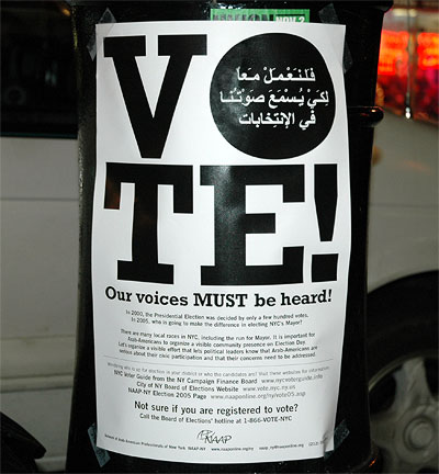
It’s election day today in NYC. I spotted this in Bay Ridge Brooklyn this weekend.
The bilingual poster does not endorse a particular candidate or ballot initiative, simply the vote itself. It’s not trying to sell anything but political power.
The poster reads:
“There are many local races in NYC, including the run for Mayor. It is important for Arab-Americans to organize a visible community presence on Election Day. Let’s organize a visible effort that lets political leaders know that Arab-Americans are serious about their civic participation and that their concerns need to be addressed.”
Political power in New York City can often be drawn among community lines. This often becomes a game of numbers, and graphics in community spaces play a small but important part.
Kimberly from Australia emails:
“[I am writing] to see if you have a copy of Tibor Kalman’s ‘Fuck Bush. Vote’ poster. Reading your post today about the bilingual poster for the NYC elections made me remember Tibor’s and would love to see it.”
Here you go. A shot of page 75 in Tibor Kalman: Perverse Optimist:
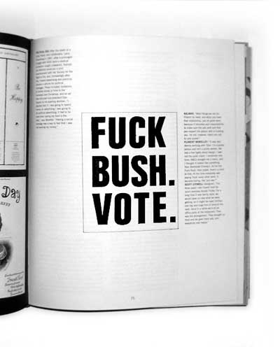
Before his famous “political advertising” for Benetton, Kalman and his company M&Co created such at the behest of Florent Morellet, owner of the eponymous bistro in the meatpacking district.
The text on the page above reads:
“After the death of a close friend, and collaborator Larry Rosenberg, in 1987, after a prolonged struggle with AIDS (and a medical profession caught unawares), Kalman and Morellet produced a joint advertisement with the Society for the Right to Die, and, increasingly after this, Florent advertising and publicity became a vehicle for political messages. These included invitations to donate money or time to the homeless over Christmas, and an ad that ridiculed vice-president Dan Quayle for his spelling abilities.
‘I decided that if I was going to spend money on advertising I was going to do political advertising; it had to be more than saying my food is the best,’ says Morellet. ‘Having a social message was a way to feel that I was not wasting my money.’
Kalman: ‘Most things we did for Florent he liked, and when you have that relationship, you do great work, because it becomes your responsibility to make sure the ads work and that you respect the person who is trusting you. He did, however, reject our call to vote poster.’Florent Morellet: ‘It was very stormy working with Tibor. I’m a pushy person and he’s a pushy person. We had a few fights about design. I was not the quiet client.... As for the Fuck Bush, Vote poster, there’s a limit to that. At the time everybody was saying ‘fuck’ every other word. It became boring, like ‘you see.’’
Scott Stowell (designer): ‘For three years I ate Florent food for lunch everyday except Friday. For a long time it was family style; we would have no idea what we were getting, so it might be roast chicken one day and huge tins of borscht the next. Once in a while we’d do an office party at the restaurant. That was the arrangement. They brought us food and we gave them ads, and everybody was happy.’”
Florent has a history of community engagement. In 2003, with preservationist Jo Hamilton, he helped earn landmark recognition for the Gansevoort Historic District.
The context of the Florent ads, arising from rage and personal loss, and even the barter arrangement, make the feel a lot less crass and gratuitously provocative than Kalman’s later work for Benetton.
---
See previous posts Half Empty on Tibor and Commodify Your Dissent on merchant politics.
The 2008 Beijing Olympics Committee today announced their five Official Mascots:
“Like the Five Olympic Rings from which they draw their color and inspiration, the Five Friendlies will serve as the Official Mascots of Beijing 2008 Olympic Games, carrying a message of friendship and peace — and blessings from China — to children all over the world.
Designed to express the playful qualities of five little children who form an intimate circle of friends, the Five Friendlies also embody the natural characteristics of four of China’s most popular animals — the Fish, the Panda, the Tibetan Antelope, the Swallow — and the Olympic Flame.”
That’s the same Tibetan Antelope now teetering on the edge of extinction — endangered by infrastructure development and poaching. (Its wool is some of the finest in the world.)
The character is intended to project an image of happy diversity:
“His head ornament incorporates several decorative styles from the Qinghai-Tibet and Sinkiang cultures and the ethnic design traditions of Western China.”
Students for a Free Tibet, however, notes another agenda:
“The Chinese authorities’ plan to use the Tibetan antelope as propaganda purporting the unity of the nationalities in China in order to distract from the reality that China has illegally occupied Tibet for more than 50 years can be seen clearly in the statements made at the mascot unveiling ceremonies. According to Liu Qi, head of the Olympics organizing committee, the mascots ‘reflect the cultural diversity of China as a multi-ethnic country... and the enthusiasm and aspirations of our people.’
The Tibetan antelope is not a Chinese symbol and is being used to legitimize China’s occupation of Tibet.”
SFT is encouraging letters to Mr. Liu Qi. For more, see the SFT and Human Rights Watch campaigns on the 2008 Olympics in China.
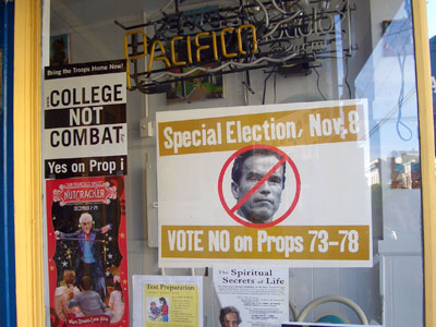
Passing through San Francisco, I spotted these near 16th street and Valencia. The Arnold poster says nothing about the substance of the initiatives — it doesn’t need to. For locals, there’s no explanation necesary.
Like the U.S., Australia has a growing problem of fundamentalists in politics.
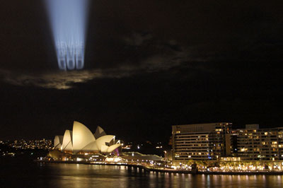
In response, graphic designer, artist, and activist Deborah Kelly has undertaken a large scale public art project in the streets (skies and train stations) of Sydney. From bewareofthegod.com:
“This site intends to be a resource of diverse material documenting, analyzing, and musing upon the impacts and aspirations of religious literalists in the public sphere. It is being produced in Australia, in 2005, so that is its first focus. However, you will also find here information, ideas and reportage from other places, because even though context is everything, a global phenomenon is also something.”
The project incorporates multiple media, including:
A 30 second film shown every ten minutes on 42 billboard screens in Sydney train stations, viewable in miniature here [Quicktime 874 Kb]
Projections onto clouds over Sydney Harbor:
Distribution of 40,000 free postcard/stickers (you can mail or peel the front off and stick to your door.)

And essays and analysis posted on the project Web site. On the site is an open call for further cultural and analytical material.
The effort is backed by the Museum of Contemporary Art in Sydney as part of their biennial Contemporary Australian Art show, this year called Interesting Times.
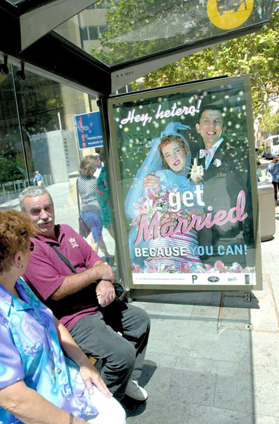
Related projects from Kelly include a series of posters designed with Tina Fiveash satirizing the right wing regime of “compulsory heterosexuality”.
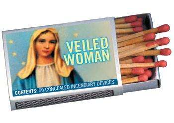
And a series of illustrated matchboxes satirizing the Christian right push in Australia to have muslim women and girls banned from wearing hijab “because they might be hiding bombs.” Kelly and friends made thousands of satirical matchboxes and left them lying around.
Kelly is also involved in a collective challenging the rhetoric of politicians calling refugees ‘boat people.’ See more at http://www.boat-people.org/
Though not aligned with a specific organizing campaign, I think such cultural work is important in the battle for hearts and minds.
On the west coast last month, I had a chance to visit the amazing folks of the Desgin Action Colletive in Oakland. Talking process and vision, something Innosanto Nagara said really stuck with me. It was something like:
“The challenge for progressives is not a lack of ideas. The models exist. The arguments exist.
But when you ask someone on the street if they want universal health care tomorrow, they say ‘Oh, that’s communism.’
The problem is a failure to communicate. And visual communications is a powerful tool that we need to learn to use better.
I strongly believe that on-the-ground organizing is where it’s at. And the communications work we do is to augment that.”
Now there’s a concise manifesto.
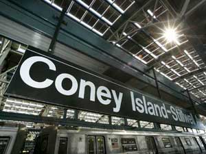
On October 28, Wired ran this bit on NYC’s new solar powered subway station:
“On a sunny day, 60,000 square feet of integrated solar paneling on its roof can generate 210 kilowatts of power, enough to meet two-thirds of the station’s energy requirements. The solar energy doesn’t run the trains, but is expected to contribute approximately 250,000 solar kilowatt hours per year to the station’s other energy needs — primarily lighting and air conditioning in the station and its attached offices and retail stores....
In addition to the Stillwell station, photovoltaic, or PV, cells help power a bus terminal and rail yard in Queens, as well as the Whitehall Ferry Terminal at the southern tip of Manhattan.”
OK, pretty cool. (But are we subsidizing those retail stores? Or are they paying the MTA for the juice?)
And of note is this little factoid:
“Total renovation costs approached $300 million, though it’s not clear how much of that came from expenses related to the solar roof.”
OK, pricey, but these things stick around a while. And of course, there’s the MTA’s $1 billion dollar surplus this year.
But it all puts into further context the MTA’s last minute demand that pushed the union to strike.
From today’s NY Times we learn that in the final minutes before the midnight deadline for negotations, the MTA changed their “final offer”, and pushed a demand to cut the wages of new workers by 4 percent. The plan would have the union win current benefits at the expense of future members (a classic tactic of employers negotiating with unions) and save less than $20 million over three years:
“less over the next three years than what the New York City Police Department will spend on extra overtime during the first two days of the strike.”
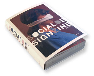
Just in time for the new year is this massive collection of social design notes from the Associazione Italiana Progettazione per la Comunicazione Visiva, the Italian Association for the Design of Visual Communication.
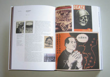
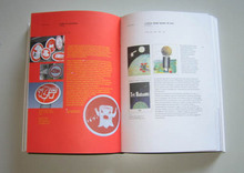
SocialDesignZine Vol.UNO collects two years of posts from the blog SocialDesignZine.The book weighs in at 464 pages with over 1100 color images.
In my broken translation:
“The book is an immense anthology on topics of visual communication and the social responsibility of the designer. An appeal for us to think about the future, this collection is a small contribution to the formation of an Italian design community.
Introduced with essays by Steven Heller, Mario Piazza, and Oliviero Toscani, the text draws from a wide range of sources collection (text, Web, video) that deepen the arguments over time. Many pages include a sidebar of selected user comments from the site itself. Also of use is the immense analytical index that allows one travel over the pages again. Articles are cross-indexed on repeated themes through the book. The book costs 30 Euros online plus shipping.”
The book grabs a few items and images from my own site, though is more tightly focused on graphics. In fact, the introduction cites this site as an inspiration! It’s thrilling to see how far they’ve run with the idea. I can’t wait to see what happens in volume 2.
Onwards!
 I’m not big on “humanitarianism” as a political strategy, nor posters as limited edition collectibles, priced as luxury goods. But The Hurrican Poster Project hits a few good notes. From the site:
“The Hurricane Poster Project seeks limited edition sets of hurricane-related posters from high-profile and up-and-coming artists, designers, and firms from the United States and abroad. The donated posters will be sold online, and all profits will go directly to the Red Cross.”
As of this writing, the site shows 108 posters from around the U.S. and the world. As with any open call, the sophistication of the messages is checkered — but there are a few that do a good job. It’s also instructive to see the wide variety of approaches. And, despite the depoliticized context the campaign, several images do hold FEMA, Bush, and the media to account.
Back in November 2004, a portrait of a U.S. Marine in Iraq rapidly became an icon of weary, insouciant toughness and cool that so many love in their cinematic heros.
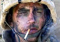 Patrick J. McDonnell wrote in the Los Angeles Times:
A smoke break creates icon of the war; now groupies seek out the weary Marine
“Miller is the young man whose gritty, war-hardened portrait, shot by Luis Sinco, a Los Angeles Times photographer, appeared Wednesday in more than 100 U.S. newspapers, including The Seattle Times. In the full-frame photo, taken after more than 12 hours of nearly nonstop deadly combat, Miller’s camouflage war paint is smudged. He sports a bloody nick on his nose. His helmet and chin strap frame a weary expression that seems to convey the timeless fatigue of battle. And there is the cigarette, of course, drooping from the right side of his mouth in a jaunty manner that Humphrey Bogart would have approved of. Wispy smoke drifts off to his left.
The image has quickly moved into the realm of the iconic.
More than 100 newspapers printed it, although it took the New York Post to sum it up in a front-page headline: ‘Marlboro Men Kick Butt in Fallujah.’ The fact that Miller’s name was not included in the caption material only seemed to enhance its punch....
The photo was taken on the afternoon after Charlie Company’s harrowing entry into Fallujah under intense enemy fire, in the cold and rain. Miller was on the roof of a home where he and his fellow First Platoon members had spent the day engaged in practically nonstop firefights, fending off snipers and attackers who rushed the building. No one had slept in more than 24 hours. All were physically and emotionally drained.”
See this previous post on Bag News Notes for further analysis of the Times article and photo.
See also Human Rights Watch‘s report on Charlie Company‘s earlier seige and occupation of Fallujah.
Today, however, we learn from Editor and Publisher that:
‘Marlboro Man’ in Iraq War Photo Suffers from PTSD
Back home, he got married in June, but on duty during the Hurricane Katrina relief effort, Miller suffered from symptoms of post-traumatic stress disorder (PTSD), and was granted an honorable discharge from the Marines in November....
Miller went into therapy, but knows he is not alone. ‘A lot of guys have had way worse incidents from being in Iraq,’ he said. ‘And I guess it just -- it troubled me due to the fact that their incidents may have been more severe, and they weren’t suffering from the same things I was. I just didn’t understand how it could affect me so dramatically and not affect some of these guys. But a lot of them deal with different ways.
‘The more and more I talk to [other guys], the more I found out there were a lot of Marines that are going through same or similar emotions. It’s tough to deal with. Being in Iraq is something no one wants to talk about.’”
page 1 2 3 4 5 6 7 8 9 10 11 12 13 14 15 16 17 18 19 20 21 22 23 24 25 26 27 28 29 30 31 32 33 34 35 36 37 38 39 40 41 42 43 44 45 46 47 48 49 50 51 52 53 54 55 56 57 58 59 60 61 62 63 64 65 66 67 68 69 70 71 72 73 74 75 76 77 78 79 80 81 82 83 84 85 86 87 88 89 90 91 92 93 94 95 96 97 98 99 100 101 102 103 104 105 106 107 108 109 110 111 112 113 114 115 116 117 118 119 120 121 122 123 124 125 126 127 128 129 130 131 132 133 134 135 136 137 138 139 140 141 142 143 144 145 146 147 148 149 150 151 152 153 154 155 156 157 158 159 160 161 162 163 164 165 166 167 168 169 170 171 172 173 174 175 176 177 178 179 180 181 182 183 184 185 186 187 188 189 190 191 192 193 194 195 196 197 198 199 200 201 202 203 204 205 206 207 208 209 210 211 212 213 214 215 216 217 218 219 220 221 222 223 224 225 226 227 228 229 230 231 232 233 234 235 236 237 238 239 240 241 242 243 244 245 246 247 248 249 250 251 252 253 254 255 256 257 258 259 260 261 262 263 264 265 266 267 268 269 270 271 272 273 274 275 276 277 278 279 280 281 282 283 284 285 286 287 288 289 290 291 292 293 294 295 296 297 298 299 300 301 302 303 304 305 306 307 308 309 310 311 312 313 314 315 316 317 318 319 320 321 322 323 324 325 326 327 328 329 330 331 332 333 334 335 336 337 338 339 340 341 342 343 344 345 346 347 348 349 350 351 352 353 354 355 356 357 358 359 360 361 362 363 364 365 366 367 368 369 370 371 372 373 374 375 376 377 378 379 380 381 382 383 384 385 386 387 388 389 390 391 392 393 394 395 396 397 398 399 400 401 402 403 404 405 406 407 408 409 410 411 412 413 414 415 416 417 418 419 420 421 422 423 424 425 426 427 428 429 430 431
[ Back ]
[ Next ]


