Found 5343 matches from 1,400 records in about 0.0767 seconds for text or to or speech or TTS.
While one may be tempted to use all manner of exclamatory marks to further amplify the message of one's posters, proper punctuation almost always enhances clarity. Consider the difference in the following:
No War on Iran!
Versus
No! War on Iran!
Or even
No! War! On Iran!
Two months before Bloomberg and his Office of Long Term Planning and Sustainability rolled out PlaNYC 2030, London’s Mayor Ken Livingstone released his own 148-page report called the Climate Change Action Plan. The two documents are strikingly similar in approach and have been applauded by environmental and business leaders alike. Yet there is at least one conspicuous – and significant – difference between the London and New York reports. The London plan devotes a full section to commercial and institutional buildings – analyzing in minute detail their energy use, recommending ways to improve efficiency and outlining various regulatory measures intended to force the commercial sector’s hand. New York City’s report, however, has no such section.”
Wow! Back in March 2006, I blogged an idea installing a compass rose at subway exits to help emerging travelers find their way. I posted a stencil design to help inspire action. Three weeks later, graffitti roses appeared in lower manhattan. And now a year-and-a-half later, the New York City Department of Transportation announces a plan to implement it.
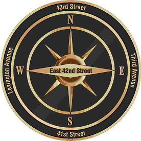
The DoT will test the designs in midtown, around the heavily touristed Grand Central area. The context specific labels are a nice innovation, not just pointing north, but naming the nearest street in each direction.
See the official DoT press release here and a NY Times article here.
 Folks reading my most recent post about the New York City’s implementation of the compass rose by subway exits may have thought the Department of Transportation took its inspiration from my blog. Not so.
I came up with the idea in conversation with out-of-towner Micah Anderson over dinner with the folks from Eggplant Active Media back on March 4, 2006 and later posted it to this blog.
Graffiti roses showed up near downtown exits three weeks later, though I was never sure if my post inspired this. After kottke.org picked up my link, I received this email:
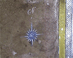
hey man,
i am NOMAD, I have been doing the compass rose graffiti, someone just showed me your post on it,
great minds think alike....
However, while this was all in March 2006, last week’s New York Times article on the DoT’s 2007 implementation of the compass, cites the new transportation commissioner who says she got the idea from “an Upper East Side man who was among about 20 New Yorkers quoted in The New York Times in January 2006 in an article about practical ways to improve the city.”
After my post about the official NYC rose was picked up by a couple of blogs, I received an email from Mary Ciuffitelli who says she proposed the idea publicly back in 1992:
Hey John,
I like your website and design, but I have some news for you.
In 1992, I received an award from The Municipal Art Society for this compass rose idea. MAS ran a big competition called Design New York. There were seven winners out of 1500 entries, followed by an exhibit, an awards ceremony, a lot of press (including the New York Times), NBC TV News interviews, etc. I have my original sketch, award letter, ceremony program, tape of the TV interview, all the documents.
Fifteen years ago, there was talk of the city implementing the idea. In the meantime, friends and I talked about going guerrilla and just spray-painting compasses all over the subway system. I wish we had. I was working at a design studio back then, and there was plenty of enthusiasm. We designed a stencil for our plan based on the floor compass in the subway at Grand Central Station. If I keep digging through my stuff, I’ll find that drawing as well.
There were some pretty great ideas that came out of that contest. (Including a submission very close to mine.) Time to look back before setting down the history. This NY Times article boils down my idea to one sentence, but my submission included slightly more elaborate suggestions to reflect neighborhood character and landmarks.
Designing a Better New York, September 24, 1992 http://query.nytimes.com/gst/fullpage.html?res=9E0CE7DA1F3BF937A1575AC0A964958260
Since it looks like the idea is on the brink of becoming a permanent part of New York City design, I would like to set the record straight. Maybe you’d like to help me.Yours in brilliant ideas,
Mary
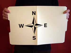
In the meantime, the folks at the Eyebeam OpenLab and Graffitti Research Lab generously let me use their laser cutter to produce a couple of stencils. I have 20 compass roses and 20 North arrows. Want to help put this up?
Send your postal address and PayPal me $2.00 for first class postage and I’ll send you one.

A year ago, I received an email from “Tony:”
“I have looked all over the web, and just can’t find the simple themes that can be posted to the back of poster board or foam board and used at street vigils. I just need simple stuff for 11 by 17 AND 8 1/2 BY 11 COPYING.
Can you help? The power of one or two people in public holding simple antiwar protest messages is great. I just can’t find anything on the net that isn’t too artsy-fartsy, or too damn pacifist-wimpy.”
I smacked into this “artsy-fartsy” factor again a few weeks ago when United for Peace and Justice asked if I could turn out some poster designs on short notice. They sent their final copy and I set to thinking about how to represent things iconographically in a beautiful, compelling way. I rummaged through the usual toolbox (coffins, dollars, boots, ribbons, etc.) as well as play with color and typographic notes (big X’s, oversized punctuation, etc.) One slogan in particular raised an interesting problem: how to graphically represent “community” for marches in eleven very different cities.
Nevertheless, over the weekend’s iteration the org requested the gradual removal of all imagery, iconography, and embellishment. I was trying to do something graphically interesting to myself, but the group had a very specific use case in mind. The posters were not intended for pasting on the street, to attract passersby with flourish, humor, or imagery. They wanted something to be carried high and read from a distance, particularly when reproduced in photos, newspaper clippings, or seconds-long TV news highlights. As such, these were props to represent the march in memory as much as in person, to disappear and punch the message through network editing and newspaper cropping. The simpler and bolder the better.
With a little more time I would have refined these further, but here are the results below. Click on a thumbnail to download a printable PDF.






 By ignoring color, black-and-white photographs depict an abstract surreality — one that has become strongly associated with an iconic truthiness. In this RealAudio clip, NPR talks with Naitonal Geographic Society photographer Chris Rainier about Kodak’s black-and-white Tri-X film. Tri-X was a technical innovation that allowed faster shutter speeds so pictures could be taken without flash in a wider range of situations. “It became the film of choice for everything from fashion to combat photography.... It also has a sort of graininess to it that we all now, in the beginning in the 21st century... associate with many of the most historically important events over the last 50 years.” (via)
Wikipedia on Tri-X: “Since the advent of digital photography it has all but fallen out of use in newspaper journalism. Apart from possible use in educational establishments, it still remains reasonably popular in documentary journalism.”
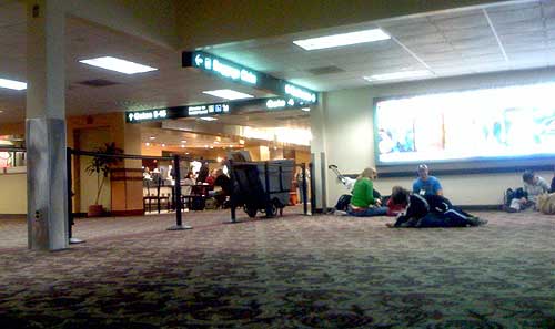
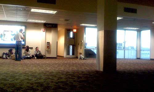
Gate 4 in Terminal 2 of Sky Harbor International Airport in Phoenix, AZ is not meant to be used.
Behind the black stanchions, the roughly 50 x 50 foot space has no TV, no gift stand, no seats; just a row of outlets, a few windows, and a single column supporting the mostly uninterrupted, open space. Which of course makes it a perfect space for kids to wrestle and run, for strollers to park, and for bloggers to plugin their laptops and cellphones and lounge on the floor for a few restful minutes. It’s just a big, empty playroom — and a breath of fresh air, particularly after standing in line for an hour, when your departure gate is crammed, and you’re about to spend the next 5½ hours of your life hunched over your knees in steerage.
I suppose it only works because the space was relatively uncrowded — the black ropes keeping most out, but having no affect on those who toddle right under them, or the rest whose craving for free electricty overrides the risk of a stern talking to. The space probably would not have worked if this were an actual functioning departure gate. I suppose all the rigid rows of plastic seats are a good way of making sure luggage and bodies don’t collide.
But it seems like a fine idea — a sort of indoor, public park. I wish more places had uninterrupted, unstructured, uncommercialized open space. More airports should do this.
page 1 2 3 4 5 6 7 8 9 10 11 12 13 14 15 16 17 18 19 20 21 22 23 24 25 26 27 28 29 30 31 32 33 34 35 36 37 38 39 40 41 42 43 44 45 46 47 48 49 50 51 52 53 54 55 56 57 58 59 60 61 62 63 64 65 66 67 68 69 70 71 72 73 74 75 76 77 78 79 80 81 82 83 84 85 86 87 88 89 90 91 92 93 94 95 96 97 98 99 100 101 102 103 104 105 106 107 108 109 110 111 112 113 114 115 116 117 118 119 120 121 122 123 124 125 126 127 128 129 130 131 132 133 134 135 136 137 138 139 140 141 142 143 144 145 146 147 148 149 150 151 152 153 154 155 156 157 158 159 160 161 162 163 164 165 166 167 168 169 170 171 172 173 174 175 176 177 178 179 180 181 182 183 184 185 186 187 188 189 190 191 192 193 194 195 196 197 198 199 200 201 202 203 204 205 206 207 208 209 210 211 212 213 214 215 216 217 218 219 220 221 222 223 224 225 226 227 228 229 230 231 232 233 234 235 236 237 238 239 240 241 242 243 244 245 246 247 248 249 250 251 252 253 254 255 256 257 258 259 260 261 262 263 264 265 266 267 268 269 270 271 272 273 274 275 276 277 278 279 280 281 282 283 284 285 286 287 288 289 290 291 292 293 294 295 296 297 298 299 300 301 302 303 304 305 306 307 308 309 310 311 312 313 314 315 316 317 318 319 320 321 322 323 324 325 326 327 328 329 330 331 332 333 334 335 336 337 338 339 340 341 342 343 344 345 346 347 348 349 350 351 352 353 354 355 356 357 358 359 360 361 362 363 364 365 366 367 368 369 370 371 372 373 374 375 376 377 378 379 380 381 382 383 384 385 386 387 388 389 390 391 392 393 394 395 396 397 398 399 400 401 402 403 404 405 406 407 408 409 410 411 412 413 414 415 416 417 418 419 420 421 422 423 424 425 426 427 428 429 430 431 432 433 434 435 436 437 438 439 440 441 442 443 444 445 446 447 448 449 450 451 452 453 454 455 456 457 458 459 460 461 462 463 464 465 466 467 468 469 470 471 472 473 474 475 476 477 478 479 480 481 482 483 484 485 486 487 488 489 490 491 492 493 494 495 496 497 498 499 500 501 502 503 504 505 506 507 508 509 510 511 512 513 514 515 516 517 518 519 520 521 522 523 524 525 526 527 528 529 530 531 532 533 534 535
[ Back ]
[ Next ]


