

Found 3599 matches from 1,400 records in about 0.0890 seconds for twitter or is or lazy.
I first heard of this in Japan a couple of years ago. A friend who ran a community development initiative in Boston’s Chinatown, was off to Gifu, the butt of all jokes and an industrial city struggling with the long recession and a loss of manufacturing jobs.
It took a while, but I finally had a chance to search around for a decent definition.
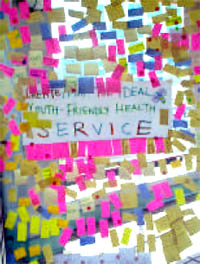
Community asset mapping sounds like a good way to begin analyzing and building political power within a community using design and graphics.
From a Michigan State University Best Practices Brief (468 Kb PDF):
“Community Asset Mapping is a capacity-focused way of redeveloping devastated communities. This positive approach is proposed as a substitute for the traditional deficits focus on a community’s needs and problems. Using problems to formulate human service interventions targets resources to service providers rather than residents, fragments efforts to provide solutions, places reliance on outside resources and outside experts, and leads to a maintenance and survival mentality rather than to community development.
 Instead, they propose the development of policies and activities based on an understanding, or ‘map,’ of the community’s resources — individual capacities and abilities, and organizational resources with the potential for promoting personal and community development. This ‘mapping’ is designed to promote connections or relationships between individuals, between individuals and organizations, and between organizations and organizations.
The asset-based approach does not remove the need for outside resources, but makes their use more effective.
The community assets approach
- starts with what is present in the community
- concentrates on the agenda-building and problem-solving capacity of the residents
- stresses local determination, investment, creativity, and control
In this context, spatial mapping may or may not be used. Within any given neighborhood or community, most assets as defined by Kretzmann and McKnight, [who developed the asset mapping approach to development,] do not have a spatial quality. Community Asset Mapping has very little to do with spatial mapping... and much more to do with a community survey and the mobilizing of individuals and organizations to make connections and build capacity. The information obtained through the survey process must be organized and accessed in an inventory format. It can be computerized as a data base inventory. Computerized mapping can be used, showing the location of assets on a geographic map, as well as the attributes attached to each asset.
The Community Asset Mapping process as outlined by Kretzmann and McKnight is intended to initiate a process that will fully mobilize a community to use its assets around a vision and a plan to solve its own problems. Their guidebook provides considerable detail about how this might be accomplished, with numerous examples of the types of connections that can be developed.“
Some forms of mapping include:
Mapping Public Capital
Such as
- social gatherings that enable people to learn about what is happening in the community
- organized spaces for interaction where people can learn about, discuss, and act on community challenges
- catalytic organizations that spur discussion on community challenges and marshall a community’s resource to move ahead;
- safe havens for decision makers to meet for unofficial candid discussions.
From this the community, can fill in gaps and identify action points and obstacles to overcome.
Cultural Mapping
Documenting cultural resources in the community — examining long-term customs, behaviors, and activities that have meaning to individuals and to the community. Information for cultural mapping is gathered by face-to-face interviews. Communities can use cultural mapping as a tool for self-awareness to promote understanding of the diversity within a community and to protect and conserve traditions, customs, and resources.
Community Relationship Mapping
Ecomapping was initially developed as an effective way for a therapist to identify relationships within a family. The mapping of inter-organizational linkages is a form of ecomapping designed to show the relationships that one organization has with other organizations within the community. Relationships with other organizations may relate to funding, referrals, access to resources, joint service planning, collaborative projects with contributed staff or funds, etc. Ecomapping may be undertaken to clarify the place of an organization in the community spectrum, to identify gaps in linkages, to indicate the multiple relationships between organizations, etc.
From the Northwest Regional Educational Laboratory, regarding the Mapping Community Assets Workbook:
“‘From a community development perspective, it helps to think of our communities in terms of their wealth—in people, things, services, and resources that they possess,’ says author Dr. Diane Dorfman. ‘To build from what you have requires asking different kinds of questions to learn different kinds of things about where you live.’
Learning how to ask what communities have to offer begins a process of building and developing. It brings knowledge, skills, and capacities out into the open, where they can work together to everyone’s benefit. As the web of assets grows, so does the potential for the community.
An asset map is an inventory of the strengths and gifts of the people who make up a community. Asset mapping reveals the assets of the entire community and highlights the interconnections among them, which in turn reveals how to access those assets.
The workbook’s engaging, lively style invites active participation on practically every page. Through a series of questions and exercises, readers first learn to uncover their personal assets, both tangible and intangible, material and nonmaterial. Then they expand to take stock of their community, listing all of its special features. Readers also learn how to design a questionnaire to uncover the hidden assets in their community, those from people or places that are not familiar.
‘Connections to people can also become connections to resource-filled institutions. Likewise, a connection to an organization or institution may actually conceal a personal relationship,’ notes Dorfman.
Here’s an annotated resource list on community asset mapping, and a page on asset mapping with youth.
Still there’s something curious about that Michigan State University’s ‘Capable Communities’ center. Why are they offering this particular public service? Is that university campus, like so many in the U.S., surrounded by pockets of poverty? With this image in mind, it occurs to me that Community Asset Mapping is rather “inward” focused. This is the point, I know, but it does not interrogate or confront external actors or institutions, economic or public policies that also give shape to the community. This is, perhaps, a different map. Building a stronger community, however, builds a solid foundation for challenging the status quo.
Image manipulation software, like Adobe Photoshop, can be a powerful tool to involve communities in the process of urban development.
From the Local Government Commission:
Computer Simulation as a Public Participation Tool
 “Most of us have a hard time envisioning what two-dimensional plans or a development proposal will look like when built. Computer simulation translates such plans and descriptions into pictures that help us see what a proposed development will actually look like. This allows residents and policymakers alike to make more informed planning decisions.
Simulation exercises help settle complex planning issues and guide design and planning activities. As a mechanism to improve public communication concerning local planning and development issues, computer simulation can be used to
- Help develop design guidelines
- Evaluate controversial proposals
- Analyze urban design qualities before formal discussion begins on an actual proposal
- Develop choices about the appearance of a project
 Before the advent of personal computers, architects and urban designers were only able to show their clients what a proposed project would look like through artist’s renderings and/or by constructing elaborate three-dimensional models. Such models and renderings are expensive and time consuming to produce.
Today, advances in computer technology, such as computer aided drawing and design (CADD), global information systems (GIS), and advanced two and three-dimensional graphics software, have made it possible for design professionals to present their projects to clients or the public through computer simulation. Computers make it possible to produce highly accurate simulations faster and less expensively than do traditional methods. Furthermore, once computer simulations are produced, they can be easily adapted to design changes. An artist’s rendering, in contrast, may have to be completely redrawn.
Computer simulation begins with a scanned photograph of a building or area within a community. Using computer software, elements of the image are added, taken out, or otherwise reorganized into a new image representative of a proposed development design strategy. The result is a series of before and after images...
This technique allows all stakeholders to see the differences in proposed design styles and development patterns and allows decision-makers to evaluate the potential impacts of proposed developments.”
From the company Urban Advantage:
“Working with architects, planning staff, and citizen groups, we create visions of pedestrian-friendly, socially-interactive communities by transforming photographs with photo-editing software. In addition to the illustration skills necessary to make seamless montages, we also incorporate into the images an understanding of urban planning, architecture, arboriculture, and transportation. This results in informed collaboration with clients.”
Some of their before and after photo simulations are truly stunning — though after a while, the solutions do start to look a lot alike.
The LGC page lists serveral other specialist firms that provide illustration services, but with the increasing power of home computers and the increasing popularity of digital cameras and image manipulation software, I imagine that community residents themselves might also be able to render their own visions.
One often hears the criticism that political graphics are just “preaching to the converted.” After all, no one’s mind is changed by a poster. Why waste limited time and energy on mutual admiration? A self-reinforcing love-in doesn’t move the masses.
This criticism assumes that such graphics are actually intending to change the mind of the viewer. In turn, this is based on a narrow conception of how advertising works: one sells an idea, brand, or product to a passive and otherwise uninterested consumer.
Whatever the intention, the function of posters is often not to change people’s minds outright, but to push them in a certain direction. Posters make ideas publicly visible and provide alternative explanations, interpretations, narratives, and myths, or reinforce existing ones. Whether or not they directly convince, posters can provoke skepticism. And, without putting forth a nuanced argument, posters can provide notice of an event or opportunity.
Within politically marginalized communities, posters are a way for the community to assert its voice publicly, to put forward its own images and narratives, promote collective action, and ultimately seize political power and push for social change. When no dissent is visible in the corporate media, posters and graphics are one alternative venue. Showing cracks in the ‘consensus’ may convince others to speak out.
While many in the street are ephemeral and quickly replaced or washed away, posters also have historical value. They are often collected and preserved by a variety of individuals and institutions. As Carol Wells, of the Center for the Study of Political Graphics, points out, when history is written by the victors, posters provide a tangible record of social movements otherwise confined to the margins or entirely left out of the ‘acceptable’ narrative. Such grahpics are a visible voice from the past that future generations can learn from and build upon.
But if graphics don’t change people’s minds, how does one reach those ‘moderates,’ ‘undecideds,’ and ‘swing states’? drapetomaniac once proposed that changing minds is often an indirect result of propaganda. No one I know listens to right-wing talk radio, yet somehow its arguments seep into the “mainstream,” occasionally tilting “conventional wisdom,” and ultimately trickling into casual conversation. I imagine that hearing an idea one agrees or learning additional facts, broadcast with conviction from a source you trust may do something to bolster one’s own confidence. And in conversations with others, this must surely come across.
While those 92% of people polled who said political ads had not swayed them to change their prospective votes, how would a poll measure the impact of the ads on the people who agreed with the messages? i.e. of those people on others?
So why not preach to the converted? There’s certainly a value in bringing people together around an issue, rallying the base, and reinvigorating exhausted campaigners.
I wrote the essay below for the Design Issues column in the May/June 2004 issue of Communication Arts. I profile a couple of folks using graphic design for advocacy. I didn’t call it out explicitly in the text, but it’s of some relevance that the projects here are generally not pro-bono projects “for charity,” but are organizations started by designers generally working with broader communities. Check it out.
Taking it to the Streets
Graphic design for advocacy
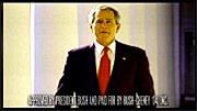
Walking the streets of New York City in February 2003, one couldn’t help but notice all these little blue stickers. Stuck to walls, phone booths, bus stops, scaffolding, mail boxes — they popped up everywhere to announce the February 15 march against President Bush’s invasion of Iraq.
The blue stickers were just one of the many anti-war graphics circulating at the time. Around the Web, activists were posting free, easy-to-print designs using a variety of techniques: clever slogans, typographic play, dramatic photos and the ironic use of vintage propaganda imagery.
But the February 15 stickers on the streets of New York were different — simple and bold, a little blue banner announcing the time and place of the march. They did not make an emotional appeal with pictures of scarred and armless Iraqi children or U.S. soldiers, nor was there any argument about why the war was wrong.
The February 15 posters were not intended to change people’s minds in a direct way, but to notify the public about the upcoming protest — and to make dissent visible. The mainstream media had entirely avoided covering the anti-war movement prior to February 15. In the face of this de facto censorship and police obstruction over the route of the march, the stickers acted as thousands of little acts of civil disobedience. And with the urban landscape as a medium, the stickers set the stage for even larger acts of defiance.
From AdAge, May 24, 2004, “Consumers Largely Unmoved by Presidential Campaign Ads”:
“More than half the consumers queried in a new Advertising Age poll conducted by Lightspeed International Research said the blitz of presidential campaign ads had not influenced them and in total, 92% said the ads had not swayed them to change their prospective votes....
 The online poll, conducted among 1,653 respondents nationally who have seen ads for both candidates, also breaks out eight battleground states. In those states, which are carrying the bulk of the presidential hopefuls’ advertising, both candidates’ ads are viewed as even less persuasive....
The majority, 60%, of national respondents said Mr. Bush’s ads aren’t focusing on issues they care about, and even more, 69%, said Mr. Kerry’s ads don’t address issues they care about....
To no one’s surprise, two out of three respondents — regardless of state or party — view political ads for the presidential race overall as too negative. And that could work against the candidates, as one-third of respondents said a candidate’s negative ads — rather than sway them to vote for that candidate — may actually influence them to avoid voting for them.
Oddly, while ads from the Bush campaign have mostly attacked Mr. Kerry, who has been running mainly biographical spots, poll respondents saw the challenger’s ads as more negative than Mr. Bush’s. A full 61% of those surveyed said Mr. Kerry’s ads were more negative in the national sample vs. 54% for Mr. Bush.
 The reason may be that Democratic groups such as Media Fund and MoveOn.org have been running anti-Bush attack ads and the comments about the negative Kerry ads apparently reflect those ads rather than those from the campaign itself. In fact, among the general population, respondents were equally split on whether they could distinguish ads between candidates or public interest groups. (Respondents in Florida and Ohio were more likely to be able to distinguish the two.)
In some battleground states, however, the results ran counter to the national results. In Michigan and Minnesota, more people found Mr. Bush’s ads negative than they did Mr. Kerry’s.
Even though the election is a little over five months away, already 55% of respondents believe there is too much political advertising.
They are also largely unimpressed with the largesse. Half of respondents on a national basis said Mr. Bush’s ads don’t clearly state his position; Mr. Kerry fared worse, with 70% responding that his ads don’t clearly do so.”
From the data, it seems voters are craving more information and less rhetoric. And might MoveOn’s celebrated Bush in 30 Seconds ads be doing more harm than good? (Though, might Ad Industry professionals have something against ads produced by “amateurs”?) I wonder how these figures compare with past presidential elections.
Still even 8% of several million is several thousand voters who might tip a another close election. But then we also that know what users say is not always what users do.
The article does not elaborate on the methodology or link to an example of the online poll. I’m wonder how the poll addresses ads that put forward a substantive critque of the candidates — in other words “negative” ads that do address issues.
But really, “voters” as “consumers”? Wow.
From an interview with Hrant H Papazian designer of typefaces for Latin, Armenian, Georgian, Cyrillic, Arabic, and Hebrew scripts:
 “But virtually everything I complain about in type (even the stuff I take action on) is essentially trivial in the context of the needs of the world. Except for one thing: increasingly I become more worried about Latinization — the imposition of Latin alphabetic ideals on other scripts. It’s really nothing short of cultural imperialism, even cultural genocide. To me Latinization is a henchman of globalization, and anybody who feels that cultural variety is a central pillar of life being worth living needs to fight it.”
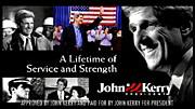
In recent months, there have been several open calls to designers to help stir up the electorate.
Designs On The White House
![]() “Designs On The White House is a grassroots fund-raising organization in support of the John Kerry 2004 Presidential campaign. We aim to mobilize the creative community through an online design contest, judged by designers, celebrities, and activists. Winning designs will be available for resale on T-shirts and other products, and all proceeds after expenses will benefit the John Kerry Presidential campaign. Designs on the White House Organization (DOTWHO) is an independent political committee and is not authorized by any candidate or candidate’s committee.
“Designs On The White House is a grassroots fund-raising organization in support of the John Kerry 2004 Presidential campaign. We aim to mobilize the creative community through an online design contest, judged by designers, celebrities, and activists. Winning designs will be available for resale on T-shirts and other products, and all proceeds after expenses will benefit the John Kerry Presidential campaign. Designs on the White House Organization (DOTWHO) is an independent political committee and is not authorized by any candidate or candidate’s committee.
The Categories
- Best Pro-Kerry Shirt (positive spin, no mention of Bush)
- Best Anti-Bush Shirt (negative spin, must mention Bush)
- Best Issue Shirt - Domestic
- Best Issue Shirt - Foreign
- Funniest Shirt
- Best Retro Shirt
- Best Get Out The Vote Shirt
- Most stylish / Most likely to be featured on Queer Eye
Each design will be entered in only one category.”
Anyone with a valid email address can register with the site and cast their votes on the contributed designs.
The site also features blogs about the DOTWH campaign and the Kerry campaign. A recent entry encourages non-designers with design or slogan ideas to post them.
The deadline for entries is May 22, 2004.
Let Down By Labour
![]() “Want to see your film on national television? Want your poster idea on High Street billboards? Want to tell everyone how labour have let you down? We can make it happen for you.
“Want to see your film on national television? Want your poster idea on High Street billboards? Want to tell everyone how labour have let you down? We can make it happen for you.
‘Labour isn’t Working’ fast became one of the most famous posters in advertising history. Imagine if you had been able to have a crack at that brief? Just as in 1979 when Labour wasn’t working, today swathes of the population feel let down by Labour.”
The final date for submissions was April 23, 2004.
“We have received a massive response from the people of Great Britain and we would like to thank all of you for your contributions. We will be displaying the best ideas in a gallery so that everyone can see how let down by Labour the British people feel. The large number of submissions we have received means that it will take some time for us to sort through the ideas. But as soon as they are ready to be unveiled to the public we will be presenting a selection of them here. Once again thank you for your support.”
And from the comments of VoxPop:
One thing CCO isn’t shouting from the rooftops is that they opened this competition to the "creative industries" (i.e. trendy spec-wearing ripped jeans fans) the week before they opened it to the public.
Also, there’s absolutely no guarantee that they’ll use any of the entries.
Honestly, this scheme could not have been met by more incredulous stares had it been announced on April 1st - Saatchi coming up with a scheme whereby members of the public do his job for him? Shurely shome mishtake.”
Blogged here previously, that famous poster also turns out to be a fake.
AIGA Get Out the Vote
 From the AIGA Atlanta Web site:
“AIGA will again mount a campaign to demonstrate the power of design in the public arena by encouraging designers to contribute to a coordinated get-out-the-vote campaign for national elections in the fall of 2004. The objective is to demonstrate the value of design to the public, public officials and business by providing a clear call to action for an activity that is important to everyone.
The campaign will have two elements to it. The first will be a selection of designers who will be asked to create nonpartisan calls to action that will bear a national AIGA campaign identity. AIGA’s national coordinator will select six designers and each AIGA chapter will be encouraged to select a designer to develop a design, for a potential total of 53 different designs.
The second element will be an open gallery of member designs that will be posted on the website and available for local printing, specifically by our members and also available to any visitor to the website. Any member will be entitled to post a design in the open gallery. This will become the largest gallery of available designs in support of this critical civic function. Some of the unsolicited submissions may be selected to be included among the collection of posters that AIGA will print and will distribute to all chapters for posting locally.
After careful consideration of the success of the previous campaign, this year we are proposing a slightly smaller-scaled window card format rather than posters, since the potential for actual posting in public places increases substantially if the designs are of a scale that can be placed in small shop windows and on public bulletin boards (places where a larger poster would not be posted). The scale also allows for printing out on local color printers as well as commercial printing. Our intention is to demonstrate the strength of our communication design, regardless of the production values of the print. This is in the spirit of civic postings since Revolutionary times....
The purpose of this campaign is to encourage voter turnout. There is no single message, although the intent is a call to action, motivating people to register and to turn out to vote. The visuals and the text of the message must be nonpartisan—we are supporting the basic democratic premise of citizen participation, not a partisan position on candidates or issues. Messages or images that are likely to offend substantial numbers of citizens will not be selected nor included on the site, since they would be counter to our intention of developing messages that encourage voter participation through effective use of images, text and ideas.”
The deadline for submissions was April 1, 2004. You can view or download the posters here.
I also note that the designs must include the AIGA logo:
“All posters must incorporate the required branded band (this will be embedded in the supplied template). The band will include the AIGA logo and the tagline ‘Good design makes choices clear’ along with sponsor information.”
No RNC Poster Collective
 “No RNC Poster Collective is a small collective of friends with experience in graphic design and independent media. We came together with the goal of facilitating visual resistance for the anti-RNC activities in NYC this summer. We want to make protest beautiful and connect artists with organizations working against the RNC.
Our goal for the project is to create a visual blitz in New York City against Bush and the Convention, and to blend art with politics in the finest New York style.
We are putting together in a free book of posters relating to the Republican National Convention in New York City, August 29th -September 4th. We are mass producing these posters on newsprint for distribution across New York City and the country in bookstores, apartment windows, picket signs and pasted up on the street.
We are looking for artists who can make posters with themes anywhere in the range from anti-Republican to anti-RNC-being-held-in-NYC to anti-Bush to antiwar to anything else you think is relevant. The plan is to have some posters about specific marches and actions and others that communicate a general anti-RNC message.
We are printing the posters in early June so that we can circulate them all summer. Submissions should be in black and white. Dimensions are 14" x 21" (that’s 15" x 22" with a half inch border). Deadline for submissions is May 30th. If you are at all interested, please e-mail us at: [email protected].
In mid-June, we’ll head to the printers with the best designs we get, and then set up a distribution network to get thousands of them up on the streets, in storefronts, in apartment windows, on picket signs.... everywhere there’s room.
We’re also setting up an online gallery to display all the great work that people are sending in. In addition to that, we’re working on a gallery show-style event where we can show everything together, which will hopefully also act as a small fundraiser for the project.
We’ll also be doing stickers, stencils, pins, and more over the course of the summer, so please keep in touch if you have other designs or ideas.
Also, one of our goals in starting this project was to hook up artists with organizations — if you think you might be interested in designing a poster for a specific group or event, let us know, it’d definitely help. Info on all the events and groups is here: http://rncnotwelcome.org/logistics.html. Check it out and see if anything leaps out at you.
We hold regular meetings in Brooklyn every Wednesday night, which people are welcome to come to — e-mail us if you have any interest. We’re currently working on fundraising and other logistics,
We’re working closely with the fantastic folks at Arts in Action, who are planning all sorts of fun, creative, and challenging work in the city this summer. Check them out at http://www.thechangeyouwanttosee.org for more info on what they’re up to.”
The budgetary and printing limitations will also give the No RNC posters a consistent, low-tech aesthetic despite the variety of designs and designers.
You can view the final posters here.
...
Though the projects follow much the same format, the politics differ considerably. And though each is an open call for entries, distributed primarily through email and the Web, each seems to target participants much like the organizers themselves, though each in the end aspires to influence a broader public.
Designs On The White House is a grassroots initiative endorsing a major political party. They are rallying a younger crowd seeking to inject a sense of style and hipness into the stodgy, elitist political machine.
Let Down By Labour is a top-down initiative, probably financed by the political party. As noted by the commentor, they seem to be looking for free labor, particularly from other advertising professionals.
The AIGA, a national professional association of dues-paying designers, while explicitly non-partisan, is encouraging participation in the electoral process. The competition was only open to members, and is as much about promoting the AIGA and the public value of design as it is about getting out the vote.
The No RNC Poster Collective, an a grassroots, open, volunteer collective is explicitly partisan, and while challenging the Republican convention, is tied to the protest and civil disobedience to take place around the convention. They are accepting contributions from anyone.
Judging for Let Down By Labour is secret and closed. The judges are unknown. Judging for the AIGA and Designs on the White House are via celebrity panelists, though Designs on the White House does open some voting to the public through the Web. Judging for the No RNC Poster Collective project is open, though one has to physically travel to Brooklyn.
The motivation pitched by each also varies: Let Down By Labour promotes pure self-interest and the prospect of fame for oneself; The AIGA sells the high ideals of civic engagement; Designs on the White House pitches the fun of it; while the No RNC Poster Collective provides a place to focus one’s outrage.
I also note how the choice of media plays into the politics.
Designs On The White House focuses on T-shirt design, seem to implicitly target an audience in their 20’s and 30’s that would wear cheeky political T-Shirts. T-shirts with the winning designs will be put on sale for anyone to purhcase.
Let Down By Labour focuses on advertising, specifically national television and billboards, expensive media generally only accessible to wealthy corporations, advertising agencies, and the big political parties themselves. While this might seem to be an opportunity to the grassroots to gain access, it is still corporate spaces purchase by corporations in the service of a conservative, corporatist party.
The AIGA Get Out the Vote initiative and the No RNC Poster Collective both focus on poster design. Both will have open distribution via the Web, and printed posters will be distributed on an ad-hoc basis. The AIGA posters will probably have perennial use for future election campaigns, though the RNC posters are specifically located towards the convention in New York City, the walls and public surfaces of the City, setting the stage for the massive civil disobedience.
From Cute, by Kitty Hauser in the London Review of Books, Vol. 26 No. 8, April 15 2004.
“It is characteristic of subcultural style that it should resist the interpretations of outsiders. The signs emblazoned across the bodies of these Japanese teenagers speak in code to those who inhabit the same world of meaning; that, in one sense, is the point. But more than this, the broader ‘meaning’ of style is not something that can be read off its surface. If cute means anything, it isn’t going to be what it seems to mean. It isn’t, for example, necessarily juvenile to dress like a child. Nor does dressing up at the weekend necessarily betray a desire to be ‘someone else’. Most important, the deliberate dumbness of many of the youngsters in Fruits doesn’t necessarily mean they have nothing to say, or that they are saying nothing by acting dumb.
 Cute culture has thrown [Donald] Richie and other writers off track because it doesn’t conform to what the baby boomer generation expects of youth culture. Cute is not rebellious — at least not in any obvious way. It isn’t cool. It doesn’t seem to be about sex. It doesn’t want to overthrow capitalism — cute is hooked on brand-names. It is cosy, not angry. And despite the apparently unique get-ups in Fruits, it isn’t really about individuality: Richie points out with a triumphant air that the most outlandish sartorial affectations are widely copied, as if this were proof of a lack of imagination in this nation of conformists, rather than simply in the nature of subcultural style the world over. Cute is evidently rather disappointing and embarrassing to writers such as Alex Kerr, who, in Dogs and Demons (2001), sees it as one of many depressing symptoms of Japan’s decline. Whatever we might think of grown women in lacy ankle-socks and Barbie handbags or young men wearing tiny school uniforms, we ought to take them seriously, not least because cute culture is spreading. Sanrio, the company responsible for Hello Kitty, Little Twin Stars and a host of other cuties, has a billion-dollar turnover, much of it derived from the lucrative licensing of products from T-shirts to sex toys. These characters have a huge demographic appeal in many parts of the world, with or — increasingly — without the gloss of camp irony which justifies their consumption in some quarters. And it must mean something when large numbers of young people dress in ways which twenty years ago would have been considered more suitable for children.
Richie would have done well to read the work of Sharon Kinsella, whose writing on cute is free from the preconception that youth culture ought to be an authentic expression of individuality. On the contrary, according to Kinsella, cute style betrays a lack of confidence in the very notion of the individual, and cannot muster the energy and optimism necessary for rebellion. It is a soft revolt. It seems that becoming an adult is not an attractive option to these burikko (‘fake children’) when it is associated with the responsibilities and obligations of work and family. This is a generation of ’freeters’ (the word comes from ’free arbeiter’) who have rejected the stringent work patterns of their parents, even when they are available, as they often are not in the current economic climate. Acting and dressing like children represents their refusal of the adult world: as Kinsella writes, cute style ‘idolises the pre-social’. Cute is a kind of rebellion, then, but its retreat to the imagery of childhood indicates that there is no alternative to the adult world except a deliberate regression to this one remaining realm of freedom. Seen in this way, cute style is bleak: it allows no looking forward to a future, either for individuals or for society. In this sense it is far darker than punk, which had an energy and rage that promised action, if not social change. Cute disguises its pessimism and political inertia as winsomeness.”
![]() So you’re at a presentation by some kickass organization. You’re convinced by their analysis and the work they do. The rest of audience seems fired up, too. But by the end of the question and answer period it’s getting late and the energy has started to wane. Half the crowd has already trickled out by the time someone asks, “How can I get involved?”
So you’re at a presentation by some kickass organization. You’re convinced by their analysis and the work they do. The rest of audience seems fired up, too. But by the end of the question and answer period it’s getting late and the energy has started to wane. Half the crowd has already trickled out by the time someone asks, “How can I get involved?”
Only then does it come out “Oh yeah, can anyone pass around a piece of paper to get everyone’s email addresses?”
But by then it’s almost always too late. The crowd has dispersed or is too busy talking to each other.
I’ve seen this happen again and again and again. In fact, I’m guilty of it myself.
Enough! Say it with me:
“Sign Up for the Mailing List!”
It’s such a basic thing. And so very, very powerful.
While maintaining a Web site does require some special skills, maintaining an email list is easy. Whether publishing a newsletter, sending out an action alert, announcing an event, raising funds, building solidarity, or generally spreading the word, the costs for maintaining an email list are minimal. And the impact can be great.
For example:
- Using email and the Web, dockworkers in Liverpool mobilized workers around the world in a successful action against the Mersey Docks & Harbour Company
- Working for Equality & Economic Liberation used a free database tool and email to increase voter turnout in low-income neighborhoods and change welfare policy in Montana.
- The Zapatista National Liberation Army successfully resisted the Mexican military by publicizing the attacks to journalists and sympathizers in Mexico and around the world.
- Subscribers to Amnesty International’s Urgent Action Network have helped free thousands of prisoners.
- With their enormous email list, MoveOn has raised millions of dollars from their subscribers, registered tens of thousands of voters, and organized hundreds of meetings with elected officials in the U.S.
- SMS text messaging (a kind of email for cellphones) has helped topple heads of state in Spain, South Korea, and The Phillipines.
I’ve also seen four job descriptions in the last two weeks from large non-profit organizations recruiting online organizers. While these large organizations may be able to afford expensive online activist tracking database software, there are several free listserv services available to individuals and small organizations.
Steer clear of “free” services from big corporations, though. Not only are these often padded with advertisements, but Yahoo! and Topica don’t much care for the privacy or security of your users.
Below is a list of organizations that provide free email list services. They are run by activists for activists, generally staffed by volunteers and funded by donations. They generally do not include advertisements on their email lists. Many have specific policies about the types of groups they support and the types of email messages they do not. Visit: autistici.org/inventati.org, cat.org.au, communitycolo.net, interactivist.net, mutualaid.org, resist.ca, icomm.ca, nodo50.org, sindominio.
You can also set up a free announcement list on very your own Web server with phpList. It manages bounces and multiple lists very well and seems perfect for folks who are not yet ready to tackle a full-on Mailman installation.
If you do have a Web site, make sure it’s immediately clear that you do have an email list. And make it very easy for people to sign up. No need for pop-up windows — a prominent link or sign-up form will do.
Here are a couple of links to tips and tricks on using email for advocacy:
- A very basic introduction to email lists
- A more extensive list of techniques for email campaigns
- Notes on email newsletter usability
- Drafting effective subject lines
- Writing effective email action alert text
I also appreciate when an organization lets you know how an action went. Following-up an action with a brief update is a good way to build good will. MoveOn is particularly good at this.
And please only send email to people who have agreed to receive it from you. Spam from activists is sometimes called “tofu.” It’s just as nasty.
So please, please:
- Put out the sign-up sheet ahead of time. In fact, put out a couple of them.
- Pass them around early, while the event is still taking place.
- Before the end of the event, ask if everyone has signed up.
And if you don’t mind my saying so, be sure to add the email addresses you’ve collected to your listserv soon after the event. Then send your participants an email message thanking them for participating and letting them know about upcoming activities.
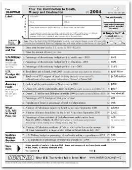
SUSTAIN is an acronym for “Stop U.S. Tax-Funded Aid to Israel Now.” They are:
“a group of women and men who have come together in cities across the country by our responsibility and concern as U.S. taxpayers. We understand that our tax-dollars fund Israeli violations of Palestinian national and human righ.”
They publish the 1040WAR Form, a one-page fact-sheet handout that parodies the IRS’s 1040EZ income tax form and provides information about U.S. support for Israel. Download the PDF. Sources for the information on the form are available here.
page 1 2 3 4 5 6 7 8 9 10 11 12 13 14 15 16 17 18 19 20 21 22 23 24 25 26 27 28 29 30 31 32 33 34 35 36 37 38 39 40 41 42 43 44 45 46 47 48 49 50 51 52 53 54 55 56 57 58 59 60 61 62 63 64 65 66 67 68 69 70 71 72 73 74 75 76 77 78 79 80 81 82 83 84 85 86 87 88 89 90 91 92 93 94 95 96 97 98 99 100 101 102 103 104 105 106 107 108 109 110 111 112 113 114 115 116 117 118 119 120 121 122 123 124 125 126 127 128 129 130 131 132 133 134 135 136 137 138 139 140 141 142 143 144 145 146 147 148 149 150 151 152 153 154 155 156 157 158 159 160 161 162 163 164 165 166 167 168 169 170 171 172 173 174 175 176 177 178 179 180 181 182 183 184 185 186 187 188 189 190 191 192 193 194 195 196 197 198 199 200 201 202 203 204 205 206 207 208 209 210 211 212 213 214 215 216 217 218 219 220 221 222 223 224 225 226 227 228 229 230 231 232 233 234 235 236 237 238 239 240 241 242 243 244 245 246 247 248 249 250 251 252 253 254 255 256 257 258 259 260 261 262 263 264 265 266 267 268 269 270 271 272 273 274 275 276 277 278 279 280 281 282 283 284 285 286 287 288 289 290 291 292 293 294 295 296 297 298 299 300 301 302 303 304 305 306 307 308 309 310 311 312 313 314 315 316 317 318 319 320 321 322 323 324 325 326 327 328 329 330 331 332 333 334 335 336 337 338 339 340 341 342 343 344 345 346 347 348 349 350 351 352 353 354 355 356 357 358 359 360
[ Back ]
[ Next ]