

Found 3599 matches from 1,400 records in about 0.1113 seconds for twitter or is or lazy.
From the Center for the Study of Political Graphics:
“Carlos Cortez was an extraordinary artist, poet, printmaker, photographer, songwriter and lifelong political activist. His mother was a German socialist pacifist, and his father was a Mexican Indian organizer for the Industrial Workers of the World (IWW), also known as the Wobblies. Carlos was a Wobblie until he died. He spent two years in prison for refusing to “shoot at fellow draftees” during World War II.
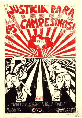 After his release, Carlos took a series of jobs: in construction, in a small imported foods shop, in a chemical factory. He also started drawing cartoons in 1948 for the Industrial Worker, the IWW newspaper, but soon learned to do linoleum block prints.
‘Many radical papers—not having advertising, grants or angels who are rich radicals—operate on the brink of bankruptcy. So Industrial Worker couldn’t afford to make electric plates out of line drawings. I saw that one of the old-timers was doing linoleum blocks and sending them in because the paper was being printed on a flatbed press. I started doing the same thing, and each issue would have one of my linocuts.’
When the price of linoleum became too steep, Carlos started using wood. Used furniture was easy enough to find in any alley. ‘There’s a work of art waiting to be liberated inside every chunk of wood. I’m paying homage to the tree that was chopped down by making this piece of wood communicate something.’ Carlos later became an accomplished oil and acrylic painter, though he always preferred the woodcuts because they were reproducible and affordable.
When the Industrial Worker switched to offset in the 1960s, Carlos began drawing pen-and-ink cartoons. He has also served as editor of the newspaper and on the union’s General Executive Board, and was one of the IWW’s most popular public speakers. In 1985, to commemorate the union’s 80th anniversary, he organized an important exhibition, ‘Wobbly: 80 Years of Rebel Art,’ featuring original works by many IWW cartoonists. Carlos was probably the only IWW artist whose work was exhibited at the Museum of Modern Art in New York. His art is exhibited throughout the United States, Europe and Mexico.
In the 1960s, Carlos married Marianna Drogitis, and in 1965 they moved to Chicago where he became involved with the local Mexican and Chicano mural movement.
‘I’ve always identified myself as a Mexican. I guess this was a result of my early years in grammar school. Even though I resembled my German mother more than my Mexican father, being the only Mexican in a school full of whites made me mighty soon realize who I was. But it was my German mother who started my Mexican consciousness. She said, “Son, don’t let the children at school call you a foreigner. Through your father you are Indian, and that makes you more American than any of them.”’
Inspired above all by the work of José Guadalupe Posada, printmaker of the Mexican Revolution, and the German expressionist Käthe Kollwitz, Carlos blends the techniques and styles of the German expressionists with themes from the ancient Aztecs and modern Chicanos. He made countless images support striking workers, from miners in Bolivia to farm workers in California, though he is best known for large linocut poster-portraits of activists and labor organizers such as Joe Hill, Ricardo Flores Magón, Lucy Parsons and Ben Fletcher.
‘After some 40 years of construction labor, record salesman, bookseller, factory stiff and janitor, I no longer punch a clock for some employer and have entered the most productive phase of my life where I do what I want to do and not what some employer wants me to do for him... As I keep working out ideas, I keep getting more ideas. So I’m going to go out kicking and screaming.’
He passed away last month in Chicago at age 81.
CSPG has posted a couple of images.
See also this interview and remembrance.
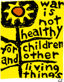 In 1965, Lorraine Schneider, an activist and mother, created the original art for “War is Not Healthy.” She entered the 4" by 4" print into a design contest. Her image was seen as too simplistic and did not win.
In an introduction to a book of Schneider’s art work, Barbara Avedon wrote:
“On February 8, 1967, fifteen friends met at our house to discuss ‘doing something’ about the war in Vietnam. We wanted to do something that would communicate our horror and disgust to our elected representatives in one concerted action. We were not ‘bearded sandaled youths,’ ‘wild-eyed radicals’ or dyed in the wool ‘old line freedom fighters’ and we wanted the Congress to know that they were dealing with an awakening and enraged middle class — voters, precinct workers, contributors. We decided to send a Mother’s Day card to Washington. We would print and distribute one thousand — one thousand letters of protest that said in a very ladylike fashion:
For my Mother’s Day gift of this year,
I don’t want candy or flowers.
I want an end to killing.
We who have given life
must be dedicated to preserving it.
Please talk peace.
Lorraine had given our family an etching of ‘Primer’ some months prior to that meeting. Its eloquent, irrefutable, sunflower truth said it all for us. I called Lorraine and asked if we could use ‘Primer’ on the face of the card. She said, yes, and one thousand became two hundred thousand cards. And because of her genius Another Mother for Peace was born.” [source]
Another Mother for Peace was founded to “educate women to take an active role in eliminating war as a means of solving disputes between nations, people and ideologies.”
The overwhelming success of the Mother’s Day card led to the creation of the AMP newsletter, filled with anti-war editorial and reports on the stances of lawmakers on issues related to war and peace. Each newsletter contained a number of action items called ‘Peace Homework’ that encouraged readers to make their voices heard by organizing, educating and communicating with other citizens and their elected representatives.
Thirty-six years later, concerned about the human costs of America’s “war on terror” Joshua Avedon, Barbara Avedon’s son, and Carol Schneider, Lorraine Schneider’s daughter, began to consider — separately — how to revive AMP.
Schneider’s image has become an international icon for the anti-war movement. Supporters of Another Mother for Peace display the image around the world. A simple yet powerful statement of conscience, the sunflower logo helped make Another Mother for Peace a visible anti-war voice.
In cooperation with Another Mother for Peace, the Center for the Study of Political Graphics has reproduced the War is Not Healthy poster, the first edition available since the Viet Nam War. Stickers, pins, and other materials are avaialble from Another Mother for Peace.
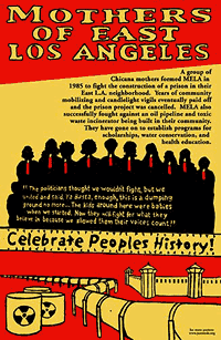 The Celebrate People’s History poster series is a series of linocut and silkscreen prints on important moments in ‘people’s history:’
“These are events, groups, and individuals that we should celebrate because of their importance in the struggle for social justice and freedom, but are instead buried or erased by dominant history. Posters celebrate important acts of resistance, those who fought tirelessly for justice and truth, and the days on which we can claim victories for the forces of freedom. In the past 5 years over a dozen posters have been produced on a variety of subjects, from the Battle of Homestead to Fred Hampton, Malcolm X to Jane, an underground abortion collective.”
The posters appear in storefront windows, homes, and classrooms, and are wheatpasted by street teams to public spaces around the U.S.
Nearly seven years old, the project has also created a loose network of artists interested in creating radical public art and showcasing the work of unknown artists who want to create art that is functional, carries a social message, “and doesn’t get buried at the bottom of the heap of the capitalist ‘art world.’”
Images are visible here and on this brief interview with Josh MacPhee one of the organizers.
The project is always looking for new artists to design posters, so if you or anyone you know might be interested, just get in touch.
See also this post on the Northland Poster Collective Posterfolio.
An article of mine is running in January/February 2005 issue of Communication Arts.
If any of you were wondering what all that Nixon bit on the Federal Design Assembly was about, it was background research for this.
Guns, Butter and Ballots
Citizens take charge by designing for better government
What did the President know and when did he know it? In April 2004, the White House declassified one of the President’s daily intelligence briefs issued just a month before September 11, 2001. The brief specifically states that Al-Qaeda and Bin Laden were planning attacks on the United States with hijacked airplanes.
Graphic designer Greg Storey was horrified. Not just because the information was all right there, but by the design. It’s no wonder the information could be ignored. The document is an uninflected, grey mash of sans serif type. Might thousands have been saved if the information design had been better?
“Nothing in the text is emphasized, making it difficult to scan,” Storey noted on his Weblog. “It would be much better if keywords, names and places were in bold and/or in a different color. Make it so that within seconds the President can see how serious of a threat it is.” Mouse in hand, Storey created a redesigned brief of his own (below right), adding a larger headline, highlighted key terms and, most prominently, a large colored number indicating the level of the threat.
Though no one in government ever contacted Storey, readers of Storey’s blog clamored for a document template they could use themselves. He dutifully responded. (Visit http://airbagindustries.com/archives/002868.php.) “My intentions were nothing more than to rant about what I saw to be a problem with how our government works day to day,” he wrote. “I thought I would spend a few minutes in front of Photoshop to see what I could come up with.”
Alas, President Bush does not actually read the daily briefs, the Director of Intelligence summarizes them to him out loud. Nonetheless, Storey’s redesign is a dramatic example of how information design might affect the government and the public.
But the truth is, graphic designers across the country are already hard at work collaborating with local, state and national government officials to harness the power of design in the public interest. Their work affects the lives of millions of Americans by improving public safety, promoting public health and facilitating democracy on a massive scale — often at the initiative of the designers themselves.
That government agencies use graphic design is nothing new. From posters to packaging, identity and, of course, forms, the federal government is one of the largest purchasers of design services in the world. But much of this work is less than inspiring — even obscure or downright misleading. For a variety of reasons, government designers may be stifled by bureaucrats and lawyers. And sometimes it seems like the lawyers and bureaucrats do the designing themselves.
The late 1960s and 1970s, however, saw a number of seminal graphic design projects sponsored by the U.S. Government. To name just a few: Vignelli Associates’s graphic standards for National Park Service publications; Danne & Blackburn’s NASA “worm” logo; and Chermayeff & Geismar’s logos for the Park Service, Environmental Protection Agency and U.S. Bicentennial.
Continuing a wave of public art initiatives at the time, Richard Nixon even asked Congress to triple the budget of the National Endowment for the Arts and created the Federal Design Improvement Program to help upgrade government architecture and graphics.
But by the end of the 1970s, faced with an energy crisis and an economic recession, the new leadership shifted the government’s priorities. By the 1980s, a backlash raged against public arts funding. Budgets were cut and interest in public design projects waned.
Still, during this period, two masterpieces of modern infor- mation design were developed, both of which have had a demonstrable impact on public safety.
Burkey Belser’s company usually designs communications materials for law firms and other services companies. But in 1978, he was asked to design the EnergyGuide label for the Federal Trade Commission. The frustrated regulators had become desperate after a top-shelf New York design firm had failed — and submitted a hefty bill in the process. The EnergyGuide that Belser designed is a bright yellow informational sticker that must be displayed by retailers on all major appliances (like air conditioners, refrigerators and washing machines). The Guide shows the estimated yearly operating cost and energy consumption on a scale from least to most efficient. Consumers actually used it to consider not just purchase price, but cost over the life of the appliance. The success of the label convinced government regulators that you could modify consumer behavior through clear, friendly information design, gently pushing them towards more environmentally friendly, if slightly more expensive, purchases. Multiplied by millions of refrigerators, the energy savings have been enormous.
Belser’s 1994 redesign of the Nutrition Facts label also attempts to influence consumer decisions. But the label, the most widely reproduced graphic in the world, very nearly had no designer at all.
In 1991, Congress mandated that the science behind the label be revisited. Originally developed in the 1960s, the previous label was based on a culture of famine during the Great Depression and two World Wars. Hunger was an epidemic. Food was scarce and the country lacked an interstate highway system to move fresh fruits and vegetables to market. The government’s priority in the first label design was to fend off malnutrition, rickets and scurvy, and so the label highlighted essential vitamins and minerals. In 1991, Congress realized we were living in a different culture — a culture of plenty...and of fat. They tasked the Food and Drug Administration (FDA) to develop a new labeling scheme to fend off an epidemic of obesity.
The Center for Food Safety and Applied Nutrition at the FDA was well equipped with top scientists, nutritionists and epidemiologists, but lacked experience in public communication. The Center had hired another big New York design firm, but was dissatisfied with the results. And so they prepared to go it alone.
Sharon Natanblut had a background in marketing and public relations, and had just started at the FDA as advisor to the Commissioner for strategic initiatives. When she found out that the scientists were designing the label themselves, she intervened. “The scientists saw graphic design as a trivial thing,” she recalls. “They thought more information is better. But ultimately, it is the design that helps you understand it.”
Natanblut knew Belser from his work on the EnergyGuide and knew he could communicate with both scientists and government officials, and would ensure that the design reflected the goals of the project.
Belser offered to do the job for free (though was able to charge for some expenses.) “If ever there was a call for pro-bono work,” says Natanblut, “this was it.” Belser comments, “Designers should really take on public projects as a part of citizenship. That’s why we did it. How often do you get a chance to affect so many people? Anyway, I didn’t want to mess with the government procurement process at the time.”
Belser and his staff put in countless hours and, after designing 30 variations, learned there is no such thing as a universal symbol. They found that literacy is more complex than they had imagined. The label had to be accessible to both poor and fluent readers. They found that poor readers stumbled over commas, dashes and semicolons, and that graphs, icons, pie charts are more sophisticated than they’d thought, requiring a relatively high degree of visual literacy. In focus groups and in public comment, designs that used these elements were slaughtered.
Eventually Belser and his team developed the current layout. The generic and anonymous looking design is anything but. The placement and grouping of information and the use of boldface create a visual hierarchy. To combat increasing obesity, the new design highlights calories, fat and cholesterol. And the resulting label is used by health-conscious shoppers to count calories and monitor their cholesterol intake. As former FDA Commissioner David A. Kessler recalled, “The nutrition facts label has within the space of a few years become a standard that many Americans use to make basic decisions about their diet and nutrition.”
The apparent lack of “marketing devices” is also misleading. The space is branded with a kind of “look of truth” — neutral, scientific, institutional and authoritative.
Nonetheless, obesity continues to rise at a dangerous rate — fast becoming the number one cause of death in the United States. In response, Belser is currently working with concerned advisors to government to further modify the design.
One might argue that it’s not the government’s place to interfere with people’s behavior or engage in “social engineering.” Belser responds, “I don’t think that there’s any government, corporation, or anybody that is not trying to influence somebody else. We have a Constitution and body of laws that say certain areas are off limits...But what the government is willing to do, and what, I believe, has a perfect right to do is to manage issues of public health and safety.”
Citizen action
The Nutrition Facts and EnergyGuide labels show the reach of government sponsored information design. Recently, however, the design process seems to be shifting.
Whether designers are tired of commercialism or were awakened by the 2000 butterfly ballot fiasco, there seems to be increasing interest in civic engagement. As portrayed in the 2000 reissue of the First Things First Manifesto and the AIGA’s recent Voice conference, designers are increasingly thinking about social responsibility and looking for ways to get involved.
In fact, several recent government design projects have been driven from the bottom up rather than the top down. Redesigns of the 2000 census, voting materials, New York City’s ubiquitous choking victim poster and the 1040 tax form were all initiated by designers themselves. In some cases starting out as class projects.
From the American Institute of Graphics Arts:
“AIGA and Worldstudio Foundation will collaborate on a number of projects in 2005.
 ‘Design Ignites Change,’ a new joint initiative of AIGA and Worldstudio Foundation is an annual program in which members of the design community across the country work individually or in teams to create together some kind of visual artifact that will have broad visibility in our communities; that will be seen as a way to emphasize the value of design by doing something valuable to the community; and that will stimulate thought, dialog and action.
The goal is to showcase the projects in a traveling exhibition with a companion book or publication that will demonstrate the impact they had in their respective communities.
We are currently seeking designers’ input on what the program should address through a short online questionnaire.
Please take just a few minutes to share your thoughts before Friday, February 11.
While project parameters are still in development, certain criteria will be important, whatever final form the program may take: the program will be nationwide, annual, should include nonprofessionals and/or young people and program themes should be topical, current and politically nonpartisan.”
While it’s great that the AIGA is compiling a collection of graphic work for social change, it’s a shame that it’s so isolated from the rest of their work. For instance, there wasn’t much at all on social change in the results of their annual competition. Just think what an engine for progress the AIGA could be if they required (or even just awarded bonus points) for printed entries submitted recycled paper, printed with non-toxic, sustainable practices.
These types of things also tend to recognize work that other designers like rather than what works best for the client or issue. But if the resulting publication inspired a designer or student or two to take on a project in the public interest, that’d be a fine thing indeed.
And while the AIGA is a 501(c)(3) non-profit corporation and can’t endorse candidates or lobby too much, the whole “politically non-partisan” thing seems increasingly like a firm vote of approval for the status quo and its consequences. Now more than ever.
In any case, it’s hopefully a full first step towards a broader embracing and encouraging design in the public interest. And it’s nice that they are open for comments. Go tell ‘em what you think.
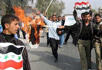
“Iraqi policemen burn election posters of Interim Prime Minister Allawi, as they rally through the streets of Najaf, some 160 kilometers (100 miles) south of Baghdad, Monday, Jan. 17, 2005. Policemen demanded their salaries for last several months. (AP Photo/Alla al-Marjani)”
How quickly propaganda is turned on itself.
Those political symbols, even for specific elections, don’t just rally the base — they reach far beyond their borders.
For instance, elections in Kyrgyzstan take place next month.
Kyrgyz Leaders Eye Ukraine Nervously, December 21, 2004:
“Speaking at a conference on democracy in Bishkek, [President Akayev] warned that no ‘colour’ revolutions would be permitted in Kyrgyzstan, referring to Georgia’s ‘rose revolution’ which brought down President Eduard Shevardnadze in November 2003, and the recent post-election turmoil in Ukraine, where Yuschenko supporters wore distinctive orange scarves.”
“Kyrgyz opposition responds to President Akayev’s warning of possible coup,” December 22, 2004, BBC Monitoring Central Asia:
“The united opposition in Kyrgyzstan denies the suggestion that it has ties to the West and does not believe that any revolutionary scenarios will be played out during the parliamentary election campaign. The deputies representing opposition parties and movements in Kyrgyzstan’s parliament even issued a lengthy statement to assure the public that they ‘do not applaud the events occurring in Ukraine’ and that they are not planning to organize a ‘tulip revolution’ in Kyrgyzstan, because ‘it could cause disparities in the country’s system of government’. Furthermore, the statement underscored the opposition’s intention to prevent any kind of outside intervention in the electoral process in Kyrgyzstan.”
KYRGYZINFO, January 13, 2005:
“President of Kyrgyzstan Askar Akaev urged the population of the republic to oppose the provocateurs and exporters of ‘velvet revolutions’. This was stated in his address to the people, to the parliament, to the government, to representatives of international organizations, to accredited diplomats and journalists.”
“Kyrgyz youth movement says no to ‘export of revolutions,’” January 18, 2005, BBC Monitoring Central Asia:
“The leader of the KelKel youth civil movement said: ‘Lemon is our symbol. We have chosen the lemon colour. We are against a party of the orange orange [Russian: oranzhevyy apelsin]. We are against the export of revolutions from abroad. We want to build our house on our own. We want to live in a sovereign and independent state.’”
Could this be the end of the one-color state?
Reader Kristin from Minneapolis writes:
 “Yesterday I joined a picket line for a local laborers’ union that is on strike against the Minneapolis Public Housing Authority and I saw one of our newest tools: the local Teamsters have a huge semi truck trailer that they drive up and park near picket lines. This one was brightly lit with labor support banners and some Xmas lights. Absolutely necessary this close to solstice when at 7 a.m. the city is still pitch dark.
Back during the Hormel strike in the ‘80s, labor supporters ‘used’ trucks at picket lines, but they were the kind that would ‘suddenly’ break down in front of the plant gates and take a while to be used. This is a new twist on that idea, I think.
A quick search on the web netted me this image from Denver.”
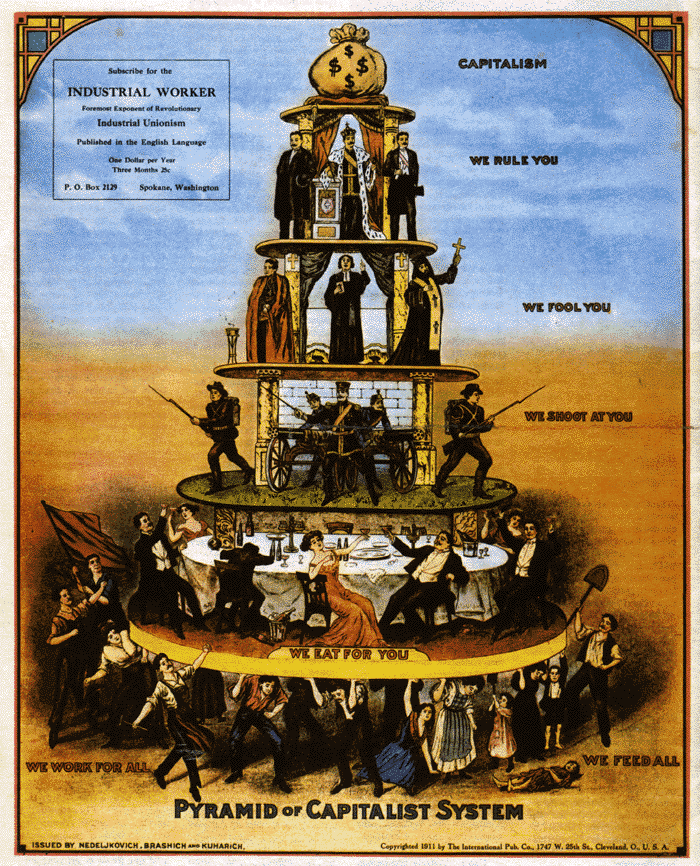
Pyramid of Capitalist System, issued by Nedeljkovich, Brashich, and Kuharich in 1911.
Just one of the graphics available at http://www.iww.org/graphics/
The United Nations Office for Project Services currently seeks a graphic designer and cartoonist to facillitate elections in Kabul, Afghanistan.
“The Afghan Government has announced the holding of elections for Parliament in July 2005. The Joint Electoral Management Body (JEMB) consists of Afghan Electoral Commissioners, UN appointees, and the Secretariat of the JEMB supported by UNOPS who are responsible for the electoral process.�
“Under the supervision of the Chief of Public Outreach and the Senior Designer the incumbent will be expected to work with the team to conceptualize, design and produce nation wide print campaigns for civic education, voter registration, training and elections. These materials will be produced in English, Dari and Pashto. The materials will include posters, brochures, flip charts, manuals and other printed materials. Specific tasks include: �
- Working with Public Outreach officers, training and procurement officers and senior designers to conceptualize the print campaigns.
- Design and layout print materials in Quark Xpress, Photoshop, Illustrator and Word.
- Design and layout Dari and Pashto versions of printed materials.
- Provide illustrations for designs where needed.
- Assist in providing direction and assistance to local artists/illustrators.
- Prepare materials for printing.”
Cartoonist:
“In close consultation with the Chief of Public Outreach, Civic educators and the Senior Designer from the Graphic Design Unit and the National Illustrators the incumbent will be expected to undertake the following tasks:
- To work as a team member to develop the concepts of print materials for Civic Education, Public Information and Training.
- To execute initial cartoons/illustrations and revise for flip charts, posters, leaflets, newspaper cartoon strips and inserts, booklets and other print materials as needed.
- To attend National focus groups and meetings to ensure the intended message is easily understood.
- To work with the National Illustrators in developing these cartoons/illustrations into final art.
- To provide direction and assistance to local artists/illustrators.
- To work with Graphic designers when creating final art to ensure the illustrations work with the intended print materials.”
The deadline for applications is January 7, 2005.
Funny, I wonder why the UN can’t find local a designer willing to support the election.
page 1 2 3 4 5 6 7 8 9 10 11 12 13 14 15 16 17 18 19 20 21 22 23 24 25 26 27 28 29 30 31 32 33 34 35 36 37 38 39 40 41 42 43 44 45 46 47 48 49 50 51 52 53 54 55 56 57 58 59 60 61 62 63 64 65 66 67 68 69 70 71 72 73 74 75 76 77 78 79 80 81 82 83 84 85 86 87 88 89 90 91 92 93 94 95 96 97 98 99 100 101 102 103 104 105 106 107 108 109 110 111 112 113 114 115 116 117 118 119 120 121 122 123 124 125 126 127 128 129 130 131 132 133 134 135 136 137 138 139 140 141 142 143 144 145 146 147 148 149 150 151 152 153 154 155 156 157 158 159 160 161 162 163 164 165 166 167 168 169 170 171 172 173 174 175 176 177 178 179 180 181 182 183 184 185 186 187 188 189 190 191 192 193 194 195 196 197 198 199 200 201 202 203 204 205 206 207 208 209 210 211 212 213 214 215 216 217 218 219 220 221 222 223 224 225 226 227 228 229 230 231 232 233 234 235 236 237 238 239 240 241 242 243 244 245 246 247 248 249 250 251 252 253 254 255 256 257 258 259 260 261 262 263 264 265 266 267 268 269 270 271 272 273 274 275 276 277 278 279 280 281 282 283 284 285 286 287 288 289 290 291 292 293 294 295 296 297 298 299 300 301 302 303 304 305 306 307 308 309 310 311 312 313 314 315 316 317 318 319 320 321 322 323 324 325 326 327 328 329 330 331 332 333 334 335 336 337 338 339 340 341 342 343 344 345 346 347 348 349 350 351 352 353 354 355 356 357 358 359 360
[ Back ]
[ Next ]