

Found 3599 matches from 1,400 records in about 0.0956 seconds for twitter or is or lazy.
Two months before Bloomberg and his Office of Long Term Planning and Sustainability rolled out PlaNYC 2030, London’s Mayor Ken Livingstone released his own 148-page report called the Climate Change Action Plan. The two documents are strikingly similar in approach and have been applauded by environmental and business leaders alike. Yet there is at least one conspicuous – and significant – difference between the London and New York reports. The London plan devotes a full section to commercial and institutional buildings – analyzing in minute detail their energy use, recommending ways to improve efficiency and outlining various regulatory measures intended to force the commercial sector’s hand. New York City’s report, however, has no such section.”
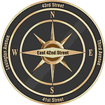
 Folks reading my most recent post about the New York City’s implementation of the compass rose by subway exits may have thought the Department of Transportation took its inspiration from my blog. Not so.
I came up with the idea in conversation with out-of-towner Micah Anderson over dinner with the folks from Eggplant Active Media back on March 4, 2006 and later posted it to this blog.
Graffiti roses showed up near downtown exits three weeks later, though I was never sure if my post inspired this. After kottke.org picked up my link, I received this email:

hey man,
i am NOMAD, I have been doing the compass rose graffiti, someone just showed me your post on it,
great minds think alike....
However, while this was all in March 2006, last week’s New York Times article on the DoT’s 2007 implementation of the compass, cites the new transportation commissioner who says she got the idea from “an Upper East Side man who was among about 20 New Yorkers quoted in The New York Times in January 2006 in an article about practical ways to improve the city.”
 But wait, there’s more!
After my post about the official NYC rose was picked up by a couple of blogs, I received an email from Mary Ciuffitelli who says she proposed the idea publicly back in 1992:
Hey John,
I like your website and design, but I have some news for you.
In 1992, I received an award from The Municipal Art Society for this compass rose idea. MAS ran a big competition called Design New York. There were seven winners out of 1500 entries, followed by an exhibit, an awards ceremony, a lot of press (including the New York Times), NBC TV News interviews, etc. I have my original sketch, award letter, ceremony program, tape of the TV interview, all the documents.
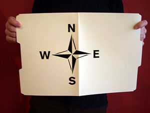
Fifteen years ago, there was talk of the city implementing the idea. In the meantime, friends and I talked about going guerrilla and just spray-painting compasses all over the subway system. I wish we had. I was working at a design studio back then, and there was plenty of enthusiasm. We designed a stencil for our plan based on the floor compass in the subway at Grand Central Station. If I keep digging through my stuff, I’ll find that drawing as well.
There were some pretty great ideas that came out of that contest. (Including a submission very close to mine.) Time to look back before setting down the history. This NY Times article boils down my idea to one sentence, but my submission included slightly more elaborate suggestions to reflect neighborhood character and landmarks.
Designing a Better New York, September 24, 1992 http://query.nytimes.com/gst/fullpage.html?res=9E0CE7DA1F3BF937A1575AC0A964958260
Since it looks like the idea is on the brink of becoming a permanent part of New York City design, I would like to set the record straight. Maybe you’d like to help me.Yours in brilliant ideas,
Mary
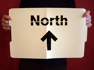
In the meantime, the folks at the Eyebeam OpenLab and Graffitti Research Lab generously let me use their laser cutter to produce a couple of stencils. I have 20 compass roses and 20 North arrows. Want to help put this up?
Send your postal address and PayPal me $2.00 for first class postage and I’ll send you one.
A year ago, I received an email from “Tony:”
“I have looked all over the web, and just can’t find the simple themes that can be posted to the back of poster board or foam board and used at street vigils. I just need simple stuff for 11 by 17 AND 8 1/2 BY 11 COPYING.
Can you help? The power of one or two people in public holding simple antiwar protest messages is great. I just can’t find anything on the net that isn’t too artsy-fartsy, or too damn pacifist-wimpy.”
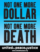
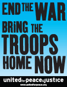
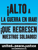
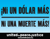
I smacked into this “artsy-fartsy” factor again a few weeks ago when United for Peace and Justice asked if I could turn out some poster designs on short notice. They sent their final copy and I set to thinking about how to represent things iconographically in a beautiful, compelling way. I rummaged through the usual toolbox (coffins, dollars, boots, ribbons, etc.) as well as play with color and typographic notes (big X’s, oversized punctuation, etc.) One slogan in particular raised an interesting problem: how to graphically represent “community” for marches in eleven very different cities.
Nevertheless, over the weekend’s iteration the org requested the gradual removal of all imagery, iconography, and embellishment. I was trying to do something graphically interesting to myself, but the group had a very specific use case in mind. The posters were not intended for pasting on the street, to attract passersby with flourish, humor, or imagery. They wanted something to be carried high and read from a distance, particularly when reproduced in photos, newspaper clippings, or seconds-long TV news highlights. As such, these were props to represent the march in memory as much as in person, to disappear and punch the message through network editing and newspaper cropping. The simpler and bolder the better.
With a little more time I would have refined these further, but here are the results below. Click on a thumbnail to download a printable PDF.


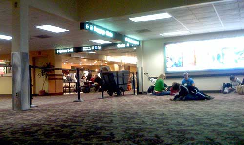
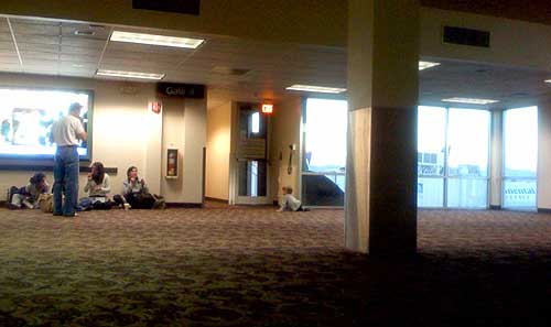
Gate 4 in Terminal 2 of Sky Harbor International Airport in Phoenix, AZ is not meant to be used.
Behind the black stanchions, the roughly 50 x 50 foot space has no TV, no gift stand, no seats; just a row of outlets, a few windows, and a single column supporting the mostly uninterrupted, open space. Which of course makes it a perfect space for kids to wrestle and run, for strollers to park, and for bloggers to plugin their laptops and cellphones and lounge on the floor for a few restful minutes. It’s just a big, empty playroom — and a breath of fresh air, particularly after standing in line for an hour, when your departure gate is crammed, and you’re about to spend the next 5½ hours of your life hunched over your knees in steerage.
I suppose it only works because the space was relatively uncrowded — the black ropes keeping most out, but having no affect on those who toddle right under them, or the rest whose craving for free electricty overrides the risk of a stern talking to. The space probably would not have worked if this were an actual functioning departure gate. I suppose all the rigid rows of plastic seats are a good way of making sure luggage and bodies don’t collide.
But it seems like a fine idea — a sort of indoor, public park. I wish more places had uninterrupted, unstructured, uncommercialized open space. More airports should do this.
On September 21, 2006 the Art Director’s Club convened a panel discussion on design and social change. They dubbed it “Designism.”
When I first heard about it, I was not optimistic. I’ve been disappointed before by how professional associations have addressed social design, and the MP3 sat on my desktop for a long, long time. After all, how radical could a professional association actually be when its bread-and-butter is mammon itself?
But after finally listening, I was very nicely surprised. The talk covered a nice, broad range of approaches to design for social change: from Milton Glaser’s big-table, middle-of-the-road approach to Jessica Helfland’s quiet collaborative engagement to James Victore’s more autonomous guerilla style.
But the best surprise of all was George Lois. I’d always loved his work. Those big, provocative Esquire covers are truly classic. But it was a special treat to learn of the progressive motivation behind them, that the man himself was an foul-mouthed, outspoken leftist — and a veteran to boot.
The event and podcast launched a number of bloggy responses and inspired a project or two.
A year later, when asked about a follow up event, Glaser responded: enough talk. This one should be a call to action. Designism 2.0 took place on December 13, 2007.
It’s not just rising costs or a lack of funds: “Infrastructure repairs simply aren’t as sexy as ribbon-cuttings. The public and politicians are more likely to support new construction, leaving existing structures wanting.”
An article of mine is running in the Design Issues column of the January/February 2008
Communication Arts. It started out as a piece about design education outside of traditional design schools, but then turned into something more — about grassroots engagement with public space and the power of design to envision change. Thanks Nicolas, Kim, Chris, David, and DK for their insight.
The Vision Thing
Seeing and creating change through design
It’s is not just in design schools. It’s not just in mentorship programs at top shelf firms. Design and education meet in the streets.
Most graphic design education points to a career as a design professional. But the same tools we use to undertake user research, solve problems, and satisfy clients can be used by young people to voice their opinions and meet the needs of their neighborhoods and communities.
The stories below are shining examples of design as populism. The designers of these projects – amateurs and professionals – have moved beyond a passive relationship to the world, beyond the daily pattern of serving clients, responding to assignments, and deadlines.
By taking it outside, they are asserting a positive vision and owning the spaces they live in – and in the process are making these places better for us all.
Human Traffic
Memorials shape our collective memory. They are a tangible, public stake against forgetting, a manifesto to the present and a reminder of the past as a warning for the future. Put forth by loved ones after a tragedy, grassroots memorials are at once both personal and public – often filling a void where government-funded memorials leave off. Some are subtle collections of flowers and personal items, occupying quiet corners of common space. Others scream out for attention. Rendered three-stories tall on the side of a building, the memorial mural on Butler Street and Third Avenue in Brooklyn is hard to ignore.
The design is a tribute to 28 pedestrians killed by cars between 1995 and 2007 in the streets of Brooklyn’s Gowanus neighborhood. The mural depicts three young boys, fifth-graders Victor Flores and Juan Estrada, and 4-year-old James Rice. All three were killed by cars speeding around corners – Rice was struck down just a block from the spot where the mural now stands. The driver who hit Rice got a ticket for failure to yield. Represented as towering figures painted in ghostly blue, the boys hold up redesigned streetsigns with traffic-related symbols urging respect for pedestrians. The three boys are accompanied by a blank silhouette holding up an unambiguous red stop sign declaring: “Not one more death.” The effect is chilling.
page 1 2 3 4 5 6 7 8 9 10 11 12 13 14 15 16 17 18 19 20 21 22 23 24 25 26 27 28 29 30 31 32 33 34 35 36 37 38 39 40 41 42 43 44 45 46 47 48 49 50 51 52 53 54 55 56 57 58 59 60 61 62 63 64 65 66 67 68 69 70 71 72 73 74 75 76 77 78 79 80 81 82 83 84 85 86 87 88 89 90 91 92 93 94 95 96 97 98 99 100 101 102 103 104 105 106 107 108 109 110 111 112 113 114 115 116 117 118 119 120 121 122 123 124 125 126 127 128 129 130 131 132 133 134 135 136 137 138 139 140 141 142 143 144 145 146 147 148 149 150 151 152 153 154 155 156 157 158 159 160 161 162 163 164 165 166 167 168 169 170 171 172 173 174 175 176 177 178 179 180 181 182 183 184 185 186 187 188 189 190 191 192 193 194 195 196 197 198 199 200 201 202 203 204 205 206 207 208 209 210 211 212 213 214 215 216 217 218 219 220 221 222 223 224 225 226 227 228 229 230 231 232 233 234 235 236 237 238 239 240 241 242 243 244 245 246 247 248 249 250 251 252 253 254 255 256 257 258 259 260 261 262 263 264 265 266 267 268 269 270 271 272 273 274 275 276 277 278 279 280 281 282 283 284 285 286 287 288 289 290 291 292 293 294 295 296 297 298 299 300 301 302 303 304 305 306 307 308 309 310 311 312 313 314 315 316 317 318 319 320 321 322 323 324 325 326 327 328 329 330 331 332 333 334 335 336 337 338 339 340 341 342 343 344 345 346 347 348 349 350 351 352 353 354 355 356 357 358 359 360
[ Back ]
[ Next ]