

Found 3599 matches from 1,400 records in about 0.1240 seconds for twitter or is or lazy.
“Euskara - which means Basque in the Basque language - refers to all kinds of characters you can find in the Basque country. Indeed each of the seven French and Spanish Basque provinces has its own geographic and cultural characteristics. For instance, those who live on the seaside - itsasoan - differ from those who live in the mountain - itsasmendi. These differences can also be felt from one valley to the other.”
Modern Basque nationalism emerged at the end of the 19th century, marked by the formation of the Basque Nationalist Party in 1895. Part of the political and cultural program of the Party was a revival of a unified Basque language. And related to this was the celebration of a distinct Basque typography.
 In 1888, Louis Colas, a schoolteacher from Baiona, begin his travels across the Basque countryside on muleback on documenting ancient Basque monuments. Colas published his research in a large, heavy volume which cost him a fortune. It initially attracted few readers.
The volume, though:
“is a genuine encyclopedia with more than 500 rough sketches and about 30 photos, tracing monuments and works since lost or destroyed. Unfortunately today, too few originals - some of them in a poor state - can be consulted as unquestioned references to the matter.” [source]
The Basques inherited their method of representing the sounds of language by literal symbols from the Romans.
“At that time, the Basque engravers knew very little about the Roman ironworks technique; their rough tools couldn’t carve deep characters like in the sculptures coming from Rome. So, instead of carving deeply, they scraped the stone around the characters which thus stuck out, creating a new technique. This explains why the Basque letters can hardly resist the passing of time: five-century-old engravings have been rubbed out, for the most part.
Moreover, very few people — such as old families of engravers — could write as well as engrave: such a treasure was to be kept secret. This explains the variety in the Basque characters. Not only did the children inherit the technique from their parents, but they also inherited the family mistakes: sometimes in a village, you may find the same misprints on the old houses fronts. The most powerful family in a valley also caught hold of all the written works. Still today, there are shapes in the carved stone which can be found only in some valleys; and it is the same for the ‘pelote Basque’, the rules of which varied according to the valleys which were the (mass) media of the time!” [source]
Later influence of the continental Celts was felt in particular on capital letters A, S, and N, and in the rare lowercase letters b, p, q, and o.
 Despite this influence and other printing fashions, the Roman influence predominates. There is hardly any Basque written work using cursive script. This results in part from the link between Latin and Christianity: almost all early written works in Basque were religious in content.
The Basque nationalist movement was banned and forced underground in 1923 by the Spanish military dictatorship of Miquel Primo de Reviera, but flourished after proclamation of the Second Republic in 1931 and the lifting of the ban.
Despite military uprisings that divided the Basques, following a large scale campaign for Basque autonomy and a plebiscite in 1932, the Government of the Republic granted autonomy to the Guipuzcoa and Vizcaya regions. The first Aberri Eguna was held on Easter Sunday, March 25, 1932 celebrating the Basque homeland, culture and language, and Catholicism.
In the 1930’s printers and foundries lavished much attention on Mr. Colas’s book which encouraged Euskara’s revival.
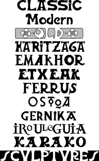
“Euskara consists of large-footed, big-eyed, Roman-styled characters. (See Some Different Basque Letters). You should not use them for a whole text because it would give a sensation of thickness: they were used on mortuary epitaphs and fronts of houses, mostly. The general pattern is rather heavy but the ten existing lowercases makes it look lighter: it seems funny that hardly any lowercase can be found in Euskara, although typically Basque letters can be found (for example, the interpenetrated DE).”
Today Euskara can be found throughout the Basque country on signage, television, newspapers, and packaging.
“Among the various Euskara characters used in offset printing, the LetraSet transfer-types are very well spread, whereas only Spanish printers have still got lead characters. Neuhaus in Hendaye is a worth-mentioning firm: their local roadsigns, printed in Basque characters, help promote tourism. Lately, a young editor from Biarritz has tried to use the Basque culture characters [for computer printing].”
But given its current status as a kind of cultural brand for consumption by tourists and others external to the Basque community, does it still retain a nationalist connotation to the community itself? Or has it become depoliticized, commodified, and folkloric?
Thierry Arsaut designed the fonts displayed above.
From Paul Shaw, “Fascism on the Facade,” in Print, May/June 2004:
 “Tourists may be unaware that Fascist architecture — fountains, monuments, public works, buildings — pervades Rome. Non-Italian guidebooks deliberately ignore these structures, and their modernism makes them seem boringly familiar — even at the most ponderous and grandiose — to anyone visiting from another large city. However, there is one thing above all else that separates Fascist architecture from modern architecture: the conspicuous presence of lettering.
Lettering, inscribed and in relief, had always been an integral part of Western architecture until the Modernists, in their drive for purity and functionality, threw it out along with ornaments, and other decorative motifs. In Italy, lettering survived and flourished in Fascist architecture because it served to advertise the regime’s aims and accomplishments.
While the Nazis settled the centuries-old fraktur oder antiqua (blackletter versus roman) debate in favor of the former, the Fascists never had an official policy regarding letterforms. ‘The idea of an “art of the State” was rejected not only by Mussolini and his minister Giuseppe Bottai, but also by all the official representatives of the regime,’ wrote Rossana Bossaglia in Ritratto di un’Idea (2002). Instead, beginning in 1926, the regime spoke of Fascist art as work that interpreted and represented the spirit of the Fascist movement. But no precise style was defined until the late 1930s. Often overlooked and mistaken for lettering of other periods, the visual language of the Fascists still permeates many of Rome’s most historic buildings.”
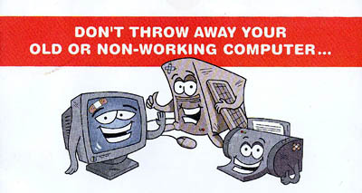
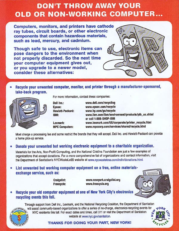
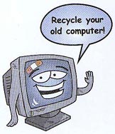
Last week, I was delighted to receive a piece of mail from the New York City Department of Sanitation.
The flyer announced a series of events around the city to collect, refurbish, and recycle old electronics in an environmentally responsible manner.
Electronic devices constitute less than one percent of the NYC waste stream, but the materials are extremely toxic if not disposed of properly.
I know non-profit and volunteer groups hold collection events from time to time, but I almost always find out about them after the fact. The refurbished computers are usually donated or sold to low-income families, schools, and community groups for a nominal fee.
This time, however, the Department of Sanitation itself is sponsoring events in the five boroughs to collect e-waste. Working cell phones are being donated to Collective Good.
The events are jointly funded by Dell and Lexmark and the National Recycling Coalition. The Lower East Side Ecology Center and other community groups are coordinating.
I asked Robert Lange, New York City’s Director of Recycling and Waste Prevention about the events:
SDN: Was this started at the initiative of the City, local groups, or manufacturers?
 Click to view a larger version |
I usually find out these things after the fact. What kind of outreach are you doing?
We sent out the flyer well in advance to every residence in the city, and posted the information on our Web site.
Is this aimed primarily at consumers or businesses or both?
It is aimed at city residences.
Will there be a similar push directed at businesses?
It’s possible.
In things like this, it depends on who picks up the tab. Does the tab get picked up by the businesses that profit from the manufacture and sale of these items? Is the tab picked up by consumers? Is some ways, ultimately, the tab is always picked up by the consumer, either directly associated as a charge with the item when they by it, or indirectly through a tax, to run a municipal program, for example.
In my own estimation, because there is an infrastructure for producing these things and delivering the products to people, it makes sense to use the same distribution network to take them back if possible.
And to some extent, Dell and other manufacturers are doing that. If you look at the flyer or the Web site, there are services currently provided by these companies for taking back computers. In some cases, there’s a nominal charge, in other cases there’s no charge, but it’s services they provide to directly take back computers from consumers after their useful life.
Given the toxicity of materials, is there a chance that the disposal may be regulated legislatively?
There are materials like this in the waste stream that are increasing in volume and they need to be addressed. Whether they need to be addressed by a municipal program or not is something that is still in question.
There are a variety of proposed pieces of legislation, both in our area and in other parts of the country to require that this material be handled in a more responsible manner. Different legislators have different perspectives on who picks up the tab.
My own opinion is that this is something that manufacturers should really be required to deal with. And to some extent they are stepping up to the plate because the funds for these drop-off programs that we are running through community-based organizations are being provided by Dell and Lexmark.
 I don’t know if you are familiar with an organization called RBRC which is for taking back batteries — particularly Nickel Cadmium batteries. It is funded and run by the battery industry. A few years ago, when the industry was facing the potential of severe regulation governing how batteries could be disposed of, all the manufacturers got together set up an informal network to receive batteries from the public. All the Radio Shacks, Staples, and organizations like that take back batteries from the public as part of the network they established. And they did that try to avoid the kind of regulation that was coming down.
I think the computer industry has an even greater incentive to do that, so I expect that what is now fairly informal will become a more formal network in the future. Either that or there will be legislation passed.
What are your future plans?
This is something of an experiment. As I said, the funds are being provided by Dell and Lexmark. Whether they will continue to provide funding... they have not made a long range commitment to that effect.
The collections will run through the fall. How we go forward will depend on the amount success we have. Events like this have been run in the City before and the average tonnage of computers and electronics received per event is approximately 10 tons. We hope to see exponentially higher numbers because this mailing is going to every household in the City.
For more information, visit the NYC Wasteless Web site.
...
And while we’re talking trash, big up to the Mayor for his plan to ship waste from Manhattan’s 59th Street pier instead of trucking it to Brooklyn and the South Bronx.This should relieve some of the burden from low-income neighborhoods who overwhelming suffer the traffic of the City’s trash.
Manifesto issued by the Union of Technical Workers, Painters, and Sculptors, 1922
“Social, Political, and Aesthetic Declaration from the Union of Technical Workers, Painters, and Sculptors to the indigenous races humiliated through centuries; to the soldiers converted into hangmen by their chiefs; to the workers and peasants who are oppressed by the rich; and to the intellectuals who are not servile to the bourgeoisie:
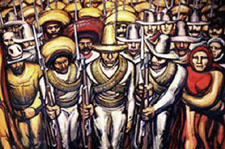 We are with those who seek to overthrow of an old and inhuman system within which you, worker of the soil, produce riches for the overseer and politician, while you starve. Within which you, worker in the city, move the wheels of industries, weave the cloth, and create with your hands the modern comforts enjoyed by the parasites and prostitutes, while your own body is numb and cold. Within which you, Indian soldier, heroically abandon your land and give your life in the eternal hope of liberating your race from the degradations and misery of centuries.
Not only the noble labor but even the smallest manifestations of the material and spiritual vitality of our race spring from our native midst. Its admirable, exceptional, and peculiar ability to create beauty — the art of the Mexican people — is the highest and greatest spiritual expression of the world-tradition which constitutes our most valued heritage. It is great because it surges from the people; it is collective, and our own aesthetic aim is to socialize artistic expression, to destroy bourgeois individualism.
We repudiate the so-called easel art and all such art which springs from ultra-intellectual circles, for it is essentially aristocratic.
We hail the monumental expression of art because such art is public property.
We proclaim that this being the moment of social transformation from a decrepit to a new order, the makers of beauty must invest their greatest efforts in the aim of materializing an art valuable to the people, and our supreme objective in art, which is today an expression for individual pleasure, is to create beauty for all, beauty that enlightens and stirs to struggle.”
David Siqueiros, et al., originally published as a broadside in Mexico City, 1922. Published again in El Machete, no. 7 (Barcelona, June 1924).
English translation from Laurence E. Schmeckebier Modern Mexican Art (Minneapolis: University of Minnesota, 1939), p. 31.
by Neil Kleinman, from Print, July/August 1973:
“Some events attract us because they promise so much of what we want, while making it all seem relatively easy to get. We would like to live in buildings that do not breed slums we would like to live in cities that have parks, promenades, and quiet open spaces; we would like to read forms, applications and booklets regulations and be able to make sense of them. We would like to drive down roads and know where we are, where we are going, and where to turn off. Such needs seem reasonable.
To most of us, it has been clear that the general performance of the government in these areas of design, architecture and planning has been unsatisfactory. Each of us can think of his own favorite monstrosity. Some of the things designed by the federal government, like the income tax forms or the brochures explaining Social Security benefits, simply baffle us. Some of them, like the Sam Rayburn building, are so ugly that they have achieved an almost mythic universality virtually becoming archetypes for what ugly is.
The First Federal Design Assembly held in Washington last April 2nd and 3rd [1973] was an attempt to set some of these federal sins aright... The purpose of the Assembly was to begin the process of showing federal administrators that ‘good design is good government’ — a rather pleasant truism if a bit unsettling in these times of political PR and managed news.”
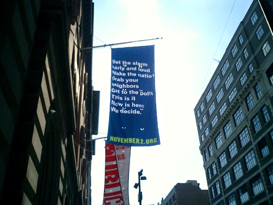
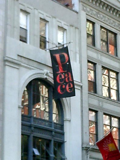
Walking around downtown, I’m noticing a number of businesses flaunting their politics. Below are a few random snapshots.
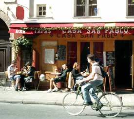
In New York City, where registered Democrats outnumber registered Republicans by 5 to 1 it probably does not harm your business much to wave a Democratic flag.
But what’s notable is that these banners do not seem to be branding or trying to create a niche. I don’t think these businesses are trying to position themselves as responsible corporate citizens. It seems more like someone wearing a political pin, though for each the context is a bit different.
Click on a thumbnail to view a larger image.
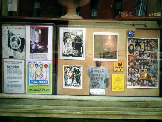 Via Della Pace, Italian café The T-shirt reads “Romani Contro Bush.” |
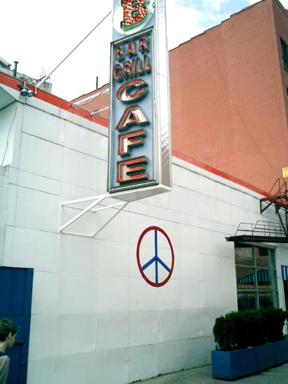 Bowery Bar and Grill Who also pioneered the gentrification around Cooper Square 10 years ago. |
|
 Banners outside the Public Theater |
 | |
 Pentagram, a design studio They usually hang a banner with a big red P. |
 Ben & Jerry’s They actually did have voter registration forms. | |
 Cookies at Once Upon a Tart “After all,” says the owner, “we’re French.” | ||
On a related note, a year ago a handful of lefty bloggers were abuzz about this:
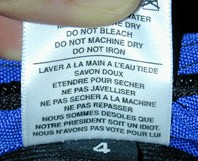
a label from a bag designed by Tom Bihn, an American company located in Port Angeles, Washington. The French repeats the English care and handling instructions, with an additional two lines:
Wash with warm water.
Use mild soap.
Dry flat.
Do not use bleach.
Do not dry in the dryer.
Do not iron.
We are sorry that Our President is an idiot.
We did not vote for him.
Few bloggers followed up to point out that the grassroots buzz actually produced record sales for the company.
From AFP, April 26, 2003:
Handbags insulting “president” in French sell like hot cakes in US
“There is no doubt that sales are hot for handbags bearing an insult — in French — aimed at ‘our president.’ The question is: Which president?
The bag’s designer Tom Bihn never guessed that purses with the message, ‘We’re sorry our president is an idiot. We didn’t vote for him’ — inscribed in French — would be blowing out of the stores.
‘It is a mystery, but since we launched the bags with the label sewn, sales have doubled,’ said Bihn, 43. ‘It is a record in the history of the company.’
He denies the message is targeting US President George W. Bush.
‘It depends on either your nationality, or the president you think is an idiot; you choose.’
Clients throughout the United States have flooded his offices in Seattle and Port Angeles with calls and e-mails to order for the bags, he said.
The company received ‘varied reactions’ including ‘hate mail from a French citizen who thought the label was addressed to (French President) Jacques Chirac.’
But 80 percent of the Americans think it is an amusing message, he said.
On his company’s website, he said: ‘Everyone seems to have a ‘president’ that they think is an idiot. Take your pick: Jacques Chirac, Bill Clinton, George Bush.’
Neither Bihn nor his 10 employees have yet taken the situation seriously, but have launched a series of T-shirts, selling at 20 dollars each, with the same message, with funds to go to a war veterans’ center in Seattle.”
“There should be no doubt that the federal government has an appropriate role to play in encouraging better design.” [source]
— President Nixon in his “Federal Design Improvement Message,” delivered at the first Federal Design Assembly in 1973, The Design Necessity.
The 1970’s saw a number of seminal graphic design projects sponsored by the U.S. government: Massimo Vignelli’s graphic standards for the National Park Service; Danne & Blackburn’s NASA “worm” logo; and Chermayeff and Geismar’s logos for the Park Service, Environmental Protection Agency, the National Aquarium, and U.S. Bicentennial, as well as traveling exhibits for the Smithsonian and Library of Congress.
Trying to find out why, I found this:
184 Memorandum About the Federal Government and the Arts. May 26, 1971
“To the Heads of Departments and Agencies:
 Americans in all walks of life are becoming increasingly aware of the importance of the arts as a key factor in the quality of the Nation’s life, and of their individual lives—whether in terms of the availability of great cultural resources, the accessibility of exhibits and performances, or simply the aesthetic enjoyment of good design.
As you know, direct Federal assistance to the arts is being sharply increased, and I have asked the Congress for full funding of the budget authorizations for the National Endowments for the Arts and the Humanities for fiscal 1972 — which would roughly double their present funding levels, and raise them to more than three times what they were just two years ago. But the Endowment programs are by no means the only Federal programs that affect, employ or contribute to the arts. In architecture, graphics, school programs, and many other activities, Federal agencies are daily involved deeply with the arts in one form or another.
It is my urgent desire that the growing partnership between Government and the arts continue to be developed to the benefit of both, and more particularly to the benefit of the people of America.
To contribute to this development, I ask each of you to direct your attention to two questions: first, how, as a part of its various programs, your agency can most vigorously assist the arts and artists; second, and perhaps more important, how the arts and artists can be of help to your agency and to its programs.
By focusing consciously, creatively and in a concerted way on these two questions, I believe that we all can find that the arts have a great deal more to contribute to what we in government are seeking to accomplish—and that this will be good for the arts and good for the country.
I am asking Nancy Hanks, Chairman of the National Endowment for the Arts, to coordinate responses on this, and I would appreciate your letting her know by September 20, what ideas and suggestions you may have, and also what new actions your agency may already be taking toward this same objective.”
— President Richard M. Nixon
More, from a Chronology of the NEA (1.9Mb PDF):
“President Nixon, acting on the responses to the 1971 survey of Federal agencies and executive departments and on the advice of the National Council on the Arts, announces government initiatives in design. The Arts Endowment is the lead agency for the Federal Design Improvement Program, to help upgrade Federal architecture, design and graphics.”
Republicans funding the arts? Astonishing! After all, in the 80’s it was Reagan and Co. who cut arts funding and waged their culture war against “indecent” public art.
So then why? Was it a public relations move? If it was, it would not have been very necessary. Despite public opposition to the war in Southeast Asia, Nixon was comfortably in the lead heading into the 1972 election — an election he won won by a landslide. The Pentagon papers were published a month after the memo in June 1971. And the Watergate burglary took place a year later in June 1972.
What’s the deal?
See this related post from February 2004 about public arts funding in the 1960’s and 70’s.
A friend has graciously permitted me to post his recap of RNC week:
“My dears Al and Mrs. S., ever the social workers, were eager to join me on Friday night’s Critical Mass bike ride. At Union Square, several of the farm vendors decided, perhaps in leu of the overwhelming crowds, to give away their end-of-day produce and baked goods. So, as the numbers of cyclists grew exponentially, we enjoyed watching the kids, who looked more at home on an Earth First commune than in front of Republic, as they heartily chomped on the raw sweet corn and warily sniffed the fresh muffins for signs of dairy.
As we peddled off (reminding me of the gnarled-metal cycle-density of Shanghai biking), we received applause from plenty of 14th street bystanders. By the time we got to Houston, the sun had set, and the bike ranks had ribboned along Broadway so we had to be wary of cabs darting past and around us. But as we began to again amass up Sixth Ave, tensions (which i’ve known too well as an ACT UP marshall for so many years) from snarled and snarling motorists inconvenienced by the rally grew ugly. Clearly, no police arrangements had been made, making this a potentially dangerous action, further worsened by inexperienced young cyclists who were aggressively flinging their bikes (and only pair of legs) into the paths of vehicles. Enraged drivers bolted out of their vehicles, one block after another, and we elders intervened in several separate potentially violent confrontations. Fortunately serious violence was assuaged, but not without seeing the cyclists, in a number of incidents, being uglier and more aggressive than the SUV drivers. By the time we got to 23rd street, the random arrests had begun. The event had successfully vilified cyclists to many drivers and police
I missed NOW’s CODE RED March over the Bridge — the photos of my beloveds, the CHURCH LADIES FOR CHOICE looked great. I made it to City Hall for the end of the Rally; the most stunning rally sound-bite take-away for me was learning that 40 million women who were eligible to vote in 2000 didn’t.
As the NYC Sanitation trucks moved in, i could not fathom why the organizers didn’t insist that the many, many thousands of people at the rally take the many thousands of expensive printed protests signs, fold them into their bags and make damn sure they were visible up all over town the entire week, and in windows through November.
Saturday evening brought thousands of bells and their owners to “the socket” and the utter bewilderment of puzzled Ground Zero pilgrim/tourists and vendors [photos]. The Calatrava “temporary” entrance to the PATH trains became a pagoda for the bells, where volunteers gave us programs that looked like LIRR train schedules. intending to ‘orchestrate’ the event, with the occasional hissing of Buddhists who were angered by gentle nearby conversation, created a soundscape only defiled later by a guy who worked the city the whole week with a big Freddy Phelps-like scroll of a sign quoting some scripture confirming why we must vote for Bush. Upon his arrival, the press was no longer interested in Pauline Oliveros’s ambitious memorial: the jingle bells, Tibetan bells chimes, and at least one industrial lampshade being thumped like a muffled gong.
The THOUSAND COFFINS affinity group at the big march was in need of help. So we helped, finishing a few pre-fab die-cut cardboard coffins, draping them with flags (black bunting for unknown soldiers), then committing to the intense heat of the next six hours. It doesn’t take much crowd-estimation expertise to conclude that a mere 100,000 people would have taken over six hours to march the 42 block route. I yearned for a rally, chock-full of speakers (many with issues that, while unrelated to the war, would still not be even voiced if the Republicans had their way), But the gigantic rally was amazing, in it’s disjointed groups; and you couldn’t help but marvel at the thoughtully engineered, underestimated march attendee counts from the press ‘n’ state.. But silently walking the coffins was a meditative way to participate. No Central Park picnic for our procession, we got to Union Square around 6 p.m., quietly dissembling the coffins and folding the flags, looking more saddened than defiant.
Although looking out my window Tuesday night I couldn’t tell if anyone else intentionally illuminated their windows, I struggled to sleep under a “What’s My Line” airline sleep-visor in my brilliantly illuminated bedroom. I had dutifully followed Milton Glaser’s request and put a ‘light’ in my window. Having recently acquired one of the ubiquitous rainbow WE THE PEOPLE flags, I taped it up in my window over Broadway, with my art projector aimed at it all night : Spent Nuclear Fuel Rods for Peace...
Throughout the week, every time i ventured outside, i wore a 8.5” x 11” repro of the great Plaza Hotel TRUTH -> <- BUSH banner mounted to foamcore and gold cord around my neck. I tended to avoid eye contact and wore a tie most days. Many people approached me all week, as inspired by the banner as i was.
Due to a work commitment, on Thursday, I was on the uptown (2) train pretty-much directly under Madison Square Garden while W was speaking: after all the overtime, there was zero security on the subway or platforms; people on the train laughing — having clearly just heard or participated in shouting “FUGEDDABOUTIT!” as Al Franken had proposed.
Friday morning, off to the GM building plaza, with an enlarged poster of the great Plaza TRUTH -> <- BUSH banner. CNN was interviewing what appeared to be high-school boys in tee shirts with “one-eyed pirates” for a liquor company. As i was manhandled off the property, they kept growling “No politics HERE, No politics HERE.” And I foolishly shrieked about how having young kids advertising booze was Highly Political.
During the week, the event that got the least press was the media march from the CBS building to FOX [photos]. I printed out a long tall (conventioneer’s) sign that read BAN 527’s / BEGIN WITH FOX. People laughed, but it was too cryptic to make the evening news. In fact, the only press i saw for the event was of Miss Understood and Lady Bunny who stormed the rally in Grand Drag... good for them! Motherfuckers.
Then, in a blink of the shutter, the RNC circus left town.
Jamie Leo, reporting.”
A collective of communication designers in Melbourne, Australia are working to defeat the current conservative government of Prime Minister John Howard.
The site dearjohn.org targets the youth vote, inviting them to download free T-shirt transfers, screen savers, badges, posters, and stickers.
Although united by a common agenda to defeat Howard, the designers do not highlight a specific issue or push an alternative party to vote for. This is left for the audience to fill in blanks.
Literally. In addition to readymade downloads, the site hosts a variety of do-it-yourself materials, including instructions on making your own collage posters or gaffers tape T-shirts, and downloadable political clipart and “dingbats” — image fragments and caricatures you can use to assemble your political messages and media.
What a day. There were so many images and messages out there — though by now so many have become familiar. There is no doubt that folks think Bush is a liar.
It probably goes without saying, but the most striking image was the sheer number of bodies.
That, and the fact that there were not many arrests before 8pm put coverage on the evening news into a favorable light.
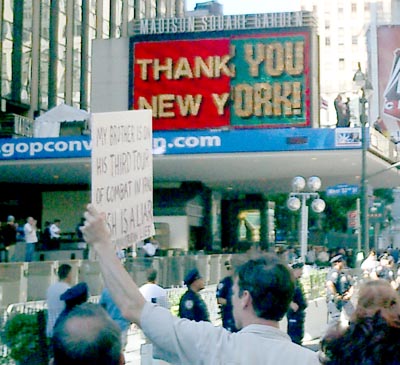
On a smaller scale, I was struck the most by one man with a sign that read simply: “MY BROTHER IS ON HIS THIRD TOUR OF COMBAT IN IRAQ. BUSH IS A LIAR.” He stared down the cops and security reps at Madison Square Garden with such a look of intensity. It was an emotional moment.
 My favorite part, though, had to be when we reached 34th street. Rather than the usual ads for Lancôme or Nike Sport, the big screen on the side of Macy’s was showing Fox News. Just then, the coverage turned to the preparations for the convention inside the Garden and at Ellis Island where Cheney and friends were speaking. Having just passed the Garden, everyone was already riled up, but when Cheney came on the screen folks really got into it — booing, hollering, chanting, and waving their signs at the giant TV screen.
Other highlights:
- The coffins. You’ve seen the photos. There were just so many of them. When I first heard the idea, it sounded a little goofy to me. But I think they pulled it off well. It was not a very somber mood on the ground, but in photos the impact is clear.
- When a marching band started playing “Crazy in Love” it was a real energy boost for folks who had been on their feet for 4 hours or so.
 - So many people wearing and selling political T-shirts.
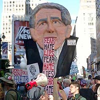
- The puppet head of Bush with the tongue/speech that continually rolled out of his mouth in a big fabric loop. It was pretty clever.
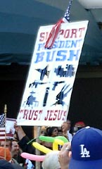
- The counter-protestor holding the sign that read “Support Bush. Trust Jesus”... interspersed with silhouettes of military vehicles of various kinds.
I’m increasingly realizing the importance of designers taking the initiative to put their messages out. I recognized several posters printed off of various Web sites. People had made their own posters with these, pinned the images to their shirts, their bags, etc. Folks were eager to use images and signs created by others. United for Peace and Justice had printed up a bunch of signs and flags available for people to pick up and use. People were happy to have something to hold up. I experienced this last March when I brought a few extra signs and folks snapped them up enthusiasitically.
The day ended for many with a picnic in Central Park — defying the Mayor’s refusal to permit a rally there, but also a nice, leisurely action against the politically motivated “elevated” terror alert.
page 1 2 3 4 5 6 7 8 9 10 11 12 13 14 15 16 17 18 19 20 21 22 23 24 25 26 27 28 29 30 31 32 33 34 35 36 37 38 39 40 41 42 43 44 45 46 47 48 49 50 51 52 53 54 55 56 57 58 59 60 61 62 63 64 65 66 67 68 69 70 71 72 73 74 75 76 77 78 79 80 81 82 83 84 85 86 87 88 89 90 91 92 93 94 95 96 97 98 99 100 101 102 103 104 105 106 107 108 109 110 111 112 113 114 115 116 117 118 119 120 121 122 123 124 125 126 127 128 129 130 131 132 133 134 135 136 137 138 139 140 141 142 143 144 145 146 147 148 149 150 151 152 153 154 155 156 157 158 159 160 161 162 163 164 165 166 167 168 169 170 171 172 173 174 175 176 177 178 179 180 181 182 183 184 185 186 187 188 189 190 191 192 193 194 195 196 197 198 199 200 201 202 203 204 205 206 207 208 209 210 211 212 213 214 215 216 217 218 219 220 221 222 223 224 225 226 227 228 229 230 231 232 233 234 235 236 237 238 239 240 241 242 243 244 245 246 247 248 249 250 251 252 253 254 255 256 257 258 259 260 261 262 263 264 265 266 267 268 269 270 271 272 273 274 275 276 277 278 279 280 281 282 283 284 285 286 287 288 289 290 291 292 293 294 295 296 297 298 299 300 301 302 303 304 305 306 307 308 309 310 311 312 313 314 315 316 317 318 319 320 321 322 323 324 325 326 327 328 329 330 331 332 333 334 335 336 337 338 339 340 341 342 343 344 345 346 347 348 349 350 351 352 353 354 355 356 357 358 359 360
[ Back ]
[ Next ]