

Found 3599 matches from 1,400 records in about 0.1252 seconds for twitter or is or lazy.
Via Reuters:
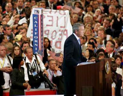
“A protest sign is held up behind U.S. President George W. Bush as he delivers his speech to the delegation during the final night of the 2004 Republican National Convention at Madison Square Garden in New York City on September 2, 2004. The protester was removed from the convention hall by authorities. Photo by Rick Wilking/Reuters”
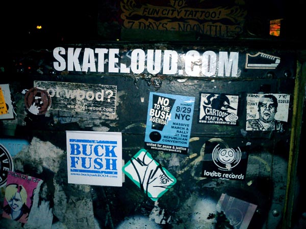
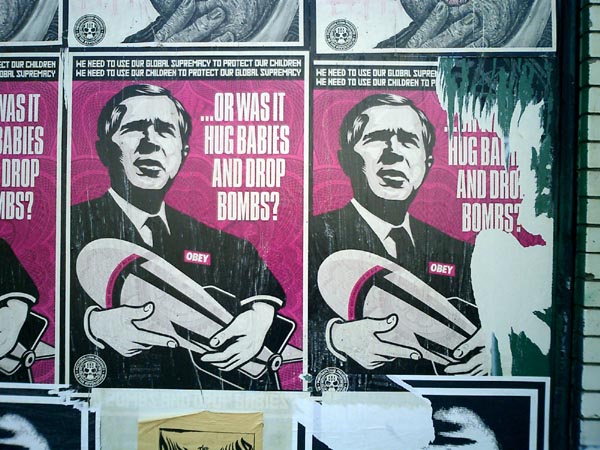
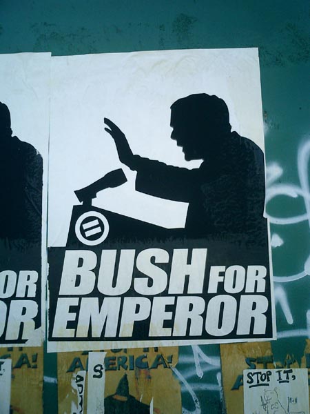
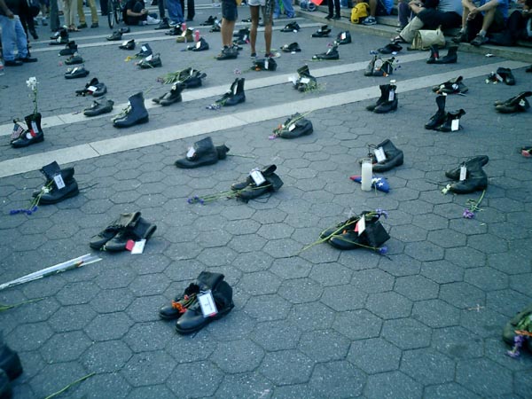
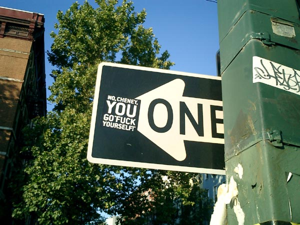
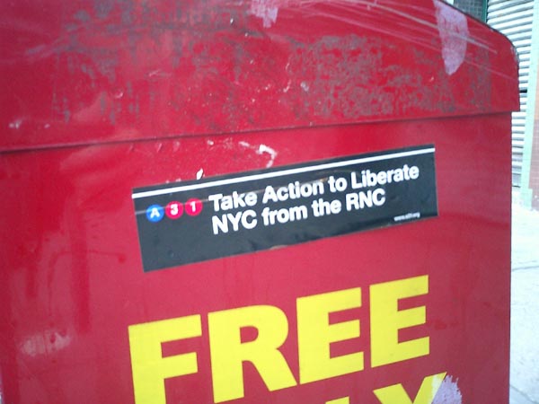
The convention is over, but the traces remain — the stories emerge and the protests continue.
Click on an image below to view a larger version.

jude sent me this link a while back. The page is part of a Frontline documentary on the life and death of “maverick humanitarian aid expert” Fred Cuny:
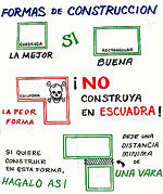
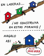
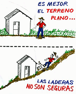
“These ‘Housing Pictographs’ are another example of how Fred Cuny was always looking for ways to use a calamity as a catalyst to improve people’s lives.
After Guatemala’s 1976 earthquake, Cuny went to the devastated central highlands to see what he could do. Working with two organizations, OxFam (U.K.) and World Neighbors, he posed a key question to both the NGO staff and the peasants whose adobe homes had been reduced to rubble:
‘How do you make safe a poor person’s house in the rural countryside?’
Fred set out to improve the design and construction of the local housing as it was about to be rebuilt. Mary McKay, the head of the World Neighbor’s Housing Education Office in Guatemala, explained to FRONTLINE how the new building program worked. The ideas were all Fred’s, she said, but ‘the local builders took those ideas and figured out what you actually did when you are out there with a hammer in your hand. Fred wasn’t a mason or a carpenter,’ but he could talk with those who were, and he loved doing that ‘especially with the guys in the sandals who really did the work.’
Cuny would draw pictures which a World Neighbor’s staff member then turned into artwork. The drawings then were silk-screened onto the backs of empty flour sacks, stitched together, rolled up and put on the back of a master carpenter’s moped. The skilled craftsmen, who had worked with Fred in developing these new building techniques, would then drive from village to village throughout the region using the ‘flip charts’ to spread the word.
Although many of those master carpenters were later killed or fled Guatemala as a result of the government’s crack down on people they thought might challenge their authority, many of the houses using Fred Cuny’s techniques are still standing. Guatemala has not yet suffered another earthquake the magnitude of the 1976 quake.”
The project sounds like a great example of design in the public interest, a low-tech, simple way to improve people’s lives for years to come — and a small note of hope within the brutality of the U.S.-backed military dictatorship.
But that last sentence is chilling. Particularly, within the context of the page’s patronizing tone.
Were the carpenters targeted because of their work with Cuny and the World Neighbors NGO?
One friend who works on Guatemala tells me:
“Often local ‘authorities’ (including non-elected community leaders) used the conflict as an excuse to settle scores. So maybe [the carpenters] were gaining too much authority in the community, and then were taken out by local thugs who may have been connected to the government, but were acting on their own in this. Or not. Hard to tell.”
Another tells me:
“One category of people who were killed are those who worked with foreigners.”
From here it’s hard to know exactly why the carpenters were killed, but it seems possibile that they were indeed a casualty of the naivete of humanitarian intervention that attempts to remain neutral or indifferent to the complexity of local political relationships and history.
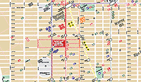
Several grassroots groups are publishing maps of the New York City to guide visitors and residents who want to participate in the protests and events around the Republican National Convention next week.
From a co-editor of, Peace Signs, a big book of anti-Bush, anti-war posters, comes The People’s Guide to the RNC
 Cited in The New York Times on August 9, 2004:
“Included is information of the sort that could be of use to any traveler: a street map of Manhattan south of 59th Street and addresses of restaurants, bookstores, libraries and places to rent bicycles.
Other elements are specific to the convention: hotels where various state delegations will be staying, sites of official convention events, and times and locations of planned demonstrations. There are also the words of the First Amendment, phone numbers for the New York Civil Liberties Union and information about bail bondsmen.
The three creators said they spent $6,000 of their own money to print the guides, but are distributing them free.
‘The main reason we made the guide is so that people have enough information to get in the way or out of the way,’ Mr. Chan said.
On Thursday, he and his friends began distributing 25,000 copies to bookstores, community groups, churches and other places.”
 You can order or download the map here.
...
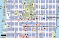
The 2004 RNC Protesters Map is more up-to-date, and features a large list of protest, art, and RNC related events, convergence spaces, and trainings. Icons on the map indicate hotels, police stations, navigation landmarks, parks (both active and passive), and the march route and rallying points. Updated on August 20, the map can be download here (792 Kb PDF).
...
 First published in March 2003, the Map of War Profiteers in New York City showed the beneficiaries in our midst, plotting the locations of government and military agencies, corporations, media profiting from the war. At the meeting of the M27 Coalition, the map helped locate the discussion determining a place for the March 27, 2003 action. Rockefeller Center ultimately was chosen for its proximity to several points on the map.
Unlike the other two color multi-page maps, the War Profiteers map has a distinctly low-tech, underground, DIY aesthetic. It is designed to be reproduced in black-and-white on the front and back of an 11"x17" piece of paper. The icons are composed of cut paper, arranged on a found map. The map was available at progressive bookstores around town, and was distributed at organizing meetings for various protest events.
 Host Country Bribes |
 Stadium Built with Slave Labor |
 Drowing in Advertising |
One of the best, and funniest, critiques of the Olympics I’ve seen this season is in the form of a font. The font is a collection of ‘real’ pictograms, lampooning the icons used by Olympics organizers to indicate sporting events without language.
Designed by Jonathan Barnbook and Marcus McCallion, the pictograms follow the style of the hugely influential sign system developed by Otl Aicher for the 1972 Munich Olympics.
View the complete font or download a copy here.
Via a comment at Design Observer
The Center for the Study of Political Graphics has posted three new online exhibitions of posters from their archives. The collections are organized thematically, around a dozen posters per theme, spanning several decades, countries, and struggles.
Notice the tiny “next” links at the bottom of some of the pages. They’re very easy to miss.
Earth, Wind & Solar
International Ecology Posters
From the site:
 “Global Warming. Arsenic in drinking water. Pesticide Poisoning. Environmental Racism. Nuclear Waste Disposal. Irradiated and Genetically Modified Food. The list is endless. Where pollution is concerned, the world is a global village where no continent, country, or neighborhood is safe. Multinational corporations’ insatiable need for new markets and greater profits consistently overrides environmental concerns, and few governments oppose them. But these posters convey an increasing sense of urgency, as international artists continue to use the power of graphics to organize a frontline of defense against rapidly escalating pollution.”
The posters are organized as follows:
- Early Environmental Awareness
- Global Warming
- Water Pollution
- Air Pollution
- Deforestation
- Pesticides And G.M.O.s
- Nuclear Power And Waste
- Environmental Disasters
- Environmental Racism
- Martyrs
- Green Alternatives
- Visions For The Future
We Shall Not Be Moved
International Graphics on Gentrification and Homelessness
From the site:
 “A missed paycheck, a health crisis, or an unpaid bill are all that separate many people from homelessness. As America’s income gap widens, renters worry if they can ever buy homes of their own—or keep their rentals through retirement. The lack of affordable housing is not just a U.S. problem. We Shall Not Be Moved uses domestic and international posters to show that homelessness and gentrification are major issues throughout the world—and from the U.S. to Europe to Australia, posters remain the resisters’ tools of choice. Posters announce demonstrations to oppose demolitions, support squatters’ rights to move into abandoned buildings, and organize tenants’ unions. They document victories, defeats, and ongoing confrontations. Posters both record these struggles, and are central to them. They show that victory does not happen overnight—it can take years—but it is possible to fight city hall and the developers and win.”
The posters are organized as follows:
- Introduction
- Development & Speculation
- Homelessness & Poverty
- Organizing Resistance
- War & Displacement
- Conclusion
Solidarity Forever!
Graphics of the International Labor Movement
From the site:
 “Organized labor has consistently produced more political graphics than any other domestic movement for social change. Labor posters are often produced in the midst of a strike or boycott and convey the urgency of the times. Others are commemoratives, marking the anniversary of a victory or a martyred labor leader. They remind viewers of a too often hidden history, rally against dangerous conditions in the workplace, and warn that such injustices still occur. Although many of the posters are historical, the issues are not. The eight-hour day is no longer sacrosanct. More and more children are entering the workforce. Pesticides threaten farm workers and consumers. Sweatshops are proliferating domestically and internationally. These graphic expressions of international solidarity are a powerful combination of art and politics, crossing borders of time and place.”
The posters are organized as follows:
Profile of Graphic Designer Tibor Kalman
by Thomas Frank, from ArtForum, February 1991:
“Tibor Kalman is a graphic designer, a crafter of corporate logos, a producer of presentation materials, a maker of menus and restaurant posters. But Tibor Kalman is so much mere than that.
 According to most of those who judge such things (with whom I concur, by the way), he is accomplished, even brilliant at what he does. He may even be the greatest graphic designer of his generation. Certainly his output of the last twenty years, just collected in the three-and-a-half-pound book Perverse Optimist (Princeton Architectural Press), sparkles with witty solutions to the problems typical of corporate presentation. But why stop there? Kalman is, we are told, a radical — a breaker of rules, a dealer in astonishment, a deft questioner of the corporate order. In a manifesto co-authored in 1990, he insisted that graphic designers be ‘bad,’ ‘disobedient,’ ‘insubordinate,’ that they refuse to be ‘a cog in the machine,’ that they must make clients ‘think about design that’s dangerous and unpredictable.’ It’s no surprise that accounts of Kalman’s oeuvre take pains to note his SDS exploits in the late ’60s.
The question that inevitably arises, though, is why a corporation should be so keen to hire a ‘radical’ graphic designer. What makes Kalman’s radicalism, such as it is, a desirable quality in what is possibly the most constrained branch of creative endeavor? What does ‘radicalism’ even mean in such a field? It certainly isn’t readily apparent from his work. What impresses one first about Perverse Optimist is not Kalman’s radicalism but his weird omnipresence in the most modish precincts of corporate-sponsored culture of the last two decades.
Graphic designer Wendy Brawer produced her first Green Map in 1991. The Green Apple Map of New York City charted 143 ecologically and culturally significant sites: community gardens, parks, greenmarkets, eco-centers, green businesses and buildings, transportation options, and toxic hot spots. It was well received and quickly inspired a second edition. Wendy writes:
“This Map encourages people to explore and understand out city — helping expand our community of environmental stewards who understand the interconnections between the natural and built environments. It can help build a network of links among people of different ages and backgrounds by highlighting places that are important to our common future. It promotes and fosters replication of successful projects. Moreover, it challenges the assumption that this intensely urban setting has little redeeming ecological value.”
 Activists and designers in other cities, particularly colleagues in the o2 Global Network, were eager to make their own Green Maps.
Green Map Systems was born in 1995 and became a U.S. registered not-for-profit organization in 2000.
Wendy and her team produced a shared set of icons, and a Mapmakers’ Agreement which sets some parameters and includes small royalty based on the proceeds — 1% to 3% depending on if the project is all volunteers or has paid staff, and 1% of printed maps. Some “scholarships” are available where needed.
After that, the projects are fairly autonomous. Each Green Map is locally organized and designed, and independently produced. The maps may highlight parks and green spaces, bike paths, gay and lesbian resources, notes on wheelchair accessibility, recycling centers, or sites of energy production and consumption.
“Printed and digital Green Maps identify, promote and link eco and social resources. Each merges the ancient art of map making and new media in creating a fresh perspective that helps hometown residents discover great ways to get involved with the urban environment, and guides tourists (especially virtual ones) to special places and successful greening initiatives they can experience, and then replicate back home.
The maps are generated with a wide range of techniques, from GIS to Illustrator, to simple drawings by hand.
As of this writing, there are now there are now 241 Green Map projects, including 45 by youth. 151 different Green Maps have been completed in 39 countries. The maps are listed here.
Map makers can also develop local variations on global set of Green Map Icons (a shrine icon for Japan, a Capoira icon for Brazil.) After a global discussion on the Green Map email list, several of these have been incorporated into the global set. The set of 125 icons and 50 youth icons have been released as digital fonts for easy placement.
Launched on February 29, 2004, the Green Map Atlas highlights the ten map making projects in Asia and North America. With the goal of promoting sustainability and greener living worldwide, the Green Map Atlas showcases the work of diverse Mapmakers in Tokyo, Toronto, Jakarta, Pune (India), Kyoto, Hiroshima and Hakodate (Japan), Robeson County, NC, Milwaukee, and New York City.
In June, CNN and others aired video footage showing a Los Angeles police officer beating a suspect with a 2-pound metal flashlight.
The response?
Redesign the flashlight.
From the Los Angeles Daily News, Thursday, August 05, 2004:
LAPD panel may design flashlights
“Two days after announcing that LAPD officers will stop carrying heavy metal flashlights that can inflict serious injuries, Chief William Bratton said Thursday that his officers will design their own rather than buy off-the-shelf models.
 Bratton estimated that it would take a committee several months to design a device that’s lightweight, bright and virtually incapable of causing serious injury. He didn’t know how much it would cost to develop. ‘We’re not aware of any flashlight that meets the training and multiple needs of our officers,’ Bratton said.
Bratton announced Tuesday that the Los Angeles Police Department will phase out the use of 2-pound metal flashlights, such as the one an officer used June 23 to strike car-theft suspect Stanley Miller 11 times. The widely publicized incident underscored the perilous potential for using flashlights as weapons rather than light sources.
If the LAPD follows through on its plan, it would be the only U.S. police department with its own brand of flashlight. Bratton said the LAPD might be able to license the device and sell it to other agencies.
LAPD officers have had discretion to choose from a variety of flashlights -- from penlight models to the foot-long metal light.
Officers have used flashlights in 15 serious use-of-force incidents since 2001.
New York police officers are allowed to pick their own flashlights as long as the models don’t use more than three D-cell batteries. Chicago police are issued a standard flashlight that fits in the palm of the hand.
Police in San Diego are issued foot-long metal flashlights. In San Francisco, officers can choose between larger and smaller models.
Chicago and San Francisco officers buy their flashlights from Streamlight Inc., a Pennsylvania company that advertises its flashlights as bright, durable and versatile enough for police and firefighters. The most common Streamlight flashlights are rechargeable and cost $100 to $200 each.
But Bratton said LAPD officials were unable to find a light that can be recharged in a police car, has extended battery life and can be easily used in one hand while the officer holds a gun in the other.
The Los Angeles Police Protective League, which represents officers, said the current metal flashlights meet officers’ needs.
‘Improvements are always welcome, but it is going to take a long time and a lot of money to make the chief’s new concept a reality,’ the union said in a statement. ‘Once the custom lights are designed, the league has questions regarding who is going to pay for this new required equipment.’”
Switching every flashlight on the force to a rechargeable model would eliminate an awful lot of disposable batteries.
However, the announcement is chilling. With officers riding around with a 2-pound metal club at their side, it seems the temptation to use it as a weapon is just too great. By redesigning the tool, the brass hope to remove this. A kind of “gun control” for people who carry guns.
A good thing to do, but it does seems like the flashlight design is being blamed for a lack of discipline on the force, and for a law enforcement environment in which beating suspects is suprisingly common. The redesign announcement seems to admit that the beatings are normal and will continue — though perhaps just a little less brutally.
Extrapolating a bit, this points to the huge potential for abuse of so-called “non-lethal” weapons. In such a law enforcement environment, I imagine the temptation will be just as great.
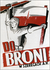
Rene Wanner has maintained his Poster Page on the Web continuously since August 21, 1997. In May, he started a blog. Yesterday, he noted:
“[August 1] is the 60th anniversary of the Warsaw Uprising against the German occupation in World War II, during which more than 250,000 people were killed and the city was largely destroyed. Some posters made by the insurgents have survived, among them the famous “Call to Arms!” (Do Broni!) by Mieczyslaw Jurgielewicz. A year before, in 1943, the Warsaw Ghetto Uprising which also failed, extinguished the lives of the jewish population of Warsaw, which was about 375,000 before the war.”
...
Also on August 1, 1944, four thousand Roma were gassed and incinerated at Auschwitz-Birkenau. By the end of the war, between 70% and 80% of the Romani population had been annihilated by Nazis. In Romani it is called “the Devouring.”
After the war, no Roma were called to testify at the Nuremberg Trials, and no one came forth to testify on their behalf. No war crimes reparations have been paid to the Roma as a people. And no posters of resistance are known. [source]
page 1 2 3 4 5 6 7 8 9 10 11 12 13 14 15 16 17 18 19 20 21 22 23 24 25 26 27 28 29 30 31 32 33 34 35 36 37 38 39 40 41 42 43 44 45 46 47 48 49 50 51 52 53 54 55 56 57 58 59 60 61 62 63 64 65 66 67 68 69 70 71 72 73 74 75 76 77 78 79 80 81 82 83 84 85 86 87 88 89 90 91 92 93 94 95 96 97 98 99 100 101 102 103 104 105 106 107 108 109 110 111 112 113 114 115 116 117 118 119 120 121 122 123 124 125 126 127 128 129 130 131 132 133 134 135 136 137 138 139 140 141 142 143 144 145 146 147 148 149 150 151 152 153 154 155 156 157 158 159 160 161 162 163 164 165 166 167 168 169 170 171 172 173 174 175 176 177 178 179 180 181 182 183 184 185 186 187 188 189 190 191 192 193 194 195 196 197 198 199 200 201 202 203 204 205 206 207 208 209 210 211 212 213 214 215 216 217 218 219 220 221 222 223 224 225 226 227 228 229 230 231 232 233 234 235 236 237 238 239 240 241 242 243 244 245 246 247 248 249 250 251 252 253 254 255 256 257 258 259 260 261 262 263 264 265 266 267 268 269 270 271 272 273 274 275 276 277 278 279 280 281 282 283 284 285 286 287 288 289 290 291 292 293 294 295 296 297 298 299 300 301 302 303 304 305 306 307 308 309 310 311 312 313 314 315 316 317 318 319 320 321 322 323 324 325 326 327 328 329 330 331 332 333 334 335 336 337 338 339 340 341 342 343 344 345 346 347 348 349 350 351 352 353 354 355 356 357 358 359 360
[ Back ]
[ Next ]