

Found 4305 matches from 1,400 records in about 0.1231 seconds for phone or e or geodeta.
Congratulations to James Corner Field Operations and Diller Scofidio + Renfro for their selection as architects for the redesign of the High Line.
 On July 15, I attended a presentation by the four finalist teams at the Center for Architecture, and it was clear that the Diller, Scofidio + Renfro team had done their research. More than any of the other teams, they had examined the relationship between the Line and the City. They presented the most nuanced sense of the pedestrian traffic in the many neighborhoods crossed by the line, and of the different types and degrees of usage the park would host. See their design boards here. While grounded in usability, the design was also aesthetically interesting — with a recurring pattern of linear struts flowing through the length of the park, and a visual vocabulary of plants chosen for their seasonal colors and textures. It was also one of the most imaginative, incorporating an elevated urban beach and swimming pond, ramps and walkways rising above and below the trees, and an elevator lowering a living tree to street level when summoned.
I was also struck by how little Zaha Hadid actually had to say. Her presentation mostly consisted of slides of her past work. It was clear her High Line proposal had less to do with the City than with her own vocabulary of attenuated forms. Her computer-generated video flyby of her High Line design was rendered through a ghostly, transparent Manhattan, hammering home her message: “We invite the City to change around the line.”
Though the winning plan was my favorite, I was sure that Steven Holl Architects would win. Their plan seemed the cheapest, their design the most conservative, and, most significantly, they emphasized public-private partnerships — stating repeatedly how the project would eventually pay for itself. This mainly involved weaving the park through various shops and cafes, anchored at the ends by a Starbucks and a Barnes and Noble. I thought surely this would capture the heart of our businessman Mayor and his administration, otherwise busy selling off branding and naming rights to our public infrastructure to fill the gaps in the city budget.
I’m happy to say I got it wrong.
Profile of Graphic Designer Tibor Kalman
by Thomas Frank, from ArtForum, February 1991:
“Tibor Kalman is a graphic designer, a crafter of corporate logos, a producer of presentation materials, a maker of menus and restaurant posters. But Tibor Kalman is so much mere than that.
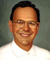 According to most of those who judge such things (with whom I concur, by the way), he is accomplished, even brilliant at what he does. He may even be the greatest graphic designer of his generation. Certainly his output of the last twenty years, just collected in the three-and-a-half-pound book Perverse Optimist (Princeton Architectural Press), sparkles with witty solutions to the problems typical of corporate presentation. But why stop there? Kalman is, we are told, a radical — a breaker of rules, a dealer in astonishment, a deft questioner of the corporate order. In a manifesto co-authored in 1990, he insisted that graphic designers be ‘bad,’ ‘disobedient,’ ‘insubordinate,’ that they refuse to be ‘a cog in the machine,’ that they must make clients ‘think about design that’s dangerous and unpredictable.’ It’s no surprise that accounts of Kalman’s oeuvre take pains to note his SDS exploits in the late ’60s.
The question that inevitably arises, though, is why a corporation should be so keen to hire a ‘radical’ graphic designer. What makes Kalman’s radicalism, such as it is, a desirable quality in what is possibly the most constrained branch of creative endeavor? What does ‘radicalism’ even mean in such a field? It certainly isn’t readily apparent from his work. What impresses one first about Perverse Optimist is not Kalman’s radicalism but his weird omnipresence in the most modish precincts of corporate-sponsored culture of the last two decades.
Graphic designer Wendy Brawer produced her first Green Map in 1991. The Green Apple Map of New York City charted 143 ecologically and culturally significant sites: community gardens, parks, greenmarkets, eco-centers, green businesses and buildings, transportation options, and toxic hot spots. It was well received and quickly inspired a second edition. Wendy writes:
“This Map encourages people to explore and understand out city — helping expand our community of environmental stewards who understand the interconnections between the natural and built environments. It can help build a network of links among people of different ages and backgrounds by highlighting places that are important to our common future. It promotes and fosters replication of successful projects. Moreover, it challenges the assumption that this intensely urban setting has little redeeming ecological value.”
 Activists and designers in other cities, particularly colleagues in the o2 Global Network, were eager to make their own Green Maps.
Green Map Systems was born in 1995 and became a U.S. registered not-for-profit organization in 2000.
Wendy and her team produced a shared set of icons, and a Mapmakers’ Agreement which sets some parameters and includes small royalty based on the proceeds — 1% to 3% depending on if the project is all volunteers or has paid staff, and 1% of printed maps. Some “scholarships” are available where needed.
After that, the projects are fairly autonomous. Each Green Map is locally organized and designed, and independently produced. The maps may highlight parks and green spaces, bike paths, gay and lesbian resources, notes on wheelchair accessibility, recycling centers, or sites of energy production and consumption.
“Printed and digital Green Maps identify, promote and link eco and social resources. Each merges the ancient art of map making and new media in creating a fresh perspective that helps hometown residents discover great ways to get involved with the urban environment, and guides tourists (especially virtual ones) to special places and successful greening initiatives they can experience, and then replicate back home.
The maps are generated with a wide range of techniques, from GIS to Illustrator, to simple drawings by hand.
As of this writing, there are now there are now 241 Green Map projects, including 45 by youth. 151 different Green Maps have been completed in 39 countries. The maps are listed here.
Map makers can also develop local variations on global set of Green Map Icons (a shrine icon for Japan, a Capoira icon for Brazil.) After a global discussion on the Green Map email list, several of these have been incorporated into the global set. The set of 125 icons and 50 youth icons have been released as digital fonts for easy placement.
Launched on February 29, 2004, the Green Map Atlas highlights the ten map making projects in Asia and North America. With the goal of promoting sustainability and greener living worldwide, the Green Map Atlas showcases the work of diverse Mapmakers in Tokyo, Toronto, Jakarta, Pune (India), Kyoto, Hiroshima and Hakodate (Japan), Robeson County, NC, Milwaukee, and New York City.
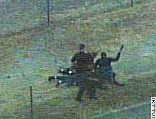
In June, CNN and others aired video footage showing a Los Angeles police officer beating a suspect with a 2-pound metal flashlight.
The response?
Redesign the flashlight.
From the Los Angeles Daily News, Thursday, August 05, 2004:
LAPD panel may design flashlights
“Two days after announcing that LAPD officers will stop carrying heavy metal flashlights that can inflict serious injuries, Chief William Bratton said Thursday that his officers will design their own rather than buy off-the-shelf models.
 Bratton estimated that it would take a committee several months to design a device that’s lightweight, bright and virtually incapable of causing serious injury. He didn’t know how much it would cost to develop. ‘We’re not aware of any flashlight that meets the training and multiple needs of our officers,’ Bratton said.
Bratton announced Tuesday that the Los Angeles Police Department will phase out the use of 2-pound metal flashlights, such as the one an officer used June 23 to strike car-theft suspect Stanley Miller 11 times. The widely publicized incident underscored the perilous potential for using flashlights as weapons rather than light sources.
If the LAPD follows through on its plan, it would be the only U.S. police department with its own brand of flashlight. Bratton said the LAPD might be able to license the device and sell it to other agencies.
LAPD officers have had discretion to choose from a variety of flashlights -- from penlight models to the foot-long metal light.
Officers have used flashlights in 15 serious use-of-force incidents since 2001.
New York police officers are allowed to pick their own flashlights as long as the models don’t use more than three D-cell batteries. Chicago police are issued a standard flashlight that fits in the palm of the hand.
Police in San Diego are issued foot-long metal flashlights. In San Francisco, officers can choose between larger and smaller models.
Chicago and San Francisco officers buy their flashlights from Streamlight Inc., a Pennsylvania company that advertises its flashlights as bright, durable and versatile enough for police and firefighters. The most common Streamlight flashlights are rechargeable and cost $100 to $200 each.
But Bratton said LAPD officials were unable to find a light that can be recharged in a police car, has extended battery life and can be easily used in one hand while the officer holds a gun in the other.
The Los Angeles Police Protective League, which represents officers, said the current metal flashlights meet officers’ needs.
‘Improvements are always welcome, but it is going to take a long time and a lot of money to make the chief’s new concept a reality,’ the union said in a statement. ‘Once the custom lights are designed, the league has questions regarding who is going to pay for this new required equipment.’”
Switching every flashlight on the force to a rechargeable model would eliminate an awful lot of disposable batteries.
However, the announcement is chilling. With officers riding around with a 2-pound metal club at their side, it seems the temptation to use it as a weapon is just too great. By redesigning the tool, the brass hope to remove this. A kind of “gun control” for people who carry guns.
A good thing to do, but it does seems like the flashlight design is being blamed for a lack of discipline on the force, and for a law enforcement environment in which beating suspects is suprisingly common. The redesign announcement seems to admit that the beatings are normal and will continue — though perhaps just a little less brutally.
Extrapolating a bit, this points to the huge potential for abuse of so-called “non-lethal” weapons. In such a law enforcement environment, I imagine the temptation will be just as great.
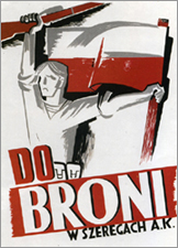
Rene Wanner has maintained his Poster Page on the Web continuously since August 21, 1997. In May, he started a blog. Yesterday, he noted:
“[August 1] is the 60th anniversary of the Warsaw Uprising against the German occupation in World War II, during which more than 250,000 people were killed and the city was largely destroyed. Some posters made by the insurgents have survived, among them the famous “Call to Arms!” (Do Broni!) by Mieczyslaw Jurgielewicz. A year before, in 1943, the Warsaw Ghetto Uprising which also failed, extinguished the lives of the jewish population of Warsaw, which was about 375,000 before the war.”
...
Also on August 1, 1944, four thousand Roma were gassed and incinerated at Auschwitz-Birkenau. By the end of the war, between 70% and 80% of the Romani population had been annihilated by Nazis. In Romani it is called “the Devouring.”
After the war, no Roma were called to testify at the Nuremberg Trials, and no one came forth to testify on their behalf. No war crimes reparations have been paid to the Roma as a people. And no posters of resistance are known. [source]
My own personal economic indicator is the number of vacant storefronts I pass on my way through New York City. Lately it seems worse than ever. Many of the stores that have been in my neighborhood since I moved here 13 years ago have closed in the last year or so.
But this turns out to have one unexpected benefit: vacant storefronts aplenty, available for short-term lease... to progressive groups during the Republican National Convention:
NYCLU Unveils Protecting Protest Storefront
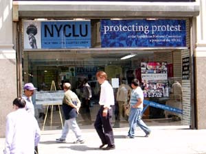 “The New York Civil Liberties Union today formally opens its Protecting Protest Storefront just two blocks from Madison Square Garden. The Storefront, at 520 Eighth Avenue (between 36th and 37th Streets) will serve as the NYCLU base of operations for monitoring protest activity during the Republican National Convention.
‘This location will be important for those who will witness democracy in action outside the Garden,’ said Donna Lieberman, Executive Director of the NYCLU. ‘As thousands of demonstrators take to the streets in peaceful protest, the NYCLU will be in constant negotiation with police to ensure that all problems are immediately resolved.’
In addition to housing the NYCLU Protecting Protest office, the Storefront will serve as a meeting place for our volunteers. The NYCLU will also host ‘Know Your Rights’ trainings and press briefings at the Storefront. Leaflets detailing the rights of protesters also will be distributed. The Storefront will also serve as the location for participants to submit information about policing tactics at the demonstrations.
‘We will be watching the NYPD night and day doing our very best to protect the right to protest,’ said Christopher Dunn, Associate Legal Director. ‘The NYCLU Storefront is the First Amendment’s beachhead to the Convention.’
During the week of the convention, the NYCLU will provide resources at the location for the media to file reports. The organization asks that those who are considering using the Storefront for this purpose contact the NYCLU at your earliest convenience. Overseeing all Storefront activities directly will be Steve Theberge, the NYCLU’s Protecting Protest Coordinator.
The NYCLU Protecting Protest Storefront is operated by the New York Civil Liberties Union, which is the New York State Affiliate of the American Civil Liberties Union (ACLU). The Storefront will serve many purposes between now and the end of the Republican National Convention (RNC):
- Source of printed information about the legal rights of groups and individuals planning to protest during the Convention;
- Location of ‘know your rights’ trainings for groups and individuals planning to protest during the Convention;
- Base of operations for NYCLU lawyers, staff, and volunteers who will be monitoring police activity leading up to and during the Convention;
- Place for people to file complaints or provide reports about police activity before and during the Convention;
- Location for approved members of the media to file stories during the Convention.
In the weeks leading up to the Convention, the NYCLU Protecting Protest Storefront generally will be open 10:00 a.m. to 6:00 p.m., Monday through Saturday. Starting on Thursday, August 26, the Storefront will be open daily from 8:00 a.m. to 10:00 p.m.”
The route for the big August 29th protest actually turns west on 34th Street so the Storefront is not directly on the march route, but two blocks from the Garden is pretty damn close. I just hope the NYPD doesn’t close off the street.
“Do you want green tea or black tea?”
In Uzbekistan, tea is the drink of hospitality. Community is all about hanging out in the choyhona (teahouse), talking and drinking tea while sitting on topchan, a kind of raised platform bed with a pad to sit on and a small table in the middle. (Thus, choyhona is also the name of a popular Internet chat network.)
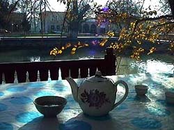 So which tea do you choose?1 The question seems simple, but the answer is fraught with political significance, identifying you as sympathetic to either ethnic Russians or ethnic Uzbeks.
One of the legacies of the Soviet occupation in Central Asia is a population of ethnic Russians living there. Born in Central Asia and raised under Soviet culture, when the USSR fell and the borders rolled back, these ethnic Russians remained. This piece in Slate describes the predicament.
“Clara was a Soviet. Today, she must search for a new vocabulary to define her identity. She has no ties to the land of her ancestors and is neither Kazakh nor Russian.
This search for identity is mirrored in millions of ex-Soviet people of all ethnic groups. One of the more interesting cultural shifts in post-Soviet Central Asia is the status and identity of ethnic Russians. During Soviet rule, the Russians comprised more than half of the population in Kazakhstan, exiled by Stalin during the 1950s and ’60s mass migration under the ‘Virgin Lands’ campaign, when Russians were encouraged to cultivate northern Kazakhstan’s pastures.
So where does this leave ethnic Russians with no ties to the new but living in the place of their birth? Rootless.”
Ethnic Russians used to be identified with the power elite, but are no longer. Since Central Asian independence they are in some ways second-class citizens. Political leaders now promote a form of nationalism using ideas of ethnic authenticity — for instance, promoting local languages and literature supressed under Communism, or in the most extreme example, the President of Turkmenistan has banned all “non-Turkmen” cultural institutions.
In this climate, signs that might otherwise seem insignificant become significant cultural markers.
In Uzbekistan, conventional wisdom holds that Russians drink black tea and Uzbeks drink green tea. When with one group or another, drinking the appropriate tea identifies one as part of the “in group.” The sign, though, can be waved by anyone — an ethnic Russian among Uzbeks may choose green tea to signify that he or she is down with the group.
Ironically, the political leaders pushing the nationalism are often themselves the products of Soviet education and the Soviet system. They speak fluent Russian... and though they’d never admit it, might even prefer black tea.
1 Choosing neither will win you a stern lecture on the important health benefits of tea.
Six out of eight of Manhattan’s diesel bus depots are located in northern Manhattan. Two of the city’s largest sewage treatment plants are there, too — powered by huge diesel engines running 24 hours a day. The area is flanked by highways and two major bridges over which trucks (also running on diesel) deliver goods into city into Manhattan. And the two outdoor train yards and elevated rail lines serve diesel locomotives daily.
In addition to diesel exhaust, northern Manhattan contains brownfield sites, vacant lots, and abandoned buildings posing chemical and social hazards.
On April 19, 2003, the New York Times reported on a study that found that 25.5 percent of children in Harlem have asthma — “one of the highest rates ever documented for an American neighborhood.”
Residents of northern Manhattan are predominantly black and Latino.
...
West Harlem Environmental Action is:
“a non-profit, grassroots organization working to improve environmental quality and to secure environmental justice in predominately African-American and Latino communities.
Since 1988, WE ACT has worked with citizen groups, youth, community residents, environmentalists, local/state/federal governments, and educational & medical institutions.
Based in Northern Manhattan, WE ACT advances its mission through research, public education, advocacy, mobilization, litigation, legislative affairs & sustainable economic development.”
 One of their programs is a mapping initiative using GIS to map health trends, particularly child asthma hospital admissions, air quality, and polluting facilities, as well as waterfront development and access issues.
“The first step toward environmental justice must be an awareness of the hazards. WEACT has an ongoing commitment to enhance community awareness of environmental hazards in northern Manhattan. The maps and ‘tour of hazards’ presented here are an incremental step toward the fulfillment of WEACT’s mission. They are the result of a joint project between WEACT and students from the City and Regional Planning Department at Cornell University. Cornell students created this web page based on interviews with area residents about environmental hazards in their neighborhoods.”
“On January 30, 1999, eight students, part of an Environmental Justice and GIS Workshop class with the Department of City and Regional Planning at Cornell University in Ithaca, New York, met with WE ACT staff and several community leaders to ‘address the dire lack of useful environmental justice information accessible to communities in New York, New Jersey, and Puerto Rico.’ At the time, the nascent GIS system setup in the WE ACT office was a mere four months old, and their collaboration helped to shape its growth to where it stands today!”
Their Toxic Tour links points on the map to photos documenting toxic sites and their proximity to homes and schools.
You’re a architect who finally has a chance to build a masterpiece. For years, you’ve built your reputation publishing your theories and experimental models. But now you have a chance to really build it right. You get a big budget and creative control — and no need to worry about urban planning, sustainability, accessibility, community input, or those annoying environmental impact assessments. Existing homes and residents in the way? Not a problem. And plenty of cheap labor, too — let the client take care of that union stuff. Yep, it’s finally your big, big chance.
Except, the client is a repressive government.
Via reluct.com, I found this interview with Rem Koolhaas at Icon magazine.
 Rem seems to have a fine model going — mixing research, theory, and practice. But to design the center for state television in China? The chief propaganda outlet in a country that heavily censors its media? And imprisons and tortures its people for speaking out?
It sounds more like opportunism than constructive engagement.
Beijing is one of the densest cities in the world, and hundreds of thousands of people are being forcibly evicted from their homes to make way for new construction — much of it related to the 2008 Olympics. Developers literally send gangs of thugs into old neighborhoods to beat up elderly people and get them out. Risking arrest and prison, thousands of evicted families are protesting how they can: petitioning government officials, posting anonymously on the Internet, and in a last desperate effort, even setting themselves on fire in Tiananmen Square.
But Rem is not alone. Big name architects like Raimund Abraham, Zaha Hadid, Paul Andreu, Norman Foster, Michael Graves, Jacques Herzog and Pierre de Meuron are also taking advantage of China’s construction boom.
Like much of the party leadership in the former Soviet Union, much of China’s ruling elite have a background in engineering, giving extra caché to massive projects like the three gorges dam and the space program.
From Time Magazine, May 2004:
“Detractors cite the $730 million CCTV project as the ultimate example of the Chinese regime’s tendency to plunder state coffers to glorify its own iron authority and say Koolhaas is an opportunist taking advantage of the country’s unique combination of state power and state capital to realize his own artistic ambitions. Ian Buruma, a writer who is a friend of Koolhaas, wondered aloud in the Guardian, a British newspaper, how the world would have reacted if an architect of Koolhaas’ stature had in the 1970s designed a TV station for Chilean dictator Augusto Pinochet.
But Koolhaas, 59, who was one of the first Western architects to study and write about China’s urban explosion, revels in such intellectual tussles. CCTV, he insists, like the mainland itself, ‘is in mutation’ and the building represents an effort to complement the state-owned company’s desire to keep pace with the times. CCTV’s current headquarters is completely closed to the public. Koolhaas’ design, in contrast, includes a public ‘media park’ in and around the base of the building intended to foster more interaction between commissars and the masses. ‘We are engaged,’ he says, ‘with an effort to support within [China’s] current situation the forces that we think are progressive and well-intentioned... We’ve given them a building that will allow them to mutate.’”
Indeed, how people do mutate.
While the push for verified, electronic voting rages on, in 2004 printed ballots and the ghost of the 2000 butterfly design still flutter through many districts. Activists, designers, and usability professionals are still working to redesign the process.
 In November 2002, I blogged about Design for Democracy, a project to bring graphic designers into the election design process. The project started as a class exercise at the University of Illinois, and is now a registered non-profit corporation backed by the AIGA.
Slate and the Chicago Tribune have both published articles about the effort.
Now, with a grant from Sappi, the Design for Democracy is publishing their findings and process, hoping to inspire action around the country.
From the archives of the AIGA somewhat-monthly newsletter, in the summer of 2003:
“Sappi Fine Papers has announced a major grant to Design for Democracy, AIGA’s initiative to improve the quality of election experience, in order to publish a book of graphic standards, with visual examples, to assist local officials in understanding the opportunities for clear communication. Marcia Lausen, former AIGA Chicago chapter president and design team leader for Design for Democracy, will be the principal author.
Marcia and Ric Grefé, AIGA executive director, presented concepts of election design to state election officials from all fifty states and selected secretaries of state in Portland, Maine in late July. A number of officials expressed an interest in contacting local chapters about how they could work with local designers. Marcia and Ric will send out a follow up letter to all the attendees encouraging them to become involved with a list of chapter presidents. If you are contacted, we can discuss different ways in which we have found it to be productive to work with state officials and will provide all chapters with copies of the templates of work done to date. The most recent states to seek AIGA assistance are Texas and Michigan.”
And from the March 2004 AGIA Communique:
“‘Election Design: Models for Improvement’ is a new, comprehensive graphic design system for improving the quality, legibility and effectiveness of election materials. In November 2000, a group of design professionals, educators and students began a dedicated effort to improve the voting experience. Organized as a program of “AIGA Design for Democracy,” this team worked in association with the University of Illinois at Chicago and directly for election officials in Cook County, Illinois and the State of Oregon. Project teams developed prototypes for improved ballot design, election administration, poll worker training and recruitment, voter registration, polling place signage, vote-by-mail, absentee voting, provisional voting and voter education and outreach.
This publication documents the resulting design system. It includes detailed information, guidelines, visual examples and templates that can be adapted for use by all states and counties. AIGA price: $100. Shipping charges $3 within U.S.A. Place your advance order.
It’s a great idea, but the $100 price tag is astonishing. That’s a big ticket for a grassroots advocacy manual. While the price might not bother AIGA members, it would certainly shut out many grassroots groups working on voting rights. What happened to all that Sappi money? Is the design of the book itself what makes printing so expensive?
page 1 2 3 4 5 6 7 8 9 10 11 12 13 14 15 16 17 18 19 20 21 22 23 24 25 26 27 28 29 30 31 32 33 34 35 36 37 38 39 40 41 42 43 44 45 46 47 48 49 50 51 52 53 54 55 56 57 58 59 60 61 62 63 64 65 66 67 68 69 70 71 72 73 74 75 76 77 78 79 80 81 82 83 84 85 86 87 88 89 90 91 92 93 94 95 96 97 98 99 100 101 102 103 104 105 106 107 108 109 110 111 112 113 114 115 116 117 118 119 120 121 122 123 124 125 126 127 128 129 130 131 132 133 134 135 136 137 138 139 140 141 142 143 144 145 146 147 148 149 150 151 152 153 154 155 156 157 158 159 160 161 162 163 164 165 166 167 168 169 170 171 172 173 174 175 176 177 178 179 180 181 182 183 184 185 186 187 188 189 190 191 192 193 194 195 196 197 198 199 200 201 202 203 204 205 206 207 208 209 210 211 212 213 214 215 216 217 218 219 220 221 222 223 224 225 226 227 228 229 230 231 232 233 234 235 236 237 238 239 240 241 242 243 244 245 246 247 248 249 250 251 252 253 254 255 256 257 258 259 260 261 262 263 264 265 266 267 268 269 270 271 272 273 274 275 276 277 278 279 280 281 282 283 284 285 286 287 288 289 290 291 292 293 294 295 296 297 298 299 300 301 302 303 304 305 306 307 308 309 310 311 312 313 314 315 316 317 318 319 320 321 322 323 324 325 326 327 328 329 330 331 332 333 334 335 336 337 338 339 340 341 342 343 344 345 346 347 348 349 350 351 352 353 354 355 356 357 358 359 360 361 362 363 364 365 366 367 368 369 370 371 372 373 374 375 376 377 378 379 380 381 382 383 384 385 386 387 388 389 390 391 392 393 394 395 396 397 398 399 400 401 402 403 404 405 406 407 408 409 410 411 412 413 414 415 416 417 418 419 420 421 422 423 424 425 426 427 428 429 430 431
[ Back ]
[ Next ]