

Found 4306 matches from 1,400 records in about 0.2777 seconds for phone or e or geodeta.
Found via kottke.org:
“Enter your work in the First Annual Idealist Nonprofit Design Contest. Winning entries will be showcased in an online gallery on the Idealist.org website and in an exhibition in New York City. In addition, winning entries—gold, silver, bronze, and student in each category—will receive prizes donated by our sponsors.
Gold winning entries will receive Apple laptop computers donated by Aladdin Knowledge Systems. Silver winning entries will receive 15GB iPods donated by Tekserve and other sponsors.
This competition seeks to promote excellence in design in the nonprofit sector and to reward and acknowledge those designers who move beyond limitations to create works that are functional and aesthetically powerful while also promoting social impact.
Any work implemented for a nonprofit that fits in the categories of web, print, or multimedia and was completed between January 1, 2003 to August 31, 2004 can be submitted. Each work MUST be accompanied by its client’s information, including the organization’s name, mission, a copy of the organization’s tax exempt certification or its latest newsletter or brochure, and contact information for a person from the organization.
The entry fee is $25 per entry for those located in the United States. Submissions mailed from outside the U.S. do not require a fee. The deadline is August 31, 2004. Please make your check payable to Action Without Borders and include it with your entry. Entries from the U.S. that are received without payment will not be considered in the contest. Entry fees are nonrefundable.
The jury is being finalized, but will ultimately include both nonprofit and design professionals.
Following Brian’s travels through Morocco, I ran into this interesting bit from his visit to Marrakesh that relates to exhibition design:
“Captions [in the Museum of Moroccan Art] were available in both French and Arabic. I originally thought I would be able to understand almost everything from my knowledge of the two languages; however, I quickly discovered a flaw in this plan: The explanations were often different.
For example, in discussing a particular musical style, the French caption talked about how it was derived from Greek forms, while the Arabic explained it as going back to the Abbasid court at Baghdad. Both of these could be true - the people at the Abbasid court could have developed it from Greek forms, but the targeted cultural bias of the information presented is an interested insight into the way the tourist industry operates. I once read an article about how tour guides in Israel change what they highlight and the style of their presentation based on the group they are guiding. The Museum of Moroccan Art in Marrakesh seems to unabashedly post written evidence of this as Arab and European tourists wander through having the information presented in a context which affirms their own culture’s past.”
Brian’s interpretation notwithstanding, he’s on to something: given Morocco’s privileged geography between continents and at the nexus of so many trade routes among regions and empires, I suspect its traditional forms were influenced by very many cultural traditions, long before the histories were spun so neatly into “East” and “West.”
Given that the curators are clearly aware of this, it’s all the more interesting that they choose to present the two distinct narratives rather than a more nuanced account of cultural exchange.
Next week the House of Representatives will vote On the evening of July 21, the House of Representatives approved a law requiring new package design standards that may save lives.
From The New York Times, July 10, 2004:
 “Each year, some 30,000 Americans are rushed to emergency rooms because of severe allergic reactions to food. Roughly 200 people die yearly from such reactions. Sound public health legislation passed by the Senate, and heading for House action before the Congressional recess, aims to lessen that toll by requiring that food labels clearly and accurately disclose the presence of the eight most common allergens in various additives: peanuts, eggs, milk, soy, tree nuts, fish, shellfish and wheat.
The bipartisan measure fills a hazardous gap in Food and Drug Administration rules, which do not require that these allergens in spices, flavorings, coloring and other additives be listed on labels even though ingesting the slightest amount can be fatal for some people. And the allergens that are listed on a label are frequently identified only by their formal names instead of in everyday English — as ‘whey’ instead of ‘milk product,’ for example.
The food industry adopted voluntary guidelines to try to fend off legislation. But although some companies now list allergens in clear terms, others still don’t. The government needs to make compliance universal.
First introduced four years ago by Representative Nita Lowey, Democrat of New York, and championed in the Senate by Edward Kennedy, a Massachusetts Democrat, and Judd Gregg, a New Hampshire Republican, the measure also has important backing from the Bush administration. Its expected passage by the House this week, and subsequent signing by the president, will give food manufacturers until 2006 to refashion their labels to list allergens more clearly. It will also give Americans an all too rare example in this election year of bipartisan cooperation to serve the public good.”
The FDA publicly recognized fatal food allergies in 1994, and in 1996 acknowledged the need to label foods containing allergenic substances. However, they were unable to require the labeling because
“Section 403(i) of the [Food, Drug, and Cosmetic Act] provides that spices, flavorings, and colorings may be declared collectively without naming each one. Secondly, FDA regulations (21 CFR 101.100(a)(3)) exempt from ingredient declaration incidental additives, such as processing aids, that are present in a food at insignificant levels and that do not have a technical or functional effect in the finished food.”
The new bill is the result of grassroots pressure and several medical and academic studies on the effects of allergens and interpretations of commercial food labeling.
This study on label interpretation is even cited in the text of House bill.
The Center for Science in the Public Interest also takes some credit, remarking that:
“A major impetus for the legislation was a 2001 article in CSPI’s Nutrition Action Healthletter that publicized a study by the Food and Drug Administration showing that about 25 percent of candy, ice cream, and baked goods from plants in Minnesota and Wisconsin had products with undeclared egg or peanut ingredients.”
I note that the CSPI’s influential document was in part a repackaging, redesign, and republishing of information already available from the FDA.
The Food Allergen Labeling and Consumer Protection Act (FALCPA, or S. 741) was approved by the House Energy and Commerce Committee on June 24, 2004. It was passed by the U.S. Senate on March 8, 2004. The bill now goes to President Bush for his signature.
The new allergen info is likely to be added to the Nutrition Facts label.
Updated July 21, 2004
In March, I blogged about MoveOn’s use of interactive maps to illustrate participation in their campaign events. The maps are a great way to visualize the scale of the event and provide feedback to the participants and the media.
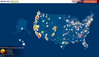 In Stamen Design’s latest project for MoveOn, the map of feedback has itself become the means of participation.
On June 28, over 55,000 people in 4,600 house parties participated in an online conversation with Michael Moore about his film Fahrenheit 9/11. Moore spoke over a live, RealAudio feed while users asked questions via the map interface. User questions and responses to questions were displayed on the map in real time.
From Stamen’s press release:
“Stamen developed a live, map-based, interactive Q&A session that allows thousands of people to communicate visually via a moderated discussion. Visitors logging on can ‘see’ themselves and their submitted questions on the map, along with those of other MoveOn community members. Michael Moore, along with MoveOn directors Eli Pariser and Adam Ruben, will respond to active polls and answer questions from the online audience. The effect is both compelling and empowering. ‘If you can see yourself on the map, so much the better, because you can identify yourself as part of a large group of Americans all working towards the same thing,’ says Michal Migurski, Stamen’s Technical Lead. ‘You can get an immediate visual picture of just how widespread MoveOn’s membership is, and immediately connect with that community.’”
A archived version of the Flash file is in the works, but in the meantime, check out the screenshots in this chronology of the event.
The event also marked the launch of local voter registration and organizing drives around the country.
...
Update: The map was used again for the July 18 house parties and screenings of Outfoxed. Here are some screenshots from that event.

OK, OK, OK.
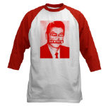
So, every time I show someone a graphic idea for a flyer or something they inevitably say, “You know, that would make a great T-shirt.”
Alright, then. I’ve created a few at CafePress. You can order them online at http://cafeshops.com/nornc
For sale: T-shirts, tank tops, posters, postcards, and stickers to welcome the Republicans in style.
Only three designs so far, but let me know what you think and I might make more.
Note, all prices shown are CafePress’s base prices. I’m not making any money here. I just want to get the word out.
---
And by the way, if you want to design some T-shirts yourself, CafePress makes it fairly easy. Basically, you upload a high resolution graphic through your Web browser to their Web site, select the product, and order it online. Voila! They handle the payment processing, printing, shipping, and customer service. You can put your design onto T-shirts, hoodies, lunch boxes, frisbees, postcards, and more. (See for instance, this lovely turntable mousepad I made.) Setting up a basic store online is free.
I first heard of this in Japan a couple of years ago. A friend who ran a community development initiative in Boston’s Chinatown, was off to Gifu, the butt of all jokes and an industrial city struggling with the long recession and a loss of manufacturing jobs.
It took a while, but I finally had a chance to search around for a decent definition.
Community asset mapping sounds like a good way to begin analyzing and building political power within a community using design and graphics.
From a Michigan State University Best Practices Brief (468 Kb PDF):
“Community Asset Mapping is a capacity-focused way of redeveloping devastated communities. This positive approach is proposed as a substitute for the traditional deficits focus on a community’s needs and problems. Using problems to formulate human service interventions targets resources to service providers rather than residents, fragments efforts to provide solutions, places reliance on outside resources and outside experts, and leads to a maintenance and survival mentality rather than to community development.
 Instead, they propose the development of policies and activities based on an understanding, or ‘map,’ of the community’s resources — individual capacities and abilities, and organizational resources with the potential for promoting personal and community development. This ‘mapping’ is designed to promote connections or relationships between individuals, between individuals and organizations, and between organizations and organizations.
The asset-based approach does not remove the need for outside resources, but makes their use more effective.
The community assets approach
- starts with what is present in the community
- concentrates on the agenda-building and problem-solving capacity of the residents
- stresses local determination, investment, creativity, and control
In this context, spatial mapping may or may not be used. Within any given neighborhood or community, most assets as defined by Kretzmann and McKnight, [who developed the asset mapping approach to development,] do not have a spatial quality. Community Asset Mapping has very little to do with spatial mapping... and much more to do with a community survey and the mobilizing of individuals and organizations to make connections and build capacity. The information obtained through the survey process must be organized and accessed in an inventory format. It can be computerized as a data base inventory. Computerized mapping can be used, showing the location of assets on a geographic map, as well as the attributes attached to each asset.
The Community Asset Mapping process as outlined by Kretzmann and McKnight is intended to initiate a process that will fully mobilize a community to use its assets around a vision and a plan to solve its own problems. Their guidebook provides considerable detail about how this might be accomplished, with numerous examples of the types of connections that can be developed.“
Some forms of mapping include:
Mapping Public Capital
Such as
- social gatherings that enable people to learn about what is happening in the community
- organized spaces for interaction where people can learn about, discuss, and act on community challenges
- catalytic organizations that spur discussion on community challenges and marshall a community’s resource to move ahead;
- safe havens for decision makers to meet for unofficial candid discussions.
From this the community, can fill in gaps and identify action points and obstacles to overcome.
Cultural Mapping
Documenting cultural resources in the community — examining long-term customs, behaviors, and activities that have meaning to individuals and to the community. Information for cultural mapping is gathered by face-to-face interviews. Communities can use cultural mapping as a tool for self-awareness to promote understanding of the diversity within a community and to protect and conserve traditions, customs, and resources.
Community Relationship Mapping
Ecomapping was initially developed as an effective way for a therapist to identify relationships within a family. The mapping of inter-organizational linkages is a form of ecomapping designed to show the relationships that one organization has with other organizations within the community. Relationships with other organizations may relate to funding, referrals, access to resources, joint service planning, collaborative projects with contributed staff or funds, etc. Ecomapping may be undertaken to clarify the place of an organization in the community spectrum, to identify gaps in linkages, to indicate the multiple relationships between organizations, etc.
From the Northwest Regional Educational Laboratory, regarding the Mapping Community Assets Workbook:
“‘From a community development perspective, it helps to think of our communities in terms of their wealth—in people, things, services, and resources that they possess,’ says author Dr. Diane Dorfman. ‘To build from what you have requires asking different kinds of questions to learn different kinds of things about where you live.’
Learning how to ask what communities have to offer begins a process of building and developing. It brings knowledge, skills, and capacities out into the open, where they can work together to everyone’s benefit. As the web of assets grows, so does the potential for the community.
An asset map is an inventory of the strengths and gifts of the people who make up a community. Asset mapping reveals the assets of the entire community and highlights the interconnections among them, which in turn reveals how to access those assets.
The workbook’s engaging, lively style invites active participation on practically every page. Through a series of questions and exercises, readers first learn to uncover their personal assets, both tangible and intangible, material and nonmaterial. Then they expand to take stock of their community, listing all of its special features. Readers also learn how to design a questionnaire to uncover the hidden assets in their community, those from people or places that are not familiar.
‘Connections to people can also become connections to resource-filled institutions. Likewise, a connection to an organization or institution may actually conceal a personal relationship,’ notes Dorfman.
Here’s an annotated resource list on community asset mapping, and a page on asset mapping with youth.
Still there’s something curious about that Michigan State University’s ‘Capable Communities’ center. Why are they offering this particular public service? Is that university campus, like so many in the U.S., surrounded by pockets of poverty? With this image in mind, it occurs to me that Community Asset Mapping is rather “inward” focused. This is the point, I know, but it does not interrogate or confront external actors or institutions, economic or public policies that also give shape to the community. This is, perhaps, a different map. Building a stronger community, however, builds a solid foundation for challenging the status quo.
 I just saw the latest Harry Potter installment and more than anything else, was struck by Hogwarts castle.
Having just spent the last weeks running around Spain looking at castles and fortresses, cathedrals and mosques, it was all so clear: who gets to build such things but people and institutions with enormous wealth and power? Wealth and power acquired and maintained primarily through inheritance and military force.
Much has been written about nostalgia for royalty, the restoration of noble blood, and inherited class privilege in Star Wars, The Lord of the Rings, and Harry Potter.
But I haven’t seen anything about this now painfully obvious clue — the politics of the architecture in fantasy literature.

See also Graphics for the Gipper, an online exhibition from the Center for the Study of Political Graphics showing more than 45 posters criticizing Ronald Reagan over two decades.


On a couple of occasions I’ve noted my admiriation for the design used by United for Peace and Justice to publicize anti-war events in New York City. The simple flag and globe motif on a bright blue ground and its bold sans-serif type are eye-catching, clear, and instantly recognizable.
However, the consistency and repetition of such a strong image in the same context (via stickers and flyers) over nearly three years may be diminishing its impact. As one UPfJ organizer notes:
“We love the blue flag standard, but have heard feedback that the design has been the same for too long... folks think it’s for an old demo.”
Image manipulation software, like Adobe Photoshop, can be a powerful tool to involve communities in the process of urban development.
From the Local Government Commission:
Computer Simulation as a Public Participation Tool
 “Most of us have a hard time envisioning what two-dimensional plans or a development proposal will look like when built. Computer simulation translates such plans and descriptions into pictures that help us see what a proposed development will actually look like. This allows residents and policymakers alike to make more informed planning decisions.
Simulation exercises help settle complex planning issues and guide design and planning activities. As a mechanism to improve public communication concerning local planning and development issues, computer simulation can be used to
- Help develop design guidelines
- Evaluate controversial proposals
- Analyze urban design qualities before formal discussion begins on an actual proposal
- Develop choices about the appearance of a project
 Before the advent of personal computers, architects and urban designers were only able to show their clients what a proposed project would look like through artist’s renderings and/or by constructing elaborate three-dimensional models. Such models and renderings are expensive and time consuming to produce.
Today, advances in computer technology, such as computer aided drawing and design (CADD), global information systems (GIS), and advanced two and three-dimensional graphics software, have made it possible for design professionals to present their projects to clients or the public through computer simulation. Computers make it possible to produce highly accurate simulations faster and less expensively than do traditional methods. Furthermore, once computer simulations are produced, they can be easily adapted to design changes. An artist’s rendering, in contrast, may have to be completely redrawn.
Computer simulation begins with a scanned photograph of a building or area within a community. Using computer software, elements of the image are added, taken out, or otherwise reorganized into a new image representative of a proposed development design strategy. The result is a series of before and after images...
This technique allows all stakeholders to see the differences in proposed design styles and development patterns and allows decision-makers to evaluate the potential impacts of proposed developments.”
From the company Urban Advantage:
“Working with architects, planning staff, and citizen groups, we create visions of pedestrian-friendly, socially-interactive communities by transforming photographs with photo-editing software. In addition to the illustration skills necessary to make seamless montages, we also incorporate into the images an understanding of urban planning, architecture, arboriculture, and transportation. This results in informed collaboration with clients.”
Some of their before and after photo simulations are truly stunning — though after a while, the solutions do start to look a lot alike.
The LGC page lists serveral other specialist firms that provide illustration services, but with the increasing power of home computers and the increasing popularity of digital cameras and image manipulation software, I imagine that community residents themselves might also be able to render their own visions.
page 1 2 3 4 5 6 7 8 9 10 11 12 13 14 15 16 17 18 19 20 21 22 23 24 25 26 27 28 29 30 31 32 33 34 35 36 37 38 39 40 41 42 43 44 45 46 47 48 49 50 51 52 53 54 55 56 57 58 59 60 61 62 63 64 65 66 67 68 69 70 71 72 73 74 75 76 77 78 79 80 81 82 83 84 85 86 87 88 89 90 91 92 93 94 95 96 97 98 99 100 101 102 103 104 105 106 107 108 109 110 111 112 113 114 115 116 117 118 119 120 121 122 123 124 125 126 127 128 129 130 131 132 133 134 135 136 137 138 139 140 141 142 143 144 145 146 147 148 149 150 151 152 153 154 155 156 157 158 159 160 161 162 163 164 165 166 167 168 169 170 171 172 173 174 175 176 177 178 179 180 181 182 183 184 185 186 187 188 189 190 191 192 193 194 195 196 197 198 199 200 201 202 203 204 205 206 207 208 209 210 211 212 213 214 215 216 217 218 219 220 221 222 223 224 225 226 227 228 229 230 231 232 233 234 235 236 237 238 239 240 241 242 243 244 245 246 247 248 249 250 251 252 253 254 255 256 257 258 259 260 261 262 263 264 265 266 267 268 269 270 271 272 273 274 275 276 277 278 279 280 281 282 283 284 285 286 287 288 289 290 291 292 293 294 295 296 297 298 299 300 301 302 303 304 305 306 307 308 309 310 311 312 313 314 315 316 317 318 319 320 321 322 323 324 325 326 327 328 329 330 331 332 333 334 335 336 337 338 339 340 341 342 343 344 345 346 347 348 349 350 351 352 353 354 355 356 357 358 359 360 361 362 363 364 365 366 367 368 369 370 371 372 373 374 375 376 377 378 379 380 381 382 383 384 385 386 387 388 389 390 391 392 393 394 395 396 397 398 399 400 401 402 403 404 405 406 407 408 409 410 411 412 413 414 415 416 417 418 419 420 421 422 423 424 425 426 427 428 429 430 431
[ Back ]
[ Next ]